Monday, December 31, 2018
Stay Close ~ inspired by Vera Lane Studio images
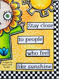
Hi everyone! Happy New Year (almost)!I decided to finish off 2018 with another page in my Vera Lane Studio themed art journal. I had printed this wonderful image called Sunny who comes with her very own sun as well as a tulip and a couple of sentiments, and I had my own sentiment that suited her so well. I also had an idea for a simple sunshiny background which I wanted to try out and this bright page was the result.
I coloured Sunny and the sun with a mix of Prismacolor and Polychromos pencils using Lagoon Stickles on her buttons and white Posca Paint Pen dots on her hair and as highlights on the sun. Super simple but cute!
Both images were fussy cut leaving a narrow white border, matted with black cardstock, and trimmed out again leaving a narrow black border.
The 6 x 6 inch watercolour paper background was stamped using Versamark ink with a curlicue background stamp (no idea who makes it...it's old like me). Clear embossing powder was sprinkled over the Versamark and then heat set to create a resist.
Carved Pumpkin and Squeezed Lemonade Distress Oxide Inks were applied over the embossed pattern and allowed to dry. Any excess ink was removed from the embossed areas with a dry paper towel. I love how delicate the white pattern looks and how it shines and catches the light. Checkerboard washi tape was adhered to white cardstock strips and added as a border around the page.
The sentiment was printed onto white cardstock, cut into sections and matted with black before being adhered in a staggered format next to Sunny. The only other finishing touch was to outline next to the washi frame to help it stand out even more next to the yellow.
Thanks for visiting today. Sunny and I appreciate that and we both hope you have a wonderful New Year's and a stellar 2019. We appreciate your support!
Life is good; so is art.
Bonnie
Saturday, December 29, 2018
I Went Pro ~ inspired by a Vera Lane Studio image
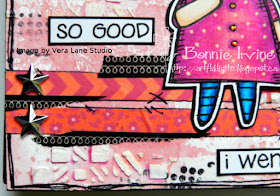
Just Kidding! About the going pro thing... not about the procrastinating thing though! I have that down to a science. Anyway, this saying made me laugh and needed a page in my art journal. I decided to make Harper from the Bright Ideas image set by Vera Lane Studio the star of this page partly because she is so cute and partly because she looks like she is pondering the wisdom of her decision.
I coloured Harper with a mix of Prismacolor and Polychromos pencils, using Tropical Tangerine Stickles to add sparkle to her buttons. She was then fussy cut leaving a narrow white border, matted with black, and fussy cut a second time leaving a narrow black border. I almost forgot to give her white highlights in her eyes but went back and did it and took another photo after it was done. It makes such a huge difference!
The background began as a 6x6 inch watercolour square. Worn Lipstick Distress Oxide was smushed onto the non-stick craft sheet and then spritzed with water. The page was then dipped into the puddle of ink several times, drying between layers to keep the layers distinct. A dotty stamp from Indigo Blu Tasty Textures was applied using Rocket Red Gold Brilliance ink and a second stamp using Jet Black Archival. Five different washi tape strips and bits were added both horizontally close to the bottom and vertically closer to the right side of the page. The black curly washi was also added to a punched semi circle and glued to the upper left sided of the page. Texture paste was scraped through Carabelle Studio Cosmic Cubes stencil in several places on the page.
The black curly washi was also added to a punched semi circle and glued to the upper left sided of the page. Texture Paste was scraped through Carabelle Studio Cosmic Cubes stencil in several places on the page and, once dry, pink Neocolor II crayon was applied with a waterbrush to shade next to some of the squares. The wording was printed onto white cardstock, cut into sections, and matted with black.
A border was doodled around the outside edges of the page with a Posca Paint pen and Black Big Brush Pen was added to the very edge on three sides. The washi was outlined and doodled on with the same black pen. Two mirrored stars were attached to the left side of the horizontal washi stripes to finish the page.
Thanks for joining Harper and me today. You have made us very happy by doing that!
Life is good; so is art.
Bonnie
Friday, December 21, 2018
Spilling coffee ~ inspired by Vera Lane Studio images
Hi everyone! I found this great quote I used in today's double art journal spread that made me laugh and then I went searching through Vera Lane Studio images to find images to tell the story. I decided upon Latte from the Cocoa and Latte set, June from Hello June, and the single balloon from the Cheers set.
Latte was printed once on white cardstock and coloured with Prismacolor and Polychromos pencils. Clear Wink of Stella was used to add shine to her whipped cream, Glossy Accents added dimension and shine to her eyes, and silvery gel pen added sparkle to her wings. The white cardstock image was then fussy cut leaving a narrow white border, matted to black, and fussy cut again leaving a narrow black border.The cup was printed again onto a gel printed piece of cardstock, fussy cut, and shaded with Clean Color brush pens and Inktense pencils. The cup was then adhered to the other matted image.
June and the balloon were printed onto white cardstock and coloured with Polychromos and Prismacolor pencils. Glossy Accents was added to June's eyes and Magenta Stickles added to her buttons. Both were fussy cut and matted leaving my usual borders.
Colour was applied to the watercolour background paper using an ink blending tool and Gathered Twigs and Broken China Distress Oxide Inks. Stencilling was added to the background using Coffee and Aquamarine Archival Inks and AALL& Create stencils (6, 39, 45) as well as Tim Holtz Splatters stencil which was applied with Gathered Twigs Distress Oxide. Black and white Posca paint pen was added to the larger stencilled circles. Chai Gelato and Walnut Brown Big Brush pen were used to darken the outside edges of the pages.
The wording was printed onto white cardstock which was matted to black once it was cut into individual words. To get the spilled coffee effect, Coffee Archival Re-inker was applied to both Latte's cup and the ground beneath it. Once dry, Glossy Accents was added over the ink to make it look wet and to add dimension. The ground was doodled in and Inktense pencil was used to shade it so the cup was not floating. A couple of rub-ons were added to June's page with the Note to Self one shaded with Gelato and circled with black pen. The same black pen was used to doodle a scribbly border to finish the page.
Thanks for joining Latte, June, and me today. We appreciate it and hope that your coffee either remains in your cup or moves nicely to your tummy and that you are able to hang onto your balloon :) No more crying over spilled coffee!
Life is good; so is art.
Bonnie
Saturday, December 15, 2018
The Key to Happiness ~ inspired by a Vera Lane Studio image
Hi everyone! Sometimes when I create I colour the image first and create a background to coordinate. Other times, I do the background first and then colour the image to coordinate. It often depends on what I'm in the mood to play with first. In the case of this art journal page featuring the image Apple and Tweet by Vera Lane Studio, it was definitely a case of the background informing my colouring.
Apple and Tweet were coloured with Prismacolor and Polychromos pencils with white Posca Paint Pen dots to highlight. They were fussy cut leaving a narrow white border, matted with black cardstock, and trimmed out again leaving a narrow black border. I already knew that my background was busy (it usually is) so this double border around the image allows it to stand out as a focal image should. A little metal key charm was added to Apple's hand once the image was adhered to the background.
The background began with an idea for a colour palette I wanted to use. Twisted Citron and Peacock Feathers Distress oxides were blended onto the 6 x 6 watercolour paper and Wilted Violet Distress Oxide was pounced through a Studio Light Stencil using a make-up sponge. The Wilted Violet was not dark enough or purpley enough to suit me so I went over it with Deep Purple Archival Ink. Text stamping with a Crafty Individuals stamp was applied using Aquamarine Archival Ink and Jet Black was used to add one of the circles from Kate's Cube by Stampotique.
Black gesso lines were applied with a piece of a gift card before white Texture Paste was scraped through Clauding Hellmuth's Confetti stencil. The Texture Paste picked up colour from the Distress Oxides so white acrylic paint was added through the same stencil once the paste was dry. Watered down Peacock Feathers Distress Oxide was applied with a brush to shade the dried Texture Paste designs on one side to help them show better.
The sentiment was printed onto white cardstock, cut into sections, and matted with black. A little torn washi was added below Apple to ground her and another bit of the same washi was added under the top section of the sentiment to emphasize it and repeat the checkered pattern. Jet Black Archival Ink was used to edge the page before a border was doodled around the outside edges to help frame it. Apple and Tweet were glued in place and the key was adhered to her hand so she could place it in one of her own pockets.
Thanks for joining Apple, Tweet, and me today. We always appreciate your good company.
Life is good; so is art.
Bonnie
Wednesday, December 12, 2018
Ragamuffins are Real ~ inspired by a Vera Lane Studio image
Hi everyone! I absolutely am smitten by this Vera Lane Studio image called Ragamuffins. They melt my heart with their well-loved look and remind me of one of my favourite quotes from The Velveteen Rabbit.
I coloured the two friends from the set with a combination of Prismacolor and Polychromos pencils. Glossy Accents were applied to their eyes to make them shine and Grape Stickles on the kitty's pendant. Real black butons were threaded with white thread and adhered over the buttons drawn by Janet. Both Kitty and RG (Ragamuffin) were fussy cut leaving a narrow white border, matted with black cardstock, and fussy cut again leaving a narrow black border.
Two different washi tapes were torn and overlapped to give RG and Kitty stand on. Another skinny strip of the black washi was added to the left edge of the page.To add a little brightness to the page, Texture Paste was scraped through a Stamperia stencil. Once dry, the left side of some of the harlequins were shaded with a purple CleanColor brush pen. A border was doodled around the outside edges of the page and three large and three small enamel dots were adhered to opposite corners of the page as the final touch to pull a little more pink from the images into the background.
Thanks for popping by today. RG, Kitty, and I appreciate that so much. I think I can relate to these two more than ever with all of my surgical scars and my super short hair. I, too, am well-loved, look and feel different from before, and have never felt more real. I'm glad to know that "it lasts for always" :)
Life is good; so is art.
Bonnie
Thursday, December 06, 2018
Mine...all mine ~ inspired by a Vera Lane Studio image
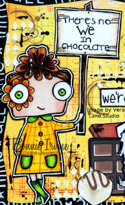
Hi everyone. I took a little time away from art journaling to make some more collage bookmarks for the library to sell. Now I'm back to celebrate my love for chocolate (which I don't share well) with a new art journal page. I chose the image called Cheers by Vera Lane Studio because I wanted part of my message to be written on a sign. Cheers fit this concept perfectly and she's mega cute to boot.
Cheers was coloured with Prismacolor and Polychromos pencils. The lettering on the sign was done by hand using a black Pitt pen. The image was fussy cut leaving a narrow white border, matted onto black cardstock, and then fussy cut again leaving a narrow black border.
The 6 x 6 background was created with Squeezed Lemonade and Carved Pumpkin Distress Oxide Inks applied with blending tools. Water was both spritzed and flicked onto the background, left a minute, and then covered with a dry paper towel to remove the ink where the water lifted it. A Hero Arts Plaid background stamp was inked up with Orange Blossom Archival Ink and then applied over the Distress Oxide background. I was not going for perfect images just texture. A circle stamp was added using Coffee Archival Ink and splatter dots with Jet Black. Black lines were added with gesso and a gift card edge before Texture |Paste was scraped through a small harlequin design, part of a larger Stamperia stencil.
The border was created by cutting a square of black cardstock the same size as the page. A border was drawn about 3/8 of an inch inside the square, and the inside section was cut away to form a frame. White Posca paint pen was used to hand write the message "mine...all mine" and the border was attached to the page using Scor tape. Several free clip art images of chocolate bars and individual chocolates were fussy cut and collaged together. That way, my little Cheers friend looks like she is standing guard over her yummy stash.
Thanks for joining us today. I'm sorry that Cheers won't share her chocolate with any of us, although I must say I get that! We are talking about chocolate, after all.
Life is good; so is art.
Bonnie
Saturday, December 01, 2018
Collaging Just For Fun
The focal image was cobbled together from bits and pieces from various collage sheets. All of the body parts, clothes, etc. come as separate pieces so you can put them together many ways, customizing them to suit your page. Love that! Even the bow on the hat and the flower on her dress are separate elements. I love adding my own touches...colouring, dots, outlining to make them my own. The hearts were punched from gel plate scraps left over from another project.
The friends sign was a piece of printed acetate from my stash which I mounted over white cardstock so the background wouldn't show through and the colours remained true. Her glasses (another collage element) were layered with Glossy Accents to give them both dimension and shine.
The second collage page started with a tan coloured designer paper over which I stamped a honeycomb pattern using Coffee Archival Ink. This was topped by a smaller rectangle of honeycomb designer paper which I then bordered with black and gold skinny washi to frame it. A definition of bee from an old dictionary was placed at the bottom of the page with the word Believe which was stamped onto white cardstock, overlapping it.
Jet Black Archival Ink was used to stamp the splatter dots onto the background and bee washi tape was added above the framed image. It was outlined with both black pen and brown coloured pencil to add more definition. This was also done to the bee definition and the word believe. To finish the page, the edges were darkened with Coffee Archival Ink.
Thanks for popping by today. We all appreciate that. This brings me to the end of the collage pages I created while my hands were uncooperative. I guess I'd better get moving and start creating some more. I've been enjoying colouring again but I am not done with collage by a long shot :)
Life is good; so is art,
Bonnie
Wednesday, November 28, 2018
Bookworms Rule ~ inspired by a Vera Lane Studio image
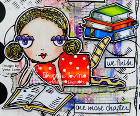
Hi everyone. I am a huge bookworm like my dad was...have been since I was little. Reading has always been a great source of enjoyment and I love to hang out in bookstores and libraries. Most of all, I love curling up on the couch in the den with my current book in hand. When I saw this fabulous image from Vera Lane Studio called Book Lover, I knew just what saying I wanted to pair with her. This one makes me laugh because quite often reading one more chapter postpones whatever action I fleetingly thought of taking. You know what I mean! You've probably played that "Just 10 more minutes" game :)
I coloured Book Lover, the book she's reading, and the stack waiting to be read using a mix of Prismacolor and Polychromos pencils. Her dress dots were created with a Posca paint pen. The images were fussy cut leaving a white border, matted in black, and trimmed out again to leave a narrow black border to help everything stand out against my usual busy background.
The journal I'm working in has 6 x 6 inch watercolour paper which stands up so well against anything I throw at it...or on it. I began by gessoing the page and, once dry, I adhered torn pieces of vintage text in overlapping layers with gel medium, leaving lots of white space. Gesso was brushed over the text to make it blend into the page. Next I fingerpainted different areas with Dina Wakley Blackberry Violet, Ruby, Lapis, and Lemon Media Paint as well as Liquitex Brilliant Green acrylic paint to pull colours from my colouring into the background. I also added the green lines here and there with the edge of a gift card.
Stamping was applied using a Kaisercraft Texture Plate and Jet Black Archival Ink and circles were added with a bottle cap and Black Media paint.Texture Paste was scraped through a piece of drywall mesh in three places and left white to add some brightness to the paint. Once dry, a couple more skinny torn strips of text were adhered to the page to give Book Lover a place to rest and bring some of that embedded text pattern to the surface again. A doodled border, Jet Black Archival Ink, and Black Big Brush Pen were added around the page to frame it.
The wording was printed onto white cardstock, cut into segments, and matted with black cardstock. Three black gems were used to create the pause dots after Bookworms rule the world. The final step to finishing the page was to add those three black semi circles to the left side of the page. It seemed to create better balance and to better draw the eye to Book Lover's sweet face.
Thanks for popping by today. Book Lover and I appreciate it...so much so that she even looked up from what she was reading...at least for a moment. LOL
Life is good; so is art.
Bonnie
Monday, November 26, 2018
Come here, Beautiful ~ inspired by Vera Lane Studio images
Hi everyone! Those who know me IRL or who follow me here know that I am a huge coffee fan, although I limit myself to two or three a day. As soon as I saw Janet's Coffee Cups images at Vera Lane Studio, I knew I had to art journal with one of them (there's also a boy coffee cup) because I had an awesome saying just waiting for the right images. I searched through the VLS shop to find the one I wanted for the coffee lover and finally decided on Kadee and Kat. I loved how she was looking sideways at the cup, inviting it over.
I coloured Kadee and Coffee Cup with a mix of Prismacolor, Polychromos and Luminance pencils, re-outlining and highlighting with black and white Posca pens. Both were then fussy cut leaving my usual narrow white border and matted on black cardstock.
The images were then fussy cut again leaving a narrow black border so that I could go as busy as I wanted on the background and they would still pop.
For the background, I dripped Vintage Photo re-inker along the top of the 6x6 inch watercolour page and spritzed with water to get it to drip. Some tipping of the page helped this process along as did a little puffing of air from my TH tool. Coffee Archival Ink was applied through TCW Mini Texturized stencil to create very faint circles in the white areas. Forget-Me-Not Archival ink was applied through Kaisercraft Dots and Dashes stencil to pull the blue from Kadee's dress into the background.
To give Kadee and the cup a place to stand and ground them, two patterns of washi tape were layered along the bottom edge.
The very wordy saying was printed onto white cardstock, cut into individual words which were then matted with black. They were auditioned in several configurations once Kadee and the cup were glued down until finally I settled on this one. Once the wording was adhered, a Technique Tuesday coffee bean stamp was applied here and there using Coffee Archival Ink. The edges of the page were darkened with Black Big Brush Pen and then Jet Black Archival to fade the black into the page a little more. Finally an enamel star was placed between the first two sections of the saying to break it up and also draw attention to how she feels about that big beautiful Coffee Cup :)
Thanks so much for popping by today. Kadee, Coffee Cup, and I appreciate it. There is still a little time if you want to play along with the coffee themed ATC swap on the Vera Lane Studio Facebook group. I would if it wasn't for our rotating postal strikes in Canada. The entries in the album are fabulous and great sources of inspiration :)
Life is good; so is art.
Bonnie
Wednesday, November 21, 2018
Friends ~ inspired by two Vera Lane Studio Images
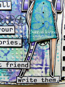
Hi everyone! I created another art journal page in my 6 x 6 inch watercolour book, again featuring images by Vera Lane Studio. The images for this page are called Adorabelle (the one with wings) and Margaux (the one with a cup on her head). I've been having fun both with this size of page and also playing with messy wet layers since the watercolour paper can handle it.
Margaux and Adorabelle were printed onto Neenah Solar White cardstock and coloured with Prismacolor and Polychromos pencils. Their lovely dresses were paper pieced and shaded/highlighted with the same pencil brands plus a little white Posca pen.
They were then fussy cut leaving my usual white border and then matted with black cardstock and trimmed out again. This guarantees they will stand out against the background.
To create the background, I smushed three separate layers of Distress Oxide onto my craft sheet, one at a time, spritzed the ink with water and then dipped the page into the diluted ink. I made sure to dry in between each layer (Broken China, Cracked Pistachio, then Wilted Violet. This kept the layers distinct and the water also activated the oxidation effect. Once the last layer was dry, Deep Purple Archival Ink was applied through Studio Light Mask MB04. Forget-Me-Not Archival Ink was used to apply the Carabelle Studio repeated star stamp in several places. Jet Black Archival Ink was used to stamp the TH circle star images. Texture Paste was scraped through Dina Wakley's Plastic Canvas stencil to create dimension and texture.
Margaux and Adorabelle were adhered to the page after the bottom two quote sections were glued in place. I wanted them to have places to rest their stylish shoes so they weren't floating. All sections of the wording were printed on white cardstock, trimmed close to the letters, and matted with black cardstock to help them pop against the busy background. A doodled border was added to the outside of the page before Black Big Brush pen was used to darken the white edges.
Thanks for stopping by today. Margaux, Adorabelle, and I all appreciate that. It's always lovely to have friends visit. To all of my American friends, Happy Thanksgiving tomorrow. I hope your day is filled with family, friends, and yummy food.
Life is good; so is art.
Bonnie


