Thursday, March 06, 2014

The bee on my nose ~ ePlay Challenge


It's the first Thursday of March and that means a new challenge at eclectic Paperie. We have changed our format slightly. Here's the scoop:


·         We’ve combined our two challenges into one called ePlay ~ Push Your Boundaries. It will be announced on the first Thursday of each month.  This gives the design team more flexibility with challenge topics and projects and allows you more time to enter! 
·         We’ll also feature a product each month, and during the first day of the challenge, you’ll receive a discount on the featured product….be sure to check for the special code! 
·         Our prize drawing is increasing from $15.00 to a $25.00 gift certificate and the winner of each challenge will be announced on the last Thursday of each month and will be featured on the eP blog. 
·         Each month we’ll hold a blog hop featuring the beautiful artwork from our design team…just scroll down to the bottom of the post for all of the links!  Talk about inspiration!!
 Our challenges are about encouraging you to explore your creative journey and inspiring you to step outside of your comfort zone.  When you submit your artwork, share a unique card, scrapbook or journal page, a canvas, home décor project, or anything that you’re excited to share!  We’re looking forward to crafting with you!
 Today’s special is on Liquitex Gesso and for one day only, you can save 10% on a bottle of gesso…perfect for all of your altered projects!  Simply use code GESSO03when checking out.
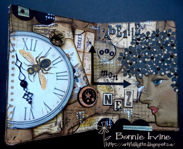
 This month’s challenge is Altered Books and our hostess is the lovely and talented Karen Crossen. This challenge was "right up my street" as my friend, Alison, says. I always have a bunch of altered books on the back burner just waiting for me to find the time to work on them. I restrained myself somewhat, deciding to do the last double page spread in my bee-themed altered board book. I love how this book is turning out and have had a blast playing with each spread.

I started this one with the pages gessoed and then tore sections of TH kraft resist paper and a page from G45's The Olde Apothecary Shoppe collection. These were edged with Vintage Photo Distress ink and adhered to the white background with Matte Medium. To fill in the white spaces, various brown Neocolor II watercolour crayons were scribbled and spread over the white gesso. Mocha chalk paint was sponged on with Cut n Dry foam, and then Walnut Brown Big Brush pen was smudged around the edges of the paper scraps. Vintage Photo DI was applied through TCW's Mini Punchinella stencil to create the hexagon pattern and thenwWhite gesso was stencilled through TCW's Texure Tile stencil.

The beautiful woman's face from TH's new Daydream stamp set was stamped with Coffee Archival ink onto plain kraft cardstock. It was colourized with a combination of Distress markers applied with a water brush and also Prismacolor pencils. Her face was then fussy cut and matted in black. Her hair was a whole lot of flowers punched from more G45 paper. These were glued to the hair area and the centers were added with black flat pearls. The bee on her nose, a nod to the hidden children's poem, is from the internet.

To continue developing the background, a TH script stamp and splatter dots were randomly applied with Jet Black Archival ink. Various collage elements purchased from Etsy were distressed with Vintage Photo and adhered to the left side. 

The tip-in element was created by gluing a Bo Bunny Timepiece Journal spot to  kraft paper which had been printed with the bee poem. More bees were fussy cut and attached to both sides along with clock hands. A wooden button popped up on foam tape creates the closure for the tip-in.

The lettering which is in French says "The bee on my nose" (L'abeille sur mon nez). It was created with Ransom Alpha Parts as well as three other types of stickers. To finish off the page, Black Big Brush pen was used to outline the edges. Washi Tape and die cut scallop borders and an arrow were  added to help the eye move around the page. Outlining and doodling as well as black gesso rings were also thrown into the mix.

And there you have it! All that's left to do on this book are the covers. Thanks so much for visiting today. I hope you get a chance to pop over to the eclectic Paperie blog to see Karen's fabulous project and hop around to the other DT members' blogs. Loads and loads of inspiration!
Life is good; so is art.
Bonnie
Here are links to the eP store for some of the products I used:

Monday, March 03, 2014

Wanna Party? ~ CYP Challenge # 203


There's a new challenge at Craft Your Passion...it is Monday, after all :) The theme this week is Birthday Bonanza and our fabulous sponsor this week is Eureka Stamps. I chose to play with this adorable party cat image called Kitty Party which I coloured with my Prismacolor pencils. The looks on their faces make me laugh, especially the grumpy one...the party pooper. The little one peeking out is so cute, too. I fussy cut the bunch of them, adhered them to black cardstock, and cut a narrow border before popping them up on foam tape.


I created a birthday hat shape for the card to reflect the shape of their party hats and make the card more playful. The card base is 5 and 3/4 x 6" and I scored the back triangle about 1 1/4 inches from the top so it would fold back to open. The front and back are glued together above that fold line so the card opens from the bottom. Clear as Mud? The background paper is from a birthday themed pad from Paper Wishes which I have had for ever!. It was cut smaller than the card base and then matted in black. Narrow black strips of the same cardstock became the stripes at the top and bottom.


The sentiment on the hat topper comes from Doodle Pantry and was cut with a Spellbinder's die before the edges were inked with Mowed Lawn Distress ink. The letters for "Wanna party?" are stickers. The white letters are sparkly and have been outlined with a black pen to make them more visible.


I kept the inside very simple with scraps of the front papers layered and faux stitched to outline, The letters are more stickers. I often complete the insides of my cards this way, layering up some papers or elements from the front to add flow to the card. It's such a simple way to finish the inside and quick to do because the scraps are still on my desk.

Thanks for popping by today. I appreciate that so much. If you get a minute, stop by the Craft Your Passion Challenges blog to see the fabulous projects from the rest of the DT. I'm hoping you will join us for this challenge...after all, who doesn't need an extra birthday card in their stash!

I am entering this card in the following challenges:
613 Avenue Create ~ #60 Optional Twist: Use Your Stash ( birthday paper and stickers)
Glitter n Sparkle ~ #74 Add a Sentiment
One Stitch at a Time ~ #202 Anything Goes
Robyn's Fetish ~ #201 Anything Goes
The Corrosive Challenges ~ #194 Animals
Catch the Bug ~ March Anything Goes

Life is good; so is art.
Bonnie

Monday, February 24, 2014

Obstacles ~ CYP Challenge #202


Woohoo! There's a new challenge at Craft Your Passion Challenges this week and it's win/win in my books. First of all the challenge is to use Black, White, Red and Kraft which is one of my favourite colour schemes evah! Then our sponsor is QKR Stampede and you know how much I love their fun and quirky images.


I chose to work with this awesome image called One Man's Trash. I just love that Speedy (the snail) is so resourceful and won't give up, using someone's trashed teacup for a shell. Way to go, Speedy! I coloured him with Prismacolor pencils after printing him once on kraft and once on white cardstock. The cup part was cut out of the white and the entire image was fussy cut from the kraft so that the cup could be layered...and be a contrasting colour to Speedy.


The background started with a rectangle of kraft cardstock which I stencilled using white gesso through TCW's chevron stencil. Next I stencilled through TCW's Confetti stencil using black gesso to create the splatters. A scrap of red patterned paper was cut into a diamond shape using a Spellbinders die. Both the kraft layer and the red layer were matted in black cardstock. The sentiment, which was matted in black and popped up on foam tape, is by Create With TLC and seemed to suit the fact that Speedy overcame a large obstacle in a very creative way. He was adhered with foam tape as well to create added dimension. The finishing touches were the scrap of black border cut with an MFT die and the red heart button that still had its staple attached from being pulled off the card...love that!


Thanks for visiting Speedy and me today. We really appreciate your fine company and interest. If you get a chance, pop over to the Craft Your Passion Challenges blog to see the fun projects created by my talented teamies. We'd love to see how you use the colour scheme of Black, White, Red and Kraft so come and join us. You may use skin,hair,fur etc.colours on your images. The rest of your cards/projects must only include the four listed colours. In the meantime, Speedy and I wish you a wonderful and creative week.
 I am entering this card in the following challenges:
613 Avenue Create ~ #60 Anything Goes (although I have included Red and White for Canada)
Challenges 4 Everybody ~ #38 Anything Goes
Sentimental Sundays ~ #195 Make your own background paper + add a sentiment
Di's Digi Designs ~ Tic Tac Toe _ Digi, Die Cuts, Flowers (on cup)
Doodle Pantry ~  #43 Any digi goes

Life is good; so is art.
Bonnie

Friday, February 21, 2014

Hit the right note ~ Craftitude Challenge 59


Whew! It's been a hectic week. My husband had knee replacement surgery on Valentine's Day (some people get chocolates...he got a new knee) and it's turned things upside down for the moment. All went well (yay!) but all of the formerly shared chores plus his care have fallen to me. It does make me appreciate how much he did around here before...lol. Anyway, it's time for a new challenge at Craftitude and our themes are Anything Goes or Hit the Right Note (music themed projects). Stamp n Doodle, which is closed due to illness,and the ever-awesome Meljen's Designs provided the images this round with Meljen's providing the prize. For my atc, I chose to play with this Meljen's Designs image called Girl Talk. What a fun and funky image to colour!

I coloured Miranda with Prismacolor pencils, fussy cut her with a white border, and then matted her with black cardstock. Bling was adhered over the image dots and she was popped up on foam tape. The background paper is a scrap matted on black cardstock. A torn strip of music paper was matted in black and adhered horizontally behind the image. Two music note brads embellish two of the corners and a third was given silver star sequins to reflect the light and echo the shine from the bling.

Thanks for popping by today. I love that you did that. If you get a chance, stop by the Craftitude Challenge blog to see the cards and atcs from the rest of my talented teamies. I'm hoping you'll be inspired to join us. We had nearly 240 participants last challenge which was awesome!

I am entering this atc in the following challenges:
Meljen's Designs ~ #198 Bling It On
Milk Coffee Challenge ~ Girly
Little Red Wagon ~ #225 Anything But a Card---but with paper
Through the Craft Room Door ~ Always Anything Goes

Life is good; so is art.
Bonnie

Monday, February 17, 2014

Cutie ~ CYP Challenge 201


We have a new challenge at Craft Your Passion this week and the theme is Girly Girl. We want to see your Girly Girl projects so bring on the ruffles, the pretty papers, the pink, and all those lacy feminine touches. Now I'm not much of a Girly-Girl kind of person. I like brights and funky, grungy and distressed. I decided to put my own spin on this theme and make it my version of Girly Girl...Girly With a Twist. I played with this adorable image from our sponsor, Crafty Sentiments Designs, called Harriet - Fancy Dress. She is so cute! I coloured Harriet with my Prismacolor pencils, fussy cut her, and then matted her in black cardstock. I love the energy that Hot Pink and Orange generate when combined. I added little flat black pearls to her eyes just 'cuz.


The background papers are from an older stack which no longer has it's cover...no clue who made it. The bottom layer was cut in a rectangle and matted with black. A rectangle of coordinating cardstock was embossed with a Swiss dot folder, matted in black and given a border of Idea-ology pleated trim. The top layer was punched in a scallop circle and also matted with black. Doodlebug letter tiles spelling Cutie were adhered to this circle layer with Glossy Accents before Harriet was layered over the layers with dimensional foam.


A pair of pink sunglasses, really a button with the shank removed, seemed to me to be pretty girly so they were added to the top left corner. Three pearls were adhered to decorate the opposite corner. The bottom right was given a pretty little doily crocheted by my 84-year-old neighbour and a Prima rose was nestled on top. The final corner has a photo corner cut with a Martha Stewart punch...not very girly but I like it...lol. A doodled line was used to frame the bottom layer and add a little more of that twist I was talking about.

Thanks for joining Harriet and me today. We appreciate your fine company, your time, and your comments. If you get a chance, pop over to the Craft Your Passion Challenges blog to see the sweet projects my talented teamies created. I'm hoping you'll feel the urge to get Girly and join us.

I am entering this card in the following challenges:
613 Avenue Create ~ Challenge 58 Anything Goes
One Stitch at a Time ~ Challenge 200 Use a Digi

Life is good; so is art.
Bonnie

Thursday, February 13, 2014

Don't Call Me Honey ~ eP post


Hi All! I had the urge to play with my pan pastels a little and try out some new (to me) techniques so I decided to play in my Bee-themed altered children's board book for my eclectic Paperie post this week.. This is my third double page spread and all I knew was I wanted to use pan pastels and this fabulous bumblebee image.


The pages were already gessoed so I began by covering the background with two shades of yellow pan pastel. Versamark ink was used to stamp the Hampton Arts honeycomb stamp. Before it was dry, I took the Yellow Ochre pan pastel and covered the wet ink to create the darker pattern. I went back and darkened in spots with Raw Umber PP. When I was happy with the background, I used Fixative to set it. Butterscotch and Chocolate gelatos were added to the outside edges, blended with a dry finger. Black Big Brush pen was used to edge the outside of the pages.


With Matte Medium, I added two papers from MME's Follow Your Heart-Be Amazing paper pack: one torn, the other fussy cut. Corrugated cardboard was peeled and adhered as well. Stamping with Vintage Photo Distress ink and Unity's Reversed Punchinella stamp as well as a Penny Black background pattern stamp addded additional texture and interest to the background. My favourite TH spotty stamp was also brought into play for the splatter dots.


The bumblebee image was in my computer stash but the bee girl is a Hidden Studios image which I fussy cut and popped up on foam over cheesecloth. I wasn't happy with how the two images blended into the background as you can see in the third photo so I printed each again, fussy cut, matted in black, and popped up on foam tape over the originals. It made a huge impact making them more focal and weighty.


The lettering for the words "Don't Call Me Honey" are a combination of Idea-ology Ransom Alpha Parts letters (Don't), Idea-ology Alpha Tiles (Call), wooden letter tiles (me), and a honey bottle label (honey). The frame around honey is from my stash and was brushed with both gesso and White Fire Treasure Gold. The wording makes me laugh because I imagine the bumblebee says this all the time to her other insect friends  who mistake her for a honeybee and the bee girl doesn't look like she would tolerate being talked down to so don't call her honey either :)


At this point, I still wasn't sold on the overall look of this spread. Upon re-evaluation, I felt that there was too much "noise", busy pattern, all the same intensity, and my eyes didn't know where to look. That's when I decided to brush white gesso across the background, including the corrugated cardboard, and to add some pops of black. The die cut arrows help the viewer follow the wording and move the eye through the pages.


The three black hexagons, cut with a Spellbinders die, have some Christy Tomlinson rub-ons to add interest. The arrows and ransom letters were given white dots. Idea-ology Remnant Rubs were applied in five spots around the pages. The Black Big Brush pen was also used to widen the black border around the pages. Three pieces of torn washi tape and a whole lot of doodling brought the page to where I was happy.  Someone (I can't remember who) said there was no need to panic if you weren't happy with your project. It just meant that you weren't done...yet. That is so true and if you trust the process, you can relax and just keep playing until you like what you see.

Anyway, that's it for my bee friends and me today. We thank you for popping by...love that! I hope you get a chance to play and get messy soon.

Life is good; so is art.
Bonnie

Here are links to the eclectic Paperie store for some of the products I used: