Saturday, August 01, 2015

Happiness ~ Rick St. Dennis Progressive Challenge Part 2


Hi everyone. Today marks the beginning of Part 2 of Rick St. Dennis' Progressive Challenge on the Sparkle and Glitter Blog. This is the part where if you played along with Part 1, you received the image for Part 2 free. If you weren't able to play along with the first part of the challenge, you can still purchase this sweet image called Helen's Mice August here and join us this time. It's such a fun image. I actually used her before for another journal page about guilt trips...LOL..


I coloured August with a mix of Prismacolor and Polychromos pencils. Glossy Accents was used to add shine to her watch face, sunglasses, and camera lens. Black Sakura Glaze pen was used to add dimension and shine to her nose, eyes, and bracelet. Metallic gel pen was added to her necklace. The background within the black frame was tinted lightly with Tumbled Glass Distress ink before the image was fussy cut and foam tape added to the back for mounting.
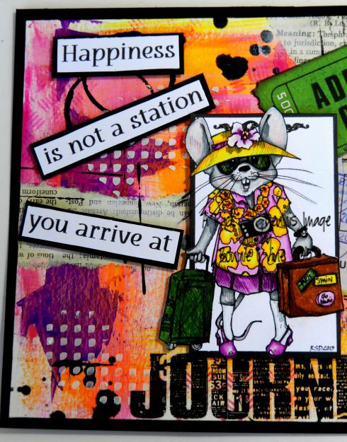

The background started with a 6 x 8 inch rectangle of mixed media paper. Bubblegum Pink, Lemon Zest, Squeezed orange, and Crushed Grape Dylusions paint was scraped onto the background using an old plastic gift card. Bits of torn book paper was applied with gel medium and then scuffed over with White Linen paint. Black stencilling, rings, and lines were added with Black Marble Dylusions paint...can you tell I was experimenting with these paints? They are a fairly recent purchase and I wanted to see what they did...love them! White embossing paste was scraped through Dina Wakley's Plastic Grid stencil to add texture and a bit of white relief to the colourful page.


Before August was added to the background, a ticket and a piece of travel ephemera were placed behind her. This pulls in the green from her suitcase, adds more weight to the image, and continues the travel theme. The word JOURNEY, which gives August a place to stand therefore grounding her, and the Post Card writing are TH rub-ons. The sentiment was computer generated, printed on white cardstock, and matted with black. Foam tape was added to the back of each segment. Black Big Brush pen was used to line the outside edges of the background before it was matted with black cardstock. A punched photo corner was added to the top right corner to balance out the page.

Thanks for joining August and me today.We love that! When you get a chance, pop over to the Sparkle and Glitter blog to what the rest of Team A have created for the Progressive Challenge with this adorable image.  Hey, did you know that Rick created a fabulous image for the Adult Colouring Worldwide Facebook page. Shhh! Don't tell anyone but there's an entire adult colouring book in the works as well. I can't wait!

Life is good; so is art.
Bonnie

Happy ~ The East Wind Freebie Challenge


Hi there! The East Wind Challenge blog runs its challenges on the first and fifteenth of every month. The challenge on the first has all of the DT members creating with the same image, the freebie which you get if you are a subscriber to Unky's newsletter. I love this challenge because it is so fun to see what everyone does with the same image. Our styles are all so different that I find it inspiring. The theme for this particular challenge is Summer Lovin' so we want to see summer activities, summer places, or summer romance in your projects. The name of the image we are using is called "Yes". She is so cute! I coloured her with a mix of Prismacolor and Polychromos pencils. She was then fussy cut leaving a narrow white border and then matted with black and trimmed out again. She was then popped up on foam tape to give a little dimension to the page.


The background began with a 6 x 8 inch rectangle of mixed media paper. I had another play with my Brusho Crystals, this time using three shades of green. These are so fun to play with. You just sprinkle the tiny crystals onto your background and then spritz with water. Often I tip the page to create runs but this time I allowed it to stay flat so the puddles stayed where they were. You still get some mixing as the puddles run into each other but the colours stay more true which gives a different look. I also wanted to leave a fair amount of white space. So fun!


Stencilling was added with Teal Zeal Memento ink through a TCW Bingo stencil. Black lines and rings were added with Black Marble Dylusions ink and a gift card (lines) or a bottle lid (rings). Using a smaller bottle lid, some of the green Brusho liquid was picked up from the page to create the smaller rings. White embossing paste was scraped through Dina Wakley's Plastic Canvas stencil with a palette knife for added dimension and texture. In order to add a little pink from her dress to the background, dandelion washi tape was torn and adhered in three places. A LOVE domed circle was placed on the bottom segment and a metal word was added to the top two. Black Big Brush pen outlined the edges of the page before it was adhered to the black matting.

Thanks so much for popping by today. I am always so happy when you do that. To see the rest of the DT projects using the "Yes" freebie image, be sure to stop over at The East Wind Challenge blog. We would love to have you join us for our Summer Lovin' challenge.

Life is good; so is art.
Bonnie

Thursday, July 23, 2015

Each Day is a Gift ~ Rick St. Dennis inspired art journal page


Hi everyone. I had a bit of a play the other day experimenting with both Brushos Crystals and Dylusions paints and created a bunch of backgrounds. Totally mindless and completely for fun. I decided that one of the Brusho backgrounds would be awesome to star Rick St. Dennis' image called You're a Gift.


I coloured her with a mix of Prismacolor and Polychromos pencils keeping the colours in the same palette as the Brusho Crystal background. She was then fussy cut leaving a narrow white border and matted with black cardstock. This was trimmed out again and foam tape was applied to the back.


The background started as a 6 x 8 inch rectangle of mixed media paper. Ultramarine and Lime Green Brusho crystals were sprinkled onto the paper and then water was spritzed over that. The results are so cool and unpredictable. The page was tipped to create lovely drips and the TH Spritzer tool was used to create the tiny drips off of the main ones. Once completely dry, white embossing paste was scraped through TCW's Tiny Circles stencil with a palette knife. Jet Black Archival ink was used to stamp Hero Arts Painted Circle in several places. White Dylusions paint was added to a bottle lid and used to stamp the smaller circles.


To give this sweet woman a place to stand, two colours of washi tape were cut into flags and overlapped under her feet. The computer generated sentiment was printed on white paper. The word Unopened was matted with green spritzed cardstock and then all tthe segments were matted with black. They were then popped up on foam tape. A SSS star die was used to cut out a green and a black sketchy star, both of which were layered and offset. White pen was used to accent the star on the background. To finish off the page, a black border was doodled around the edges, black Big Brush pen was brushed against the white edge, and a black mat was added to the background.

Thanks for stopping by today. That in itself is a gift! To see more of Rick's fabulous images, check out his Zibbet shop. To be inspired by other fabulous creations, pop by Rick's Fans & Friends page on Facebook. And remember the Part One of the Progressive Challenge is ongoing until the end of this month so you still have time to play along and earn yourself the free image for Part Two next month.

Life is good; so is art.
Bonnie

Tuesday, July 21, 2015

Rapunzel ~ New Facebook Contest theme at The East Wind


Hi everyone. On the 21st of each month, we begin a new Facebook contest on The East Wind Facebook group. The theme for this contest is Once Upon a Time so we want to see you use an East Wind image starring in a project with a Fairy Tale or Story Book theme. While there are some images in the shop which are clearly fairy tale or storybook related (Alice in Wonderland for example), there are tons of other images which could be used to depict a fairy tale/story book character. I decided to go that route.


 Thinking that with her long braid she made a wonderful Rapunzel, I coloured Aurora Daisy Kiss with Prismacolor and Polychromos pencils. The dots in the flower centers were created with Buttercup Liquid Pearls...gorgeous little spots of pearlescent colour. I extended the circle shape from the bottom of the image because I wanted to create the illusion of Rapunzel standing in a window in the tower. Then I coloured in the background within the circle with black Pitt pen. When I cut her out, I had the window disappear behind her head at the top.Her braid also appears to be this side of the window.


The background of the tower began as a 6 x 8 inch rectangle of gray cardstock. Using a TCW Mini bricks stencil, white embossing paste was loosely mixed with both Nougat and Mocha Fresco Finish paints and scraped through the bricks. By not mixing the colours thoroughly, I got the variation in colour that made the bricks more realistic looking.


Once that was dry, two shades of green vines die cut  with Cheery Lynn Fanciful Flourish were adhered to the brick. Three pink mulberry flowers were scattered on the vines. The sentiment was computer generated onto cream cardstock and die cut with an MFT die. Faux stitching and a black mat were added to the sentiment before it was popped up on foam like Rapunzel. A die cut black border was added to the bottom edge before a black mat was used to frame the entire piece.

Thanks for joining Rapunzel and me today. She's so happy she'll even let you use the stairs rather than having to climb her hair to visit. Be sure to pop by The East Wind Facebook page to check out the other DT projects created for this contest. We would love to have you join us and play along. I can't wait to see where your imagination takes you!

Life is good; so is art.
Bonnie


Monday, July 20, 2015

One Sweet Challenge July Reminder Post


Hi all. For the month of July the theme at One Sweet Challenge is Christmas in July. Today's project is another Christmas card which is a bonus since I always start to make them later than I intend. At least I will have two finished...LOL. I chose to feature Molly Harrison's Yule Fairy available at Sweet Pea Stamps. I loved colouring the wonderful folds in her dress skirt. Yum!


I coloured Yule Fairy with Prismacolor and Polychromos pencils adding gold metallic pen to her dress trim. Diamond Stickles were applied to her wings to create magical sparkle. I also painted the two ornaments with mica watercolour paint, again to add shine and elegance to the project. Colour was added to the outside edges of the image by applying Tumbled Glass Distress ink.


The background of the card was kept simple so that the beautiful image could take center stage. A dark blue textured rectangle was adhered to a white card base. The image was matted with a metallic layer of copper metallic cardstock, repeating the colour of one of the ornaments. A photo corner was punched from the dark blue cardstock and placed in the upper right corner to balance out the two sparkly ornament stickers placed in the lower left corner. A third sticker from the same collection was used to overlap one of the image ornaments, tying the background to the image and completing the card.

Thanks for joining Yule Fairy and me today. We are always delighted to have you stop by. To see the other fabulous creations by my talented teamies, pop over to the One Sweet Challenge blog. We would love to have you join our Christmas in July challenge which runs to the end of the month. Trust me...it's never too early to start your Christmas cards.

Life is good; so is art.
Bonnie

Saturday, July 18, 2015

Sweet Pea Stamps & Passionate Paper Creations


Hi there. Sweet Pea Stamps is sponsoring an event on Facebook July 17th and 18th at Passionate Paper Creations and to celebrate Lynette at SPS is offering two digis at a special price. This adorable angel is one of them. She is Karen Middleton's Blue Star Angel and she is actually the first image where I have attempted darker skin tones and very curly hair. There are lots of tutorials about which colours to use when colouring with Copics but very few (almost none!) for darker skin tones with Prismacolor pencils. Because of that, I always avoided them but it was on my "I wanna learn that" list so I gave it a go.


Once coloured, I added Stickles to her wings and fussy cut her without leaving my usual white border or matting her in black. I know...you are shocked :) I did run a black Big Brush pen around the edges to get rid of the white and frame her up a little. In order to give her someplace to stand and create the suggestion of a sky, three clouds were die cut from text paper, scuffed with the same paint colours, and edged with Vintage Photo Distress ink along the bottom edge. Once adhered to the background, they were outlined with black pen.


The background started with a 6 x 8 inch rectangle of caramel coloured cardstock. Using a brush mix of Snowflake, Nougat, and Haystack Fresco Finish paints, I stencilled the background stars Through TCW's Random Stars template leaving the last few inches on the right side blank. On that side, I sprayed Lindy's Yellow Rose of Texas spray through the same stencil so I would have just a ghost of glittery stars. That side was then patterned with a MS scattered stars punch. The black mat under the page shows through the star openings.


A Latin text stamp was applied to the left side of the background using Tree Branch Archival ink. Jet Black Archival ink was pounced through TCW's Tiny Circles stencil using a dauber. To bring a little more black to the left side and balance out the other edge, a piece of black punched scallop border was added. Black gesso was watered down slightly and added to both sides with an old gift card. A strip of black cardstock and a length of crocheted trim were layered to bridge the two sections of the background. The computer generated sentiment was edged with Vintage Photo Distress ink and matted in black before being popped up on foam tape. To complete the page, a border was doodled around the edge, stars punched from stencilled cardstock were applied and outlined, and the black mat was adhered to the back.

Thanks for joining me today. I appreciate you taking the time to stop by. Be sure to pop over to Passionate Paper Creations to join in the fun there. Who knows...there may be a contest or two and PRIZES! Wink...wink! See you there!

Life is good; so is art.
Bonnie


Friday, July 17, 2015

New release at The East Wind today


Hi everyone. There is a new release at The East Wind shop today and I love her! Her name is Aurora Scarf Lover and she is gorgeous. I love just focusing on a head shot, especially one this beautiful. I coloured her with Prismacolor and Polychromos pencils before cutting her out leaving a narrow white border. She was then matted with black cardstock and trimmed her out again before popping her up on foam tape.


The background began with a 6 x 8 inch rectangle of purple cardstock over which I layered a triangle of turquoise cardstock so that it covered half.. Once these two were glued together, Teal Zeal ink was used to stamp the painted circle design in random spots. Jet Black Archival ink was applied to the background using a Joggles background stamp. White embossing paste was scraped through TCW's Tiny Circles stencil and allowed to dry thoroughly.

Old text paper from an encyclopedia was torn and adhered behind the bottom portion of Aurora to ground her. Two circles were punched from the same paper and added to the top right corner. Three sizes of pink hearts were die cut from patterned cardstock and shaded on one side with Middle Purple Pink Big Brush pen. A white arrow sticker was coloured black with a Big Brush pen, given white paint pen dots, and then adhered beside Aurora pointing to the key word in the title.


The lettering was added with stickers but white gesso was spread in a swath where the word Unstoppable would be placed to emphasize it. White dots were added with a Signo pen. A doodled border around the word further drew attention to it. A simple border was added to the entire piece and more outlining was done around the hearts and where the colours meet on the diagonal.To complete the spread, Neocolor II crayons were added around the edges to deepen them and then activated with water. A black mat was used to frame the entire page.

Thanks for joining Aurora and me today. We appreciate that! To see other projects created by the DT and featuring this sweet image, pop over to The East Wind Facebook group where they will be posted throughout the day. We would love to see what you do with her as well.

Life is good; so is art.
Bonnie