Friday, April 06, 2018

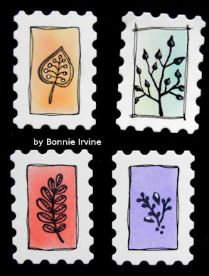
Little Postage Stamp Embellies for tags, envelopes, whatever!


Hi everyone! I've been working tiny again...sometimes that's just the thing that calls to me. The other day, I was pawing through my dies looking for a particular one when I came across an old Spellbinders  set I'd forgotten I had. It's old and has been neglected for a while but is ideal for making junk journal embellies. One of the dies is a 1 1/8 x 1 5/8 inch postage stamp with an opening in the center. I have all kinds of white cardstock scraps and this seemed a wonderful way to use some of them up...because you know I can't just throw them away :)


I ran the stamp die and the white scrap through my die cutting machine but when I was finished, I left the cut out stamp in the die until I had inked the open center using pairs of Distress Oxide Inks. This created a wonderful crisp rectangle evenly spaced from all edges. I experimented with different combinations, inking the center of each before removing the metal die and moving on to the next one.


Using Jet Black Archival Ink, I stamped various smaller size stamps onto the rectangle using washi tape to mask off the white stamp edges where necessary. I was surprised at the number of tiny stamps I have...ones I never used before because I usually work larger that this.


I went back with a fine black Pitt pen to loosely outline the coloured rectangle, thereby framing the stamping. I also added stems, leaves, flight lines, and ground to finish the designs. White Sharpie Paint Pen was used to add highlights and extra detail.


I haven't inked the edges yet with Coffee Archival Ink, which I use instead of Vintage Photo Distress Ink because the archival ink is permanent and I never know what mixed media liquids I might throw at things. I left them white because I like that look and can change it depending on the background I'll be adding these to. They were super quick and easy to do and I love the little pop of colour they add.


Here I just set one on a kraft envelope to see what it would look like...


... and here I set it on a die cut 1.25 x 2.25 kraft tag. I can see using them on larger tags as part of a cluster or on a card as a little embellie. I made a huge pile of them...they are like potato chips (fewer calories). Betcha can't have just one...LOL.

Thanks for visiting today. I have no idea if this stamp die is still available but I did see some nesting ones that would give you the same outcome in various sizes. If you try them out, I'd love to see what you create.

Life is good; so is art.
Bonnie

Thursday, April 05, 2018

Teeny Little Envelopes for Junk Journals - Inspired by Jen Miller


Hi everyone. I was drooling over all of the wonderful details of a mini junk journal I purchased from one of my favourite YouTube artists, Jen Miller, when I came upon one of her teeny tiny envelopes. As well as creating her own envelopes out of book paper among other things, Jen sews the edges and then inserts little folded papers for "all your journalling needs" as she puts it (and makes me laugh every time). I decided to take a page (or an envelope) out of her book so to speak, and create my own teeny little  (1.25 x .75 inch) envelopes...minus the sewing because I don't think I have the patience for that :) Jen is amazing!


I downloaded several free templates from the internet and chose the shape I liked the best, mounting it to cardstock so it would stand up to repetitive use. I then traced the shape onto various coffee dyed paper scraps including book text, vintage music,  kraft and graph paper. All of the outside edges as well as the inside edges of the flaps were edged with Coffee Archival Ink and a tiny red heart was drawn on the point of the flap using a fine Sharpie. The flaps were folded using a ruler and a bone folder to help coax the paper into shape without tearing the vintage paper especially. The bottom flap was then adhered to the side flaps where they overlapped.


The fronts of the envelopes were decorated with the tiniest scraps of designer or vintage paper, tiny punched flowers, and little crocheted doilies created by my 85+ year old neighbour. Buttons, pearls, and butterflies punched from corrugated coffee sleeves were also layered up. Tim Holtz Remnant Rubs made their way onto several envelopes as did some faux stitching. Really I used whatever was on my desk or in the cup where I throw bits and bobs left over from previous projects. It's a great way to use them up and just play.


The back of the envelopes open so I was able to place a little something inside each one, again drawing from the little pile of scraps on my desk, and inking the papers with Coffee Archival Ink.


The photos above and below show the papers used in a few of these envies. Stamping was done with the same Coffee Archival Ink and the backs were left without decoration.


These teeny envelopes look wonderful tucked into little pockets, mini journals, or just as an embellishment on a cluster or tag. I loved making each one and I know that I will be adding to my pile of them again soon. Special thanks to Jen Miller for the inspiration both in her awesome YT videos and in the little journal I was lucky enough to purchase from her Etsy shop. Major score that day...her art is very popular and sells so quickly...and rightly so! I will have the little book and tin worn out in no time because I keep studying it :)

Life is good; so is art.
Bonnie

Monday, April 02, 2018

Joggles Art Journal Adventure - Week 14 - the letter T


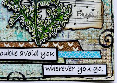
Hi everyone! I hope that all who celebrate Easter had a good one yesterday. It's Week 14 at the Joggles Art Journal Adventure and it's my turn to choose the prompt. This week, the theme is the letter T which is easy-peasy...just what my wee brain needed after a busy week :) I am so anxious to get back into my flower gardens...would you believe we had snow yesterday?!! One of the plants which I love is the ginormous thistle that I planted a couple of years ago. It's so dramatic, tall, and spiky and that flower is an amazing colour palette. So in honour of spring which has definitely not sprung here yet, my T is for Thistle.


To begin the 6 x 6 watercolour paper background for this page, Lindy's Sassy Sapphire Starburst Spray and Van Dyke Sepia Moon Shadow Mist were spritzed onto the paper with a little water to help it move and blend a bit more. Once that was dry, Coffee and Forget Me Not Archival Inks were applied to Impression-Obsession Screen Background and stamped onto the spritzed paper. Deep Purple Archival Ink was used to stamp Finnabair lines stamp and pull some of the purple from the flower head into the background. It was way too strong and was later knocked back with white gesso dry-brushing to help it recede into the background a little more. Ranger Texture Paste was scraped through one of the Joggles Punchinella Quintet stencil designs. It was scuffed with Forget Me Not Archival Ink and then white gesso once the dots dried. Two torn pieces of vintage music paper edged with Coffee Archival Ink were layered behind where the image would be placed to help it stand out against the busy background.


The focal image is a Technique Tuesday stamp called Thistle Thanks which was stamped onto white cardstock with Jet Black Archival Ink. The image was coloured with a mix of Polychromos and Prismacolor pencils as well as some gel pens and white paint pen in the flower head. The image was then fussy cut leaving a narrow white border, adhered to black cardstock, and fussy cut leaving a narrow black border. Foam tape was used to adhered it to the background and add dimension.


To ground the image, three different washi tapes were layered onto black cardstock and fussy cut to form a base. This was then adhered below the thistle. Jet Black Archival Ink was used to apply black splatter dots using a Paper Artsy Splotches Mini stamp as well as adding one of the Laurel Burch designs from the Icon stamp set (spiral). A black border was doodled around the outside of the page before Forget Me Not Archival Ink and Black Big Brush pen were used to edge the page.


The sentiment was printed onto white cardstock and cut apart into segments which were then matted with black cardstock. Foam tape was used to pop the segments up and add a natural shadow. Three medium size black enamel dots were added to the top right corner to finish the page and add a little shine.

Thanks for stopping by today to check out my T art journal page. I always appreciate you taking the time to do that. If you are interested in playing along with our weekly Joggles Art Journal Adventure or even if you are just looking for inspiration and a wonderful community, be sure to join the Joggles AJA Facebook group where we share our responses to the prompts, ideas, techniques, and discoveries we make. It's a great place to hang out :)

Life is good; so is art.
Bonnie


Monday, March 26, 2018

Joggles Art Journal Adventure - Week 13 - the Letter N & optional twist


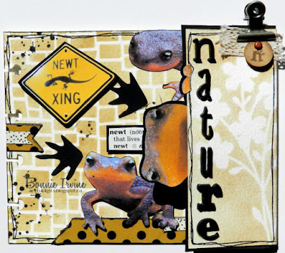
Hi everyone. It's Week 13 over at the 2018 Joggles Art Journal Adventure Facebook group and it's Barb's turn to choose the weekly prompt. She has chosen the Letter N with an optional twist of including an animal or part of one. I decided that my N would stand for Newt and Nature because newts make me smile like most lizards do. The next page in my disc bound journal is a bit of an odd size. It's actually 4.5 x 8 inches but I had folded a flap at the 2 inch mark which presented its own challenge.


I began by stencilling the 4.5 x 6 inch section using Vintage Photo and Gathered Twigs Distress Oxides and Stamperia Wall Effect stencil. Three newt images were fussy cut, two for the main page and one to peek over the flap. They were all inked with black Big Brush Pen to get rid of the white edge around them and the one full image was popped up with foam tape to add dimension. Before he was adhered, two lengths of washi tape were applied to white cardstock, edged with black, and adhered to ground him. Once the other partial newt was adhered flat to the top of the page, two other groupings of the same washi tape were added to create a visual triangle. A newt crossing sign was matted with black and popped up on foam tape as well as three newt footprints which were fussy cut from black cardstock. The definition for newt was cut from a children's dictionary, matted with black, and popped up on foam tape. A Paper Artsy Splotches stamp was applied in places with Jet Black Archival Ink to tie the design together.


The third little newt face was adhered to the backside of the flap. The inside was then covered in black cardtsock and fussy cut around the newt to frame him and add strength as well as tying in the black footprints, stamping, and washi dots. A lizard stamp was applied to the black cardstock using  Versamark Ink and then white embossing powder was sprinkled over that and heat set. Or so I thought! It turns out that the bottom one wasn't completely melted so part of him rubbed off. I can live with that :)


To colourize the front of the flap, a wildflower die cut was layered over the white watercolour paper and Vintage Photo Distress Oxide applied over that. Once the die cut was removed, the negative image of the die cut showed white next to the Vintage Photo. The word nature was created with Idea-ology Ransom Letters and a black doodled border was added to both the flap and the main page uniting them through colour and repetition.


Because I wanted a clip to keep the flap closed, I added a scrap of lace and a tiny tag stamped with the letter N. A tiny brad holds the two together.

Thanks for joining all of the newts and me today. We love that you did. Be sure to check out the other wonderful responses to this prompt as they are added to the Joggles AJA Facebook group throughout the next few weeks. All you have to do is ask to join if you haven't already. Hope to see you there!

Life is good; so is art.
Bonnie

Thursday, March 22, 2018

Joggles Art Journal Adventure ~ Week 11 (the number 3)


Hi everyone. I'm back today with a catch-up project for Week 11 of the 2018 Joggles Art Journal Adventure which I was unable to complete the week it was assigned. It was Barb's turn to choose the prompt and she picked the number 3 with the optional twist of including 3 words that go together. I decided to go with an Alice in Wonderland theme with my 3 words being Curiouser and Curiouser.


I was working on the back of the kraft coloured page I created last week but wanted more inky goodness and colour in the background because my talking flowers were going to be bright. I decided to cut a background I had already made into a 5.25 x 5.5 inch rectangle to layer over the kraft. The background colour was done with Distress Oxides and the wrinkle free technique where you smush ink onto the craft sheet, spritz with water, and dip to your heart's content. I am guessing that the inks I used were Peacock Feathers and Salty Ocean although I can't swear to that. I inked the edges of the page with Garden Patina and Manganese Blue Archival Inks and then applied Black Big Brush Pen along the very edge to frame it. Manganese Blue Archival Ink was also used to apply Joggles Nonsense Latin Text stamp here and there. One of the circle designs from Stampotique Originals Kate's Doodle Cube was applied to the background with Jet Black Archival Ink.


Alice was fussy cut from Joggles Alice in Wonderland 1 Collage sheet. She was then matted with black cardstock and fussy cut again. Foam tape was added to the back of the image to pop her up. Before she was adhered to the background, she needed something to stand on to ground her. A scrap of green spritzed paper (probably Lindy's Starburst) was pulled from my scrap folder and glued across the bottom of the page. It already had the curved shape so all I did was ink all 4 sides of it with Viridian Green Archival Ink and glue it to the bottom of the page. I added one of those circles to this layer to help embed it into the background.


The flowers were an opportunity to use the sweet little Peachy Keen Cartoon Bombshell Face stamps in the .5 inch size. I love their expressions, especially the crabby blue one. They were stamped onto yellow sprayed scraps using Jet Black Archival ink and then cut with a .75 circle punch. The edges were inked with Brilliance Rocket Red Gold ink and then details were coloured in with Prismacolor pencils. Joggles Scribble Flower #2 was stamped onto blue or pink spritzed paper scraps using Jet Black Archival. Coloured pencil was used to add shading and highlighting before white paint pen was added to each petal. The faces were glued onto the flower centers and foam tape was used to pop the flowers up. Stems and leaves were free hand cut from a green spritzed mop-up scrap. Once the stems and leaves were glued to the background, black pen was used to outline them as well as the ground line and a simple border. The sentiment, printed onto white cardstock, was cut into individual words which were then matted with black and popped up with foam tape. The background was also matted with black before it was adhered to the kraft background.

I had a great time creating this page...any time spent with Alice is time well spent and those flower faces make me smile...love that stamp set. Thanks for visiting today. Hope you're having a good one! If you haven't already joined the Joggles Art Journal Adventure Facebook group, we would love to see you there.

Life is good; so is art.
Bonnie

Monday, March 19, 2018

Joggles Art Journal Adventure - Week 12 Prompt (Definition)


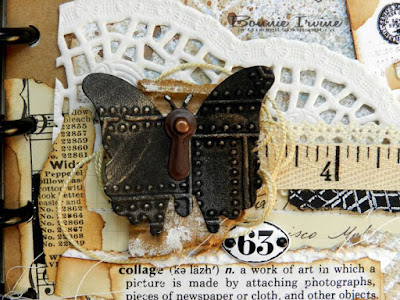
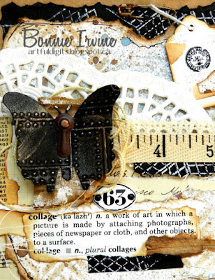
Hi everyone! I've been MIA for a while as I had some surgery almost 2 weeks ago and it kicked my butt. This is the first I have felt like creating...was a little worried that the surgeon removed my mojo along with other things but apparently not :) Phew! It's my turn to choose the prompt for Joggles Art Journal Adventure Week 12 and the prompt that I have chosen is to include a word and its dictionary definition as part of your page. I chose the word Collage cutting the appropriate section out of an old dictionary I use for that purpose. Of course, I also built a collage as an example of the definition and had a blast using bits and pieces from my desk top.


The substrate is a 6 x 5.5 inch piece of heavy kraft paper which I punched to fit in my disc bound journal. I also used a torn section from some paper I coloured when I was playing the other day. I was curious to see what would happen if I used the wrinkle free technique with spray inks. I spritzed my craft sheet with Van Dyke Sepia and Buccaneer Bay Blue Lindy's Moon Shadow Mist, Ocean Heidi Swapp Color Shine, and a little water. I then dipped white cardstock into the puddles, repeating until I liked what I had. Oh my word, what an awesome combination...I got a bunch of sheets to use for future projects and each one is unique. One of these sheets was torn to fit inside the kraft base, leaving room on all 4 sides. I dry fit it onto the page and adhered a scrap of music paper, of French dictionary paper, and two scraps of gel printed black cardstock around the edges of the page to serve as a kinda-sorta frame.


The torn inky paper was edged with Coffee Archival Ink and then stencilled using the same ink through MFT Diagonal Bars Mix-Able Stencil. Joggles/Margaret Applin Designs Vintage Correspondence Stamp was applied imperfectly to various places on the background using French Ultramarine Archival Ink. before adhering the background to the kraft paper, I layered some vintage ledger paper over a part of a doily and stitched through the three layers with my sewing machine. You can barely see the stitching because I covered it but it's visible IRL and it left some lovely long thread trails on both sides of the page. I had a scrap of vintage catalogue which I inked with Coffee Archival and adhered to the left side of that horizontal element.


For the focal of the page, an embossed and waxed piece of black cardstock was cut with a butterfly die. A brown photo turn and brad were used to embellish the body. It was glued only in the center to a torn scrap of corrugated cardboard which had gesso applied as a highlight. A length of fine silky cord was wound into a messy circle and adhered to the back of the cardboard/butterfly combo to create more texture and another layer. A scrap of cotton lace, and another of measuring tape twill ribbon were layered up with a scrap of the gel printed black cardstock sandwiched between. I wanted to bring the black and white through the page to tie the top and bottom together. Then the whole cluster was adhered above the ledger paper and the butterfly element was glued on top of that. The dictionary word and definition was added below the butterfly after being stacked onto inked vintage book paper, a teeny scrap of corrugated cardboard, and one of the black remnants. I love how these bits unified the page. An enamel Idea-ology plaque was adhered between the butterfly and the definition to bridge the gap between the two and add a little shine.


A very sketchy border was added to the original sprayed background using black pen. To add more interest an balance to the top right corner, a 1 x 1,75 inch tag was layered with stamping, paper scraps, and a TH rub-on before being inked around the edges. It was then attached to the page with a rusted safety pin and popped up on foam tape to keep it in place. To finish the page, the edges were inked with Coffee Archival. I love this collage page with all of its layers, texture, and chances to discover little details. I had so much fun with it.

Thanks for popping by today. I appreciate that so much. I hope you will join us on the Joggles Art Journal Adventure Facebook group if you haven't already. We have a weekly prompt but absolutely no pressure to complete each one. We just throw the ideas out there and then sit back and watch the magic of creativity as people join in while they can. It's a wonderful group...both talented and friendly.

Life is good; so is art.
Bonnie

Monday, March 05, 2018

Joggles Art Journal Adventure ~ Week 10 prompt~ the letter S


Hi everyone! It's Week 10 in the Joggles Art Journal Adventure and it's my turn to choose the prompt. This week, I have chosen the letter S. There are so many ideas for this one: stencils, stamps, sprays, not to mention all those techniques and items that start with S. Or maybe you'd prefer an idea like Simple, Special, or Stupendous...LOL. The Sky is the limit (see what I did there?). I chose sunshine because lately that has been in short supply with lots of rain and snow. I decided that if I can't feel the sunshine on my face, I can simply provide my own to lift my mood.


The background for this page is a 6 x 6 inch watercolour page in my disc bound journal. I smushed two colours of blue Distress Oxides (broken China & Salty Ocean) onto my craft sheet and spritzed with water. Then I began picking up the layers of blue, drying in between each dip into the inky puddles. I kept building up layers until I was happy with the depth of colour and the pattern of splotches. For my last layer, I spritzed the ink already there with Heidi Swapp Ocean Color Shine just to add a different tone and opacity to the mix. Once the background was dry, Manganese Blue Archival Ink was applied to Paper Artsy Splotches Mini Stamp in several places to create a dotty textured effect.


Ranger Texture Paste was scraped through TH Rays Layering Stencil to create the sun's rays in the direction she would be facing. Once dry, two colours of yellow acrylic paint were applied to the raised areas using a brush. Once that was dry, Iris Blue Inktense Pencil was applied with a waterbrush to the bottom of each ray to create a shadow and add dimension. Icicle Stickles was added to the top of each ray with my finger and then patted between the rays with a heavier concentration near where the image would be placed.


To create the background for the stamped Laurel Burch Sister Sun image, Yellow Rose of Texas Lindy's Starburst Spray was spritzed over mixed media paper. Stamperia Wall Effect stencil was placed over that and Marigold Yellow Orange was spritzed through the openings to create a shimmery lightly patterned background. Once it was dried thoroughly, Jet Black Archival Ink was used to stamp the sun image on the stencilled and sprayed background. Additional shading and highlighting was done using Prismacolor and Polychromos pencils. Sister Sun was then fussy cut, matted with black, and fussy cut again. Foam tape was used to pop her up, adding dimension and a natural shadow.


The sentiment was printed onto white cardstock and cut into individual words. These were matted with black and popped up on foam tape before being adhered between the rays. Black Big Brush Pen was used to edge the page and create a frame for the page. A simple line border was added to further emphasize the frame idea.

Thanks for joining Sister Sun and me today. We are delighted that you did. With so many possible ideas for S pages, I am excited to see what our wonderful Art Journal Adventure Facebook community create. The shared pages are sure to be diverse, inspirational, and creative...they always are!

Life is good; so is art.
Bonnie