Thursday, January 31, 2013

Assume I'm right


A great big happy hello to you today. I am absolutely thrilled to let you in on some fabulous news I've been sitting on for a little while. Kim at Eclectic Paperie has invited me to join her amazingly talented design team (Thank you, Kim.). I can hardly believe it. I feel both blessed and humbled as this is a group of people for whom I have great respect and admiration and from whom I have learned so much in my pursuit of altered art and mixed media. I am so excited I can hardly sit still to write this.


Today I celebrated by creating an art journal using a bunch of products available at eP which I will list and link at the end. Art journalling is one of my favourite ways to create because it is pure play. Sometimes I experiment with a bunch of techniques and products, covering the gessoed page and then move on to other things. That was the case with this double page spread. I had applied paint to the page using blue green and aquamarine with some white thrown in for good measure. I painted and sponged and used my fingers but it wasn't speaking to me so I left it. Today, when leafing through the journal to find two clean pages, it caught my attention and I decided to go with it.


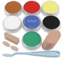
Using the 6x12" Dylusions Diamond of a Border stencil, Paynes Grey and Turquoise shade Pan Pastel were added  over the stencil in random places and then to the edges of the pages. Neutral Grey Tint Pan Pastel was randomly applied to lighten some areas. Fixative spray was misted over the Pan Pastel before white gesso was sponged with Cut n Dry foam over the 5x8" Dylusions chequered dots stencil and then watered down to allow various size plastic caps to be dipped in and printed onto the background. The same was done with Dylusions Vibrant Turquoise ink spray. An old gift card was used with the two colours to create lines on the page. More of the turquoise Dylusions ink was sponged around the edges using a piece of Cut n Dry foam.


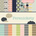
Once dry, the zigzag stamp from Dylusions Inbetweenies set was stamped around the edges using Ranger Archival Black ink. Charcoal pencil blended with a paper stump as well as black doodling with a Micron pen helped emphasize some of the pattern and texture. Drywall tape was roughly cut and applied on both pages. Paper from Lily Bee Design's Persnickety 6x6 pad was torn or punched and edged with ink before being adhered to the right page. A scrap of kraft paper left over from die cutting for a previous project was adhered to form a platform for Corrin. Because it was on one page, another scrap was adhered to the other page for continuity.


Curious Corrin, a Dylusions stamp, was coloured with Prismacolor pencils, adhered to the left page and given a crown charm. The sentiment which suits the look on her face (and me!) is from Wendy Vecchi's Tales of Art set. It was stamped in Black Archival, cut out, and mounted on washi tape. More bits of washi tape were added to both pages along with a black die cut arrow. White dots were added around the page to play up the zigzg stamping. The finishing touch is a Maya Road Mini Canvas butterfly which was sprayed yellow using Dylusions Lemon Zest spray ink. I needed a little bright yellow on that page to tie in with Corrin's dress and these butterflies take the ink so well.


I had an absolute blast completing this art journal spread and playing with some of my new goodies from Eclectic Paperie. To check out the products, click on the pictures below and you will go directly to the eP store. Thanks so much for visiting today and for reading this very long post. There's always so much going on when I get to play with my art journal. :)

Life is good; so is art.
Bonnie


Wednesday, January 30, 2013

SNP Butterfly Thanks


Happy Wednesday! It's time for another card  featuring a Stamp N Plus Scrap N stamp. I chose to create with this sweet Stencil Butterfly stamp. White cardstock was cut into 1 1/4" x 2" squares and the butterfly was stamped three times using Memento Tuxedo Black ink. Prismacolor pencils were used to colour the stamps. Once the three images were coloured, Vintage Photo Distress Ink was applied to the edges, both to darken the outside frames and to add a more hand made feel to the card.


The background was created from K & Company Wild Raspberry paper (oldie but goodie) which was inked around the outside with Red Lipstick Distress ink. A rectangle of a slightly darker textured cardstock was cut to hold the three images. Using an MFT die, a border of the same cardstock and an extra one of white were cut and adhered to the edge of the rectangle. Faux stitching was added to the outside edges of the rectangle and two metal shapes were adhered between the images. The letters are scrapbooking stickers and the photo corner was cut by hand from scraps of cardstock. A smaller version of the metal embellies was added to the top corner for continuity and repetition. It also helps create that visual triangle that helps the eye move around the card.

Just a little reminder of the spring that we so look forward to while caught in the throes of winter :) Thanks for dropping by today. Your visits make my day.

Life is good; so is art.


Bonnie

Monday, January 28, 2013

Craft Your Passion Challenge 147 ~ Seafoam the Mermaid


As Monday rolls around, so does another challenge at Craft Your Passion Challenges. The theme this week is to follow a five colour combo of  cheerful bright colours. Yummy!


For this challenge I chose to play with Seafoam the Mermaid from our fabulous sponsor, MayzyArt. Have you checked out her digi stamps? They are so cool and fun to colour. You know how I love to colour long flowing hair...well, she does it up amazingly. I coloured Seafoam with my Prismacolor pencils and then fussy cut her. She has rhinestones on her headband and one of her belts. Pearls on her other belt and Liquid Pearls on her eyes and headband. Seafoam loves to collect jewels and treasure, especially shiny things like the watch on her tail. She was mounted on a black die cut made with Labels 25 and matted in purple. Foam dots were mounted to the back of the label for dimension.


The background paper is from an Amy Tangerine stack and contained four of the five colours. A black band was added across the (almost) middle of the card and big white rick rack was layered over that. Blue buttons threaded either with ribbon or white thread were adhered to the right side of the band. Faux stitching was also doodled to continue the patterns found on the paper. The white scalloped and doodled borders above and below the band were added to give the eye a bit of a rest from all of the colour. Doodling on those pieces was done with a Micron pen


To complete the card, a faux stitched photo corner was punched and added to the top left corner to balance the computer generated sentiment in the bottom right corner. A little doodling, black matting, and foam dots were used on the punched circle. Thanks for dropping by to visit with Seafoam and me. Be sure to stop by the Craft Your Passion Challenges blog to see how the rest of the DT interpreted this  five colour palette. Hope you'll join us...I love to see what you create each week.

I am entering this card in the following challenges:
Eureka Stamps ~ #24 Use Teal or Turquoise
House of Gilli ~ #49 Anything Goes with Pink and Bling
One Stitch at a Time ~ #148 Use a Digi

Life is good; so is art.
Bonnie

Friday, January 25, 2013

FPWA ~ Love


We have a new challenge on the Fat Pages With Attitude challenge blog this fortnight. The theme is Love. For this card, I chose to work with the Girlz Bare Feet image from Bugaboo Digi Stamps. I love the sketchiness of this image and how much of a "Flower Child" she is. She was coloured with Prismacolor pencils and a little Stardust gel pen was added to her dress hem, sleeve hems, and around the neck for a bit of sparkle. She was cut out using Spellbinders Labels 25.


To make the frame, the same nestie die was traced on the inside and outside edge onto a piece of K & Company Wild Raspberry designer paper and then cut out with a craft knife. This frame was inked on all edges with Vintage Photo Distress ink and popped up on narrow pieces of foam tape. A short length of seam binding was tied to the right side of the frame.


The bottom layer of the background is yellow textured cardstock, inked on the edges with Vintage Photo and faux stitched. Over that is another rectangle from the same paper pad. The image was glued to the background with the frame on top. Two small heart buttons were added to the image to continue the love theme. A chipboard heart was covered with a scrap of the frame paper, inked around the edges, and doodled around. A small piece of Glimmer Misted cheesecloth was adhered onto the heart and a Love word transparency from my stash was backed with white cardstock and adhered over the cheesecloth. The heart was added with foam tape on the left side and Scor tape in the middle.

Thanks for visiting today. Be sure to hop over to the Fat Pages With Attitude blog to see the projects from the rest of the DT. There's lots of inspiration to get your mojo going. We'd love to have you play along.

I am entering this card in the following challenges:
Avarades Challenge Blog ~ #7 Valentine's Day or Love
Card Crafter's Circle ~ #59 Green & yellow
Delicious Doodles ~ #20 All You Need Is Love

Life is good; so is art.
Bonnie

Wednesday, January 23, 2013

SNP Happy Freezin' Season


 My Stamp N Plus Scrap N card this week is a tribute to that Freezin' Season that we know so well right now. I decided to go bright and cheerful with my colour scheme for these fun cats from the Patti's Kids line. I only used three of the set of five, colouring them with Prisma pencils and then cutting them out with a 2" circle punch before matting them with dark blue cardstock. The center image was mounted with foam dots.


The background paper and sentiment came from the DCWV Christmas Combo stack. I swear I will never even make a dent in that stack. The blue accent scallops were cut with an MFT die and green circles were punched to fit inside three of them. Confetti snowflakes plus two snowflake buttons continued the winter theme.With the bright colours and busy patterns,  embellies were kept to a minimum for this fun card

I am entering this card in the following challenges:
Tuesday Throwdown ~ #131 Furry Friends
GingerloftChallenge ~ GL55 Let It Snow

Thanks for checking it out. Stay warm!

Life is good; so is art.
Bonnie

Monday, January 21, 2013

CYP Challenge 146 ~ Totally Teal

Monday, Monday...bah dah bah dah dah dah...New Challenge Day...bah dah bah dah dah dah.
I am singing to you. Hands up if you would like me to stop...LOL


It is Monday and Craft Your Passion is hosting a brand new challenge called Totally Teal. That means that the colour teal has to be the main colour on your project. Luckily for me, teal is one of my favourite colours so I had lots in my stash that I could pull from. I chose to work with this gorgeous image from Saturated Canary called Butterfly Princess. Not only was her hair fun to colour but all of the folds in her gown were so cool...not to mention her sweet face. I used Prismacolor pencils to bring her to life and then cut her out with a Spellbinders Curved Rectangle die. The image was matted with a piece of Amy Tangerine paper. When I want a narrow mat and don't want to wing it, I trace the outside edge of the same die I used to cut the image. That will give me a narrower border than the next size die would.


The background paper comes from the DCWV Collage Musings Stack and was mounted on a darker teal cardstock. Two ribbons in different shades of teal were layered and wrapped around the background layer so they could be adhered on the back. That way, I didn't have to treat the edges with Fray-Check or Glossy Accents. The image was popped up on foam tape and adhered over the ribbon. A piece of a doily was glued so that the cut edge slid under the image and only a bit of doiliness (another new word) peeped out.

The large metal butterfly came from a Dollar Store pack of 6. The others were cut using a Martha Stewart punch. The smaller ones were punched from the light and dark papers and offset to give them a little more presence. Teal rhinestones were added to the punched butterflies and they were only adhered in the middle so the wings could lift. Three larger rhinestones added a little sparkle to the bottom right corner.

Thanks for stopping by to visit. I always appreciate that you take the time to do that. Be sure to stop by the Craft Your Passion Challenges blog for more inspiration from the rest of our design team. Then sift through your stash and pull out teal papers and embellies so you can play along. I look forward to seeing your creations.

I am entering this card in the following challenges:
Dream Valley Challenges ~ #49 Girls, Girls, Girls
The Squirrel & the Fox ~ #35 Anything Goes
Sweet 'n Sassy Digi Challenge ~ #88 Anything Goes

Life is good; so is art.
Bonnie

Sunday, January 20, 2013

Emma


This is my second post today. I wanted to participate in the Wicked Wednesday atc challenge which is Embellish It plus I have this awesome Rick St. Dennis image that I was so wanting to colour so I combined the two wishes with a little play time and came up with this atc. The image is called 1880 Hat and is one of Rick's fabulous hat series ladies. This hat lady prefers to be called Emma (so she tells me)...perhaps because she is in the Embellish It challenge. (I can hear you groaning, you know!)

I coloured Emma with Prismacolor pencils, added a pearl earring, and fussy cut her. The background of the atc is a layer of textured dark blue cardstock followed by a layer of MME Moments paper in the 6x6" size. A Martha Stewart doily has been adhered behind Emma's head to add to the vintage feel, provide contrast for the image, and to...embellish :)

The other embellies consist of a mulberry paper rose sprayed with Glimmer Mist, tiny flowers with bling centers (Thanks for the punch bunch gift, Paulette!), and a metal fan with tassels charm. I have so many ideas for how to colour Emma. I'll just have to colour her a few more times to try them all out. Love those killer cheekbones! I do have a project in mind using more of the hat ladies so you'll definitely see her again.

Thanks for visiting. I appreciate you taking the time to do that. Emma does, too.

I am entering this atc in the Wicked Wednesday ATC challenge Embellish It.

Life is good; so is art.
Bonnie

Millie the Firecracker!


Great job by the Pink team last week at the Eclectic Ellapu challenge. This week, it's the Purple team's turn to play along with the new challenge which is Special Birthdays. Think of Milestone birthdays like 21, 40, or in this case 70.


I decided to make a tag...haven't done that in a while...and the special  milestone is 70th birthday. I started with two fabulous images from Deidre Mosher Designs. I love this woman's art and digital images. They are so fun and a treat to colour which I did with Prisma pencils. Millie, the lovely senior in the leopard pants, also had some  metallic gel pen added to her tank top, glasses, shoe decorations, and bracelets. Millie loves her bling! The cake on the back has Stickles on and around it as well as metallic gel pen on the swirls and tiny dots on the top layer. The cake stand was painted with gold metallic water colour paint. Both Millie and her funky cake were fussy cut leaving a narrow white border.


The tag was cut out of chipboard and black cardstock was added to the front and back. The front has three layers on the bottom, all torn on the upper edge: white cardstock, red mulberry paper, and leopard designer paper from DCWV's Lady Couture Stack. A puffy sticker with the word Timeless ('cause Millie is) was adhered over a scrap of cheesecloth. A small white feather was glue dotted in the opposite corner with a TH Bingo piece and a charm crown on top. The sentiment is part of Millie's digi stamp...and cracks me up. Love her attitude! A heart paper clip and rhinestones finished the front.


The back is much simpler because that cake is so bright and fun. The chipboard letters are by Fiskars. A scrap of lace forms the tablecloth (nothing is too good for our Millie) and there is a rhinestone instead of the hyphen in B-Day. A brushed gold eyelet was fastened to the top and purple and dotty red ribbons were fed through and tied with red wire. A large jewel was adhered over the wire on the front.


I had a blast making this tag, partly because the images really spoke to me and partly because it's such a fun challenge theme. It makes me wonder why I haven't made a tag in so long...hmmm, note to self... Anyway, be sure to pop by the Eclectic Ellapu blog to see what the rest of the Purple Team has created. I'm hoping it'll jump start your mojo and you'll play along with us this time. Thanks for popping by to meet Millie. She's a firecracker :)

I am entering this tag in the following challenges:
Hiding in My Craft Room ~ Challenge 81 Tags
Crafty Catz Challenge ~ Challenge 166 Anything But a Card
Inspire Me Fridays ~  Party 92 Anything Goes
Simply Create Too ~ Challenge 29 Anything Goes

Life is good; so is art.
Bonnie


Wednesday, January 16, 2013

SNP Cedar Waxwing

Happy Mid-Week!


When challenged with using a smaller stamp on a regular size card, I often find that creating multiples of the same image gives it the weight and impact needed. I  really like this Stamp N Plus Scrap N Waxwing image. I looked up some images on the internet to get the colouring as close to real life as I could and then stamped the image three times on white cardstock. All three were cut into 1 1/2" squares before they were coloured with Prismacolor pencils. Red Stickles were dotted over the berries and a small black half pearl was adhered over each eye.


The background paper comes from DCWV Safari Chic textured cardstock stack. It has that lovely ombre effect which suited this card so well. The brown band is cardstock run through my Cuttlebug using a Sizzix embossing folder and lightly sanded to expose the white core in spots. Faux stitching, three threaded buttons from my stash, and some letter stickers completed this card.

Thanks so much for visiting today. I love that you took the time to do that :)

Life is good; so is art.

Bonnie

Tuesday, January 15, 2013

It's a Jungle Out There!


This week's theme at Wicked Wednesday atc Challenge  is Jungle or Safari. I thought this fun Safari Rhino digi from Meljen's Designs fit both of those themes beautifully...another two-fer :) I coloured him up with Prismacolor pencils, filling in the background with Tumbled Glass using a water brush. The image was torn around and inked with Vintage Photo Distress ink and the fly trails with gel pen. A little red x was drawn on the map with the word Mall under it. I think Rhiny is looking for a new cell phone but I'm not 100% sure.

The background paper came from the DCWV Safari Stack and echoes the leaves in the digi. The sentiment was computer generated and matted in bright green cardstock. A sunglasses button in the same bright green embellishes the bottom left corner and three half pearls were adhered at the top right. This was a fun theme to follow and a great excuse to complete another atc.

I am entering this atc in the Wicked Wednesday  atc challenge for the theme Safari of Jungle. Thanks for visiting. If you run into Rhiny, help him find his way, won't you? He needs all the help he can get. After all, it is a jungle out there :)

Life is good; so is art.
Bonnie

Monday, January 14, 2013

CYP Challenge 145 ~ Gone Country


We have a fun theme for this week's challenge at Craft Your Passion Challenges. It's Gone Country and I can't wait to see the entries. The DT projects are so much fun. They make me happy just looking at them.

I was able to work with this cute Pig in a Puddle stamp from DRS Designs, one of our wonderful sponsors. This little piggie (couldn't resist) looks so darn happy wallowing in that nice cool mud. I coloured him with Prismacolor pencils and blended with a little GAmsol which is something I rarely do any more. Then because it still wasn't smooth enough to suit me, I used a Neocolor II crayon to colour over the top of the coloured pencil and smoothed that with my water brush. It must have been the paper I printed it on or the colours I was using. Anyway, it worked and now I know I can use Neocolor II crayons over coloured pencil. Two black half pearls were added to his face for eyes and a white highlight was added to each pearl. Then Piggie was fussy cut leaving a narrow white border and popped up on foam dots for dimension.


The background paper looks like barnboard and comes from Colorbok's textures paper pad. The edges were given a light inking with Walnut Stain Distress ink to get rid of the white. A piece of gardening burlap was cut roughly and adhered to the paper with a TH Tiny Attacher to add to the rustic feel. Mr. Piggie was layered on top of the burlap. Dotty peach grosgrain ribbon was split at the end and wrapped aroung a silver buckle button. The ribbon wraps to the back of the barnboard paper and a second piece comes from the left of the buckle.

The sentiment was computer generated, printed on kraft cardstock, and a hand drawn sign was  created with scissors and prismacolor pencils. The sign was adhered with foam tape to a layer of black cardstock to create a shadow. Small brown half pearls are the nails in the corners. The final embellies are the three heart paperclips in the top right corner. It needed a shot of colour there and also to balance out the buckle.

I had so much fun creating this card. I hope you join us in this challenge. Be sure to drop by the Craft Your Passion Challenge blog to see the delightful projects from the rest of the DT. Thanks for dropping by my little barnyard today.

I am entering this card in the following challenges:
Quirky Challenge Blog ~ Something New With Pink (new button & pink pig and ribbon)
Card Makin' Mamas ~ Anything Goes
Di's Digi Designs Challenge ~ Try Something New (new image from a company new to me)

Life is good; so is art.

Bonnie

Sunday, January 13, 2013

Chalk-Ah-Lot Cafe Challenge ~ Shaped card


The challenge set this week by Cindy Groh at Chalk-Ah-Lot Cafe is to use chalk on a shaped card. I rarely make shaped cards although I really like them so this was a fun challenge for me. I knew that I wanted to use this fun iguana stamp from Stamp N Plus Scrap N so I inked it with Versamark on plain white cardstock. A scruffy old brush was loaded separately with Teddy Bear, Jade, and Brick powdered chalks from Stamp N Plus and pounced and brushed over the still wet Versamark. Each chalk colour was grabbed by different parts of Iggy (the iguana) so all three colours showed up. In a few places, the colours blended creating different shades.


Iggy was spritzed lightly with Pearl Glimmer Mist and allowed to dry thoroughly. Once dry, he was fussy cut and inked around the edges with Walnut Stain Distress ink. Iggy was then layered on black cardstock and fussy cut again, leaving a narrow border of the black. Prismacolor pencils were used to further define his stripes, head, and legs...anywhere you see dark brown. The coloured pencils worked like a charm over the chalk! A tiny black half pearl was added to his eye.

The background paper comes from the DCWV Safari Chic textured cardstock stack. A Paper Wishes template was used to trace the card shape and then the layers were hand cut. The edges were darkened with Distress inks to allow them to better frame the card.The sentiment was computer generated on a scrap of orange from the same paper stack. It was cut into a banner shape, faux stitched, and matted with kraft coloured cardstock. Foam tape gave it some dimension and nailhead stickers emphasized the flag end.

I am really happy with the way this card turned out. I had tried stamping Iggy with Versafine ink and then colouring him with Prismas but the effect was harsh. The chalk plus the Versamark really gave him the soft blended look I was going for and the coloured pencil defined him beautifully. I love experimenting like this to see what I can combine with chalk to get a different effect.

Thanks  for visiting today. Pop over to the Chalk-Ah-Lot Cafe blog to see Cindy's project for this challenge. It's beautiful. Maybe you'll feel inspired to join us. Remember, to qualify, you must use chalk somewhere on your shaped card and state where you used it.

I am entering this card in the following challenges:
Amusing Challenges ~ Scissors (fussy cut iguana and card shape)
Challenges 4 Everybody ~ #11 Anything Goes
The Squirrel and the Fox ~ #35 Anything Goes

Life is good; so is art.

Bonnie

Friday, January 11, 2013

Mer Pretty Tail (FPWA)


It's time for our next fortnightly challenge at Fat Pages With Attitude. The theme is Anything Goes and the image I chose to work with comes from the Merbabes Collection at Smeared Ink and is called Mer Pretty Tail. I am absolutely smitten with this image and always enjoy making ocean related projects.


I coloured Miss Mer Tail with my Prismacolor pencils and then painted Icicle Stickles over her lower body. I find I have more control with a paintbrush and I keep a tiny jar of rubbing alcohol on my work table so that I can clean the brush immediately just by giving it a swish. Opal Liquid Pearls were also painted in a thin layer over the middle of the shell to give that pearlescent sheen often found on shells. It looks very cool IRL. The image was cut using an MFT die, inked around with Teal Zeal Memento ink, and faux stitched with a teal metallic gel pen. The image was then matted with textured cardstock and popped up on foam tape.


The background is very subtle and I'm not sure the camera captures it all that well. The paper is from Me & My Big Ideas Low Tide stack. A sheer sparkly cream organdy ribbon was layered across  the upper third line of the background. Two lengths of sand dollar paper ribbon (maybe K&Co) were inked with Vintage Photo and adhered to the top and bottom edge of the ribbon before Miss Mer Tail was adhered over it. A short length of ribbon was knotted, glued down beside the image and wee shells from MuddPuddles Sealife were adhered on and next to the knot. Malibu Beach sand mixture, also from MuddPuddles, was applied to the bottom edge of the background using a palette knife. It has such an awesome texture and really grounds the card (no pun intended).

I love how delicate and sparkly this card turned out. The shimmer from the ribbon, the Stickled tail, pearlescent  shell, and the glitter that is part of the paper design all combine to add to the magic that Mer Pretty Tail creates. Be sure to visit the Fat Pages With Attitude blog to see the wonderful creations from the rest of the DT. I hope you will join us in our Anything Goes Challenge this time. Thanks so much for dropping by.
I am entering this card in the following challenges:
Crafty Creations Challenges ~ #204 Something New (new ribbon, new ink colour, new (to me) image)
Divas By Design ~ Anything Goes
Penny's Paper-Crafty Challenge Blog ~ #109 Anything Goes
Craft Us Crazy ~ #34 Something new  (new ribbon, new ink colour, new (to me) image)


Life is good; so is art.
Bonnie

Wednesday, January 09, 2013

SNP Bon Voyage


It's Wednesday again and that means it's time for me to post a card on the Stamp N Plus Scrap N blog, as well as here. This time I chose to do a card to wish travellers a happy trip. I chose this  sweet Riding High stamp which is not a large stamp but has lots of fun detail. I coloured her with my Prismacolor pencils, cut her out with a 2 1/2" circle punch, and inked the edges with Distress inks.


The background uses three different papers from MME's Moments paper pad: one for the large rectangle, one for the smaller rectangle, and the third for the punched scallop border under the image. All three were inked around the edges with Faded Jeans Distress ink.

The sentiment was computer generated on white cardstock. The label shape was traced using a Paper Wishes template and fussy cut. Faux stitching defined the edges and the label was mounted on foam tape. A small hole was poked through each end in order to feed blue and white baker's twine through. It was then wrapped to the back of the large rectangle once the label was affixed to the background. Three blue rhinestones were added to the top right corner of the card to complete the design. Clean and simple; no fuss, no muss! Sometimes I like that :)

Thanks for dropping by today. I always appreciate you taking the time to do that.

I am entering this card in the following challenges:
613 Avenue Create ~ Anything Goes
ABC Challenges ~ Challenge 11  CAS
Cupcake Craft Challenges ~ Cupcake 224 January Blues
Life is good; so is art.


Bonnie

Tuesday, January 08, 2013

Blowin' in the Wind


I love to join in the PAT (Pick-A-Theme) swaps at Splitcoast Stampers. People are so creative when choosing their themes. We are in groups of five and each member chooses the theme that they want the others in the group to follow when making the atcs for them. So in each group I will have 4 different themes to make one of a kind cards for and I receive four cards in my chosen theme. It's fun because often the themes are not ones I would have thought of or sometimes know anything about. It's great to see how each group member  interprets the theme differently.

The theme chosen for this atc is Blowin' in the Wind. I had this awesome snowman laundry line digi from The Stamping Boutique which I sized to fit on an atc and coloured with my Prismacolor pencils. It cracks me up that even his carrot nose was washed and hung out on the line to dry. I certainly hope he finds his pipe in the snow.The snow drifts and little flakes were accented with Opal Liquid Pearls to add shimmer and texture. The image layer was faux stitched around the edge, inked with Black Soot, and mounted on an atc size background (2 1/2" x 3 1/2") covered with snowflake paper from MME's Christmas pad. The edges of the black paper were also edged with Black Soot Distress ink.

Just a fun little atc for my SCS swapmate. Thanks for dropping by to take a peek.

Life is good; so is art.
Bonnie

Monday, January 07, 2013

CYP Challenge 144 ~ Vintage or Shabby Chic


Yay! New challenge time at Craft Your Passion Challenges with the fun theme of Vintage or Shabby Chic. I enjoy both styles but when I saw this sweet Storytime Girl image from The Sugar-Kissed Cottage, it was vintage for me all the way. Being a retired elementary school teacher, she definitely tugged at my heartstrings. I coloured her with Prismacolor pencils, fussy cut her, and added foam dots to her back.


The papers came from my hoard vault where I stash the Graphic 45 ABC Primer paper. The flashcards were cut from the same pad.Both background rectangles were matted with black cardstock to add visual weight to them and to tie in with the flash cards and the heavy lines in the image. The black border was cut using an MFT Monarch border.

To complete the card, a Tim Holtz paperclip was tied with a short length of narrow satin ribbon and added to the telling time rectangle just above the girl's head. The red ribbon echoes both the shape and colour of her hair ribbon. More red was added in the form of punched red stars which were faux stitched, given brads, and added to the bottom with foam dots. This continues the red colour through the entire card from top to bottom moving right through the image.

I love how well this image suits the paper. It's one of my favourites (still) so I always have to talk myself into using it. This little girl was very convincing in her arguments for raiding the hoard vault :)

Be sure to click over to the Craft Your Passion blog to see the other projects from my talented teammates. I hope you decide to join this challenge. I look forward to seeing your Shabby Chic or Vintage projects. Thanks for stoppping by.

I am entering this card in the following challenges:

Kaboodle Doodles ~ Challenge 153 Vintage
Whoopsi Daisy Challenge ~ Die Cuts and Punches

Life is good; so is art.
Bonnie

Magical New Year


I've been very good at catching up with DT projects so today I decided to just play. I wanted to play along with the Wicked Wednesday atc challenge this week, as well as the DP2 challenge so by using a Mo Manning fairy image, I could do both. A two-fer.

I coloured the Fairy 1 image with Prismacolor pencils and then painted Icicle Stickles on her wings.A Teal metallic gel pen was used to outline the wand and a rhinestone star replaced the one in the image. Then she was fussy cut leaving a narrow white border around the image.


The pink background paper is from DCWV's Far East stack and the brown behind it comes from DCWV's The High School Matstack. Although my camera was uncooperative in capturing this detail, I sprayed Irridescent Gold Glimmer Mist through a starburst stencil so that it radiates from behind the fairy. You can see it IRL but it is subtle...just like the fairy...LOL. Before adhering her to the background, an alarm clock charm was threaded onto her dress tie so that it looked to be a little something she carries around with her. New year...time...work with me here, people :)

The sentiment was computer generated, matted in the same brown cardstock, with the word magical given a pink matting to make it stand out a little more. Faux stitching was added to the outside edges of the pink background and a row of rhinestone stars gave the atc a little more sparkle and whimsy. She makes me smile. Who says all fairies shop in the petites section of the Fairy store? She's a woman after my own heart.

Thanks for visiting us today. I am entering her in the following challenges:

Wicked Wednesday ATC Challenge ~ Fairy Happy New Year
Mo's DP2 Challenge ~ Anything Goes with a Mo image

Life is good; so is art.

Bonnie