Tuesday, April 28, 2015

Blossom Sensuality ~ new Release at The East Wind


Hi everyone. It's Tuesday which means it's time for a new release at The East Wind and this time I was able to play along. The image is called Lucy Loo Blossom Sensuality. Although I normally use vibrant colours, this Lucy Loo image seemed to call for softer muted colours to match her mood...a bit of a departure for me but I enjoyed the challenge.


I coloured Lucy Loo with Prismacolor and Polychromos pencils and cut her out with a TH Cameo frame die. I applied Tumbled Glass Distress ink with an ink blending tool onto the background of the image and then matted it with black cardstock.


The background began with a piece of Momenta textured cardstock which was aged with Vintage Photo Distress ink. It was then stamped with a TH splatter stamp and the same ink as well as Jet Black Archival. Before adhering the image to the background, two little doilies were tucked under opposite corners and a piece of mulberry paper was torn and tucked under the right side. A cluster of Prima flowers and leaves plus a small hemp bow were added to the lower left side of the background, overlapping the image slightly. A white butterfly sticker was added to the upper right of the image and a segment of punched black border to over the white printed paper.


To complete the spread, a sentiment was computer generated and printed on white cardstock matted with black before being adhered by foam tape for dimension. Black and white photo corners were punched and overlapped in the lower right corner and three black enamel dots were added for balance on the upper left corner. A doodled border and a black mat on the background were the final touches.

Thanks for joining Lucy Loo and me today. We appreciate your company.To see what some of our other DT members created with this fabulous image, check out The East Wind Facebook page. We would love to see what you do with her, too.

Life is good; so is art.
Bonnie

Thursday, April 23, 2015

Rick St. Dennis Altered Paint Brush


Hi everyone. I thought it was high time that I altered another paint brush. I haven't played with one in ages and had the perfect Rick St. Dennis image for the job. My paint brush was just a dollar one from Walmart...such an inelegant start but I blinged and sparkled it up plenty to make up for its humble beginnings.


I featured part of the Cat Glasses image from Rick's Zibbet shop, colouring her with Prismacolor and Polychromos pencils. Cat was relieved of her beautiful top knot as I wanted the bristles to become her upswept hair. She was fussy cut and then matted in black. Grape Crush Stickles, a gorgeous mix of purple and turquoise glitter, was added to her glasses frames and Glossy Accents added to the lenses.


A palette knife was used to layer on pink paint mixed with embossing paste, adding lots of texture. While it was still wet, tiny glass beads were pushed into it to make it even more fancy-smancy. A wash of Hottie Patottie Hot Pink Starburst spray was layered over the top as well as matte medium to help keep the beads in place. Cat's necklace was created with flat pearls and a brad.


The bristles of the brush were sprayed with the same pink Starburst spray as Cat's collar. Tickled Pink Stickles were brushed over that with my finger to create shimmer and sparkle. Two layers of two toned patterned paper were cut along the pattern lines and layered over black cardstock which was then trimmed as a mat. Black Diamond Stickles was added to the lines where the papers overlapped. This piece was wrapped around the base of the bristles and adhered with wide scor tape. A length of washi tape was added to the metal ferrule and a length of metallic cording was used to tie the two patterns together. To complete her lovely outfit, purple gems and white pearls were adhered to the points of her crown and black pearls formed her buttons on the handle of the brush which became her upper body.

Thanks so much for stopping by. Cat and I appreciate your fine company. Be sure and check out Rick's Zibbet shop. There are many other of the 1100+ images there that would work beautifully for other altered paint brushes :) I would love to hear or see what ideas you have.

Life is good; so is art.
Bonnie

Wednesday, April 22, 2015

Tickled Pink ~ Sweet Pea Stamps FB Progressive Challenge


Hi everyone. The next part of the Sweet Pea Stamps Facebook Progressive challenge began on Monday and I just had to play along. If you played last time, you will have received this adorable image called Tickled Pink by Lynne Stansbery. She makes me smile because she looks like she could turn herself inside out, she is so excited and happy. If you didn't play last time, you can purchase this image from Sweet Pea Stamps, and join us.


I coloured Susie (she told me her name) with Prismacolor pencils using a few Polychromos to shade the skin. Lynne's images have the shading already on the images making them foolproof to colour. I fussy cut Susie and matted her with black cardstock to create strong contrast with the background, She was then popped up on foam squares and asked to wait as patiently as she could...she was very excited so it was a challenge to be patient :)


The background began as a manila #8 tag to which I adhered some textured green designer paper. A TH heart stamp was applied in several places to the DP using Fern Green Archival ink. White embossing paste was scraped through a TH Burlap stencil in three places and allowed to dry. Jet Black Archival ink was used to edge the outside edges of the tag. A remnant of crocheted lace was adhered to the bottom edge and Susie was placed just above it. Three mulberry flowers and some hand cut leaves were adhered in the space between Susie's dress and the top of the lace trim. Book text paper was spritzed with Hottie Patottie Hot Pink Starburst spray and die cut into 5 hearts. These were scattered around the sentiment which accompanies the image. It was fussy cut, tinted with Magenta Pan Pastel, and matted with black before tiny pink gems were added to the dots. To finish off the tag, it was given a ribbon and white rickrack topper, a little doodling, and black matting to frame it.

Thanks so much for joining Susie and me today. We are both tickled pink that you did. Be sure to pop by the Sweet Pea Stamps Friends & Fans Facebook group to see what others on the DT have created with this sweetly inspiring image. Stop by Sweet Pea Stamps to see more of Lynne Stansbery's gorgeous images as well as those by the other talented artists there.

Life is good; so is art.
Bonnie

Tuesday, April 21, 2015

New FB Challenge at The East Wind


Hi all. It's time for a brand new contest on The East Wind Facebook group. The theme this time around is It Started With a Song so we want to see your art using an image from The East Wind which has been inspired or relates to a song. Please be sure to tell what song got your mojo going.


The song that inspired me is an oldie but goody called Already Gone by the Eagles. The image that I chose to star on the tag it inspired is called Lucy Loo Voyage. With Lucy Loo's attitude , it seemed to fit the lyrics. I coloured Lucy with Prismacolor and Polychromos pencils. The dots for her shoe buttons and earrings were created with silver gel pen. She was then fussy cut leaving a narrow white border and matted with black cardstock. Foam tape was adhered to the back to add dimension and shadow when she was added to the tag.


The background began as a #10 manila tag which was covered with black cardstock. A section of MME's Traveler designer paper was added to the middle of the tag. Titan Buff paint was mixed with embossing paste and scraped through TCW's Mini Netting stencil in 3 places. In order to give Lucy a place to sit, a strip of black cardstock was added near the bottom of the designer papet. To tie in with the pink of her jacket, three lengths of washi on cream paper were added to the sides of the tag.


The sentiments were computer generated and printed on cream cardstock. The bottom one was die cut and both were matted with black cardstock to help them pop against the background. They were also popped up on foam squares. The shank was cut off the back of the metal plane button and it was attached to the cheesecloth "cloud" with Glossy Accents. The topper was created with text printed ribbon attached to the tag with a brad.

Thanks for visiting today. Lucy Loo and I are happy that you came by. When you get a minute, pop over to The East Wind Facebook group to see the other wonderful creations by some of our DT. We would love it if you joined us in this contest.

Life is good; so is art.
Bonnie


Monday, April 20, 2015

Spring has Sprung at One Sweet Challenge


Hi everyone! Today is the reminder post at One Sweet Challenge for our April Spring Has Sprung challenge. This time I chose to play with this absolutely adorable image by Sandra Caldwell called Queen Bee. I am smitten with this image in particular but also with Sandra Caldwell's style.


I coloured Queenie with Prismacolor pencils using a few Polychromos pencils for shading the skin. The image was cut into a rectangle and then the top corners were rounded with a punch. Tumbled Glass Distress ink was applied to the sky or wall portion. Black cardstock was torn around to create a mat and frame the image.


The background started with a piece of 5 x 8 inch mixed media paper which I spritzed with Lindy's Starburst sprays in Yellow Rose of Texas, Hottie Patottie Hot Pink, and Hag's Wart Orange.Once dry, a second coat was added in some areas and the excess was also mopped up to add layers, splats, and runs. Texture was added by stamping using Magenta Hue and Pale Ochre Archival inks. Black gesso was pounced through a hexagon punchinella stencil. A strip of hot pink textured cardstock was torn and adhered horizontally onto the background and the edges were outlined with black pen. White embossing paste was scraped through TH's Burlap stencil with a palette knife and allowed to dry before the image was added.


The quote was computer generated, printed on white cardstock, and matted with black cardstock. A scrap of cheesecloth topped by a bee and a hive button in the top right corner. The entire piece was matted with black cardstock for the contrast and to frame up the spread.


Thanks for joining Queenie and me today. We appreciate your wonderful company. When you get a minute, pop by the One Sweet Challenge blog to see the fabulous projects by the rest of the DT. We would love to have you join us for our Spring Has Sprung challenge there. Be sure to check out the other cute-as-a-button images by Sandra Caldwell at Sweet Pea Stamps. There are tons of fabulous artists' images to be found there as well!

Life is good; so is art.
Bonnie

Tuesday, April 14, 2015

The Many Faces of Ed ~ the Finale


Hi all. I have finally finished my altered children's board book featuring 9 of Rick St. Dennis' hilarious cat images. YaY! It's a mixed media project based on a cat named Ed and his various activities. Today I have the final two spreads and the covers to share. All spreads used Neocolor II watercolour crayons plus Gelatos and Big Brush pens for the backgrounds. You can find a step by step tutorial on my process here.


This page here and above stars the image Mouse on a Stick as Ed. This Ed is selling Mouse on a Stick from his Food vendor's cart but he seems to have cleaned out the neighbourhood and will soon have to re-locate. His name is Eradi - Cat - Ed. Like all of the images, he is coloured with Prismacolor pencils, fussy cut leaving a narrow white border, and then matted in black cardstock. Punched circles, gesso pounced through a harlequin stencil, and washi tape flags with enamel dots decorate the page. In addition, there is a mouse button with the shank removed (ouch) adhered to the top left corner.


The next spread shows a different side of Ed. He is quite the crafter and enjoys the opportunity to model his creations on Friday nights. I used Anastasia for this spread. A washi tape border, embossing paste scraped through a stencil, and a little drywall mesh were used to add to the stamped background. Die cut scissors and a thimble are a nod to Ed's crafty endeavours.


The front and back covers feature the same combination of media used throughout the book. The front has the head of the image Dave and the back has the mouse image, Eek. Two die cut hearts matted with black cardstock help tie the front and back together so that if the book is displayed open, they flow. A wide washi tape mounted on white cardstock was used to cover the spine and add an eye-catching pattern to bridge the two covers together. Letter stickers as well as Ransom Alphaparts for Ed were used on both sections as was white embossing paste and drywall mesh.


And that's it for this project. Thanks for visiting Ed and me today. I had so much fun creating this altered book. Each page was an adventure and a treat to do. Love these fabulous cats and mice from Rick's Zibbet shop. Now this book will be packaged up and mailed off to my friend, Vicky, who is newly addicted to mixed media and who needs cheering up. I hope Ed works his magic on her.

Life is good; so is art.
Bonnie

Thursday, April 09, 2015

Background Process Tutorial ~ Altered book of Ed

Very LONG post...Viewer Discretion is advised ...LOL
Hi all. A few people requested that I do a tutorial on the process I am using to create the backgrounds for my altered book about Ed using Rick St. Dennis' cat images. The easiest way to do that would be a video but since I haven't learned how to do that yet (it's on the list), I did step-out photos instead. Grab a beverage and a snack...there are tons of photos because there are lots of quick layers. Above is the finished page which follows the theme of the other pages. You can see them here and here.


 I began with a child's board book which I sanded and then coated with gesso. On this one I did two coats because the pictures were very bright and pigment dense. You can still see some of them peeking through but I like that because it's a head start on layering. I use washi tape down the center and go over the top and under it with gesso. It strengthens the bend and covers any cracking of the gesso.


Next I added colour. On this particular book, I decided to use Neocolor II watercolor crayons activated with water. I scribbled it on with few gaps because I wanted strong bright colours and lots of pigment (not watercoloury). You can see the three blues that I chose above the book (light, medium, dark).


I dried the layer with a heat gun and applied a second layer of crayon which I again activated with water in a brush. I kept the darkest colour on the outside, medium toward the center and lightest in the center. This photo was taken before I added the water to spread the the second coat. It will still be somewhat streaky after this but I like the texture that adds.


Next I added some tone on tone stamping with Cornflower Blue Archival ink and a TH text stamp, rolling the unmounted stamp onto the page. I don't use a block because I don't want any perfect impressions ... just background noise to break up the blue...another layer.


To add more variation in tones of blue as well as smooth some areas out, I added Blueberry Gelato around the edges and in a few places in the centers...usually 3 or 5 places plus the edges. I spread this with a dry finger to keep the colour more intense. Had I used a wet finger it would have blended out more. I wanted the contrast.


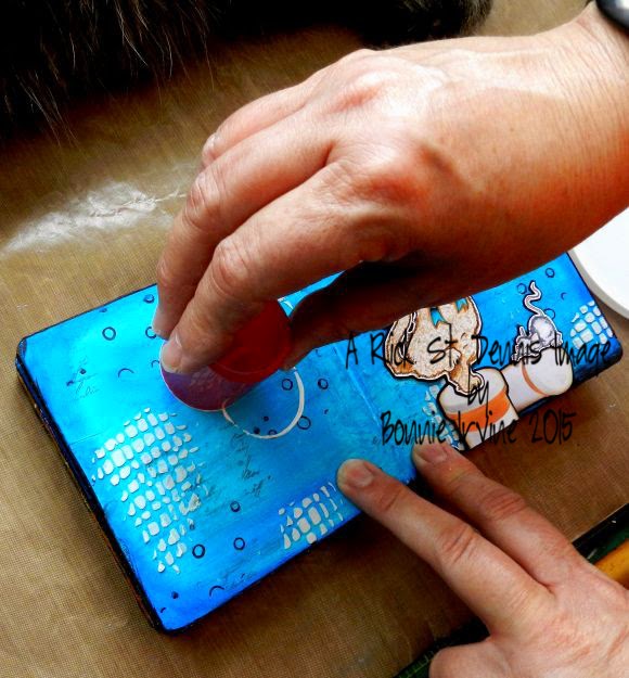
Here I am adding white embossing paste through TH's Burlap stencil using a palette knife. You can see below where I added it randomly, breaking the odd number rule :) This takes a little while to dry depending on how thick you layer it.


I always like my mixed media pieces to have a frame so I usually take a black Big brush pen and line the very edges. Then I come around the pages a second time angling the marker so that it shows on the face. I also make sure that I come onto the pages a little more in some spots to get the messy look I like. At this point the background is starting to develop into something interesting but we're not there yet.


Time for a little more background stamping, this time with Jet Black Archival ink and a bubbles stamp from Joggles. The black because it is darker than the background adds a stronger layer and pushes everything else back. Good contrast and it keeps the eye on the page instead of drifting off. In this photo you can also really see where I added the darker blue gelato earlier.


The background has a lot of texture and pattern here and there but it's time to tie it together which I have done with both white and black gesso rings. I use bottle lids or anything round and load them up with gesso which has been spritzed with a little water. This makes it create a more complete circle. I also give it a slight twist when I have placed the lid on the background. You can see by this photo that I have added the images, Bootsie and Fred, who are balancing on top of prescription bottle images (cuz Ed is Medi-cat-Ed).


Black and white circles in two sizes are done, Now it's time to add some torn paper. I could have used book paper or designer paper but I always keep a pile of atc size white cardstock papers on my desk to mop up over spray when I am using spray inks. The greeny-blue papers come from one of those mopper-uppers. Sometimes I punch them, die cut, stamp, or, in this case, just tear them. They break up the background and add...you guessed it ...another layer. I like the torn white against the deeper background. I outlined these bits with Big Brush pens in coordinating colours so the overlaps would show and they would contrast better with the background. These give the eye a place to rest from the busy background.


Almost there...are you still with me? Trust me...it takes way longer to photograph and write about it than to actually do it. This is where I look at the composition and see what details are missing. I added the letters using stickers. I had placed the torn papers with an eye to adding the letters on top so they would show up better. Once I added the Medi letters, it needed something to draw attention to that because my eye went to the word cat first because of the greater contrast. I added the faux prescription number on white cardstock under the word to attract the eye there first. The little clusters of pills added some fun detail and a pop of darker blue plus they tied the two pages together through repetition. To anchor the outside edges, create a diagonal sight line that takes the eye through the spread, and also better frame it, I added some black cardstock circles to the opposite corners. The last thing I did was use a black marker to make the doodled border.

And that's my process for these pages. I change it up but always do multiple layers of media to get the depth and layered look I like. It's a very intuitive process and I rarely have any kind of plan.Thanks for joining me today. I hope you found this helpful or interesting...or something. Ed and I are glad you hung in.

Life is good; so is art.
Bonnie

Wednesday, April 08, 2015

Sweet Pea Stamps Easter card for Mom


Hi everyone! Hope everyone who celebrates Easter had a good one. Sweet Pea Stamps was sponsoring Passionate Paper Creations this past weekend so there was lots of inspiration to be had...gotta love that! I used the one colouring contest image to create a card for my mom.


One of the colouring contests involved this gorgeous stamp by Katerina Koukiotis' called Fairy Tea Party. She is so sweet and a treat to colour. I just had to play along and since I needed an Easter card for my mom, it was a win/win. I coloured this sweet fairy with Prismacolor pencils along with a few Polychromos. When completed, she was trimmed out along the edges and matted with black cardstock before being popped up on foam squares.


The background began with a turquoisey green piece of cardstock cut to fit inside the white card base yet still allowing for a black mat. Pattern was added with Forget-Me-Not Archival ink through TCW's Mini Punchinella stencil and with white gesso through TCW's Mini Texturized stencil. Two flags were die cut from yellow designer paper and stencilled with TCW's Tile Texture and the Texturized templates using the same ink/gesso combination. They were matted with black and overlapped when they were adhered to the background.


Black half circles were added to either side of the flags and two white star stickers were also added as another layer to bridge the two. Black sticker letters were added to spell out Mom.


I always keep the inside of my cards quite clean and simple using scraps of papers from the front of the card. I did a little faux stitching and added a computer generated sentiment. Thanks so much for popping by today. Be sure to check out Sweet Pea Stamps  for more gorgeous images which are sure to inspire you.

Life is good; so is art.
Bonnie

Tuesday, April 07, 2015

TEW New Release ~ Diva Lisa "Cheeky Lisa"


Hi everyone. I hope you had a wonderful long weekend whether you celebrate Easter or not. Since it's Tuesday, it's time for a new release at The East Wind. Today's new release is called Diva Lisa "Cheeky Lisa". Love her attitude and how confident she seems. She makes me smile. The name is a hoot because she is cheeky in more way than one.


I coloured Lisa with Prismacolor pencils using a few Polychromos to shade her skin. Lisa was fussy cut close to the lines and matted with black before being trimmed again. She was then popped up on foam tape and given a magazine to look at while she waited.


The background started as a manila tag which I spritzed with California Poppy Gold Starburst spray on the top and Delphinium Turquoise and Afternoon Delight Denim on the bottom. because the yellow was a bit more gold than I wanted for the washi tape, I added Lemon Yellow gelato over the spray so the colours worked better together. White embossing paste was scraped through TCW's Halftone Borders stencil with a palette knife to provide a little texture. The washi tape was mounted on white cardstock, trimmed, and then adhered to the background top and bottom of the tag.


The edges of the tag were inked with Black Big Brush pen before the tag was matted with black cardstock. Diva Lisa was adhered using the bottom washi tape to ground her. The sentiment which is something I used to say when I was little (cheeky little thing that I was) and also in high school if someone made a negative comment about my funky way of dressing. It seemed to me like something Lisa would say as well. The topper was created by stapling two lengths of black and white ribbon to the tag with my tiny attacher.

Thanks for joining Cheeky Lisa and me today. To see creations using this new release by other on the TEW DT, pop over to the TEW Facebook group. Tons of inspiration there for sure! We would love to see what you create with her, too.

Life is good; so is art.
Bonnie

Monday, April 06, 2015

One Sweet Challenge March theme ~ Spring has sprung


Deja Vu? Feeling like you have seen this before? You have...I posted on the wrong date...today is the first Monday so here we go again! Head slap!

Hi everyone. Since this is the first Monday of March, it's also the beginning of the new challenge at One Sweet Challenge. Our theme for this month is Spring Has Sprung and I sure hope that's true because last week we had several bouts of snow...again! Soooo ready for spring!


For this project, I chose to play with a Sweet Pea Stamps image by Lisa Victoria called Rain Dragon. She's so cute and seems joyful traipsing through shimmery puddles with her leafy umbrella. I coloured her with Prismacolor pencils, adding some Icicle Stickles to her wings for a touch of shimmer and magic. I also added Wink of Stella clear to the rain drops and puddle, and blue Pan Pastel to the sky behind her. The image was then fussy cut where it could be, matted in black, and popped up on foam squares.


The background began with a 6x8 inch rectangle of black cardstock over which torn strips of water drop designer paper were adhered leaving a path between the sections. White embossing paste was scraped through a harlequin stencil and then coloured with Pan Pastel once dry. The left side of each harlequin was lined with black pen and shaded next to with graphite pencil. Tiny raindrops were added by pouncing jet Black Archival ink through a Coffee break stencil.


To bring a little of the green from the image into the background, grass was cut with a die, divided into two sections, and adhered at the bottom edge. Black pen was used to outline it because it got a little lost in the busy background. To tie the top rain streams into the background, three clouds were die cut from shiny shimmery paper and popped up on foam. Two of them were overlapping the lines at the top so that the rain appears to be coming from the clouds. The edges of the designer paper were inked with Black Soot Distress ink and then the background was matted on another layer of black cardstock to frame it and add strength. Two transparent dome gems were adhered to the top right corner to finish off the piece.

Thanks so much for popping by today. Both my little dragon friend and I are glad you did. To see the other Spring-themed projects made by the One Sweet Challenge DT, pop over to the challenge blog. We would be delighted to have you join us with your spring creation. be sure to head over to Sweet Pea Stamps for absolutely tons of fabulous images sure to inspire you.

Life is good; so is art.
Bonnie