Sunday, March 31, 2013

Eclectic Ellapu ~ Celebrate our Strengths


 April is Autism Awareness month, a cause that is near and dear to my heart. To commemorate this special month dedicated to bringing greater understanding and awareness of this spectrum, Trisha has chosen the theme for the challenge at Eclectic Ellapu with this in mind.  It's the Purple Team's week to repond to the challenge of using Primary colours and puzzle pieces to help convey a message of encouragement or thinking of you.


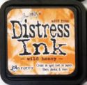
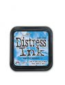
I chose to alter a wooden plaque which is approximately 5 x 8" in size. First the routered edge was painted in black gesso and allowed to dry. Next two patterned papers from an Amy Tangerine paper stack were used for the sky and the grass. The sky was adhered to the wood with Decou-Page and the green dot paper was torn into two strips which would be overlapped for the grass. Peacock Feathers and Faded Jeans Distress inks were applied over two stencils, Dylusions Letter Jumble and Dotted Flowers,using a foam applicator to create background texture. White gesso was pounced through the TCW stencil Mini Chevron. More Faded Jeans was transferred to the background via Unity's Cooped Up Notes stamp. I love that stamp for art journalling!


The flower centers were created by peeling a couple of layers off of 3 puzzle pieces and spraying them with London Blue, Pure Sunshine, and Postbox Red Dylusions ink sprays. I peeled the pieces because I wanted them to have a roughened texture to them. The puzzle pieces were backed by these lovely crocheted circles that my 83 year old neighbour makes for me. For added texture and whimsy, a piece of cheesecloth was adhered to the back of each flower. Threaded buttons finished off the flower heads. The stems were handcut and doodled from the perforated top pattern on the Amy Tangerine papers (waste not, want not :D ). The leaves were torn from the leftover bits from the grass.


Before the Idea-ology lettering was applied, I used some watered down black gesso and a gift card to make random lines in a few places. Doodling was done with a black Micron pen. Tiny gesso stars were added by pouncing with a brush over TCW's Mini Punchinella stencil. The wording was chosen with great thought. Many of you know that I am a retired teacher. Fewer know that what I taught for most of my career was Special Education which I absolutely loved and felt very privileged to teach. One of the values that I emphasized on a daily basis was to celebrate the strengths of all children (and adults). This is particularly important in dealing with those with special needs where it is all too easy to get caught up in the problems and challenges, what isn't working, rather than what is. Each day we celebrated the gains, large and small, and the strengths that each person brought to the table. I think it's a great habit for all of us to develop regardless of our age, stage, or situation. Just wanted to share that :)

Anyway, thanks for visiting today. I truly appreciate each of you for taking the time to share in my art journey and sharing your thoughts with me. Be sure to pop by the Eclectic Ellapu blog to see the wonderful makes that my teamies have created in response to this awesome challenge. I'm looking forward to seeing what you create next.

Life is good; so is art.
Bonnie


Thursday, March 28, 2013

eP Follow Your Dreams


I am having such a great time altering the pages of the children's board book that I started in February for the Get Altered challenge on the eclectic Paperie blog. You can see what the book looked like before I started in this post. At any rate, I am now on the fourth double page spread and still following the flight theme. This spread also qualifies for the current eTeam  Picks challenge at eP since it uses corrugated cardstock. (Yay)


I started this background by applying Neocolor II crayons to the gessoed page and spreading them with water and a large brush. I used 4 different shades of blue progressing from lightest at the bottom to darkest at the top. As you can see, I left the colour very streaky.


 I sprayed fixative on the page so the streaks wouldn't blend and then used Decou-Page (like Mod Podge) to adhere crumpled white tissue over the sky area. This gave it amazing texture and knocked back the colour to where I wanted it. The bottom area had a torn piece of Amy Tangerine paper adhered to it with Decou-Page.


The background was patterned with white gesso and TCW's mini chevron stencil as well as TCW's mini punchinella stencil. Unity's Cooped Up Notes stamp was applied using Faded Jeans Distress ink. Peacock Feathers Distress ink was used with the messy dot stamp from Tim Holtz's Bitty Grunge set. Mowed Lawn Distress ink was used on the Stampendous Marble Texture Cube to achieve more interest in the grass area.


Wendy Vecchi's white embossing paste was applied with a palette knife to create the fluffy clouds. I love the texture you can achieve with this stuff. I can't wait to get the black embossing paste which is in the mail as we speak. To create the path for the houses to rest upon, a curvy strip of corrugated cardstock was cut, inked with Vintage Photo Distress Stain, and adhered to the grass area.


While those layers were drying, I sprayed 6 of the little (1 1/4" tall) wooden Prima Icon houses with Dylusions ink sprays (Squeezed Orange, London Blue, Bubblegum Pink, Crushed Grape, Pure Sunshine, Vibrant Turquoise). These houses are adorable with all of their laser cut windows, doors, and detail.  They really absorb the colour of these sprays so to knock it back a little I immediately sprayed them with White Linen before they were completely dry. Once dry, I added roof and fence detail with Fired Brick, Worn Lipstick, Faded Jeans, Vintage Photo, and Spiced Marmalade Distress markers. The fence was highlighted with a white paint pen which lightened the purple even more. The houses were adhered to the page with foam dots behind the top halves and glue where they overlapped the corrugated path.


The sun was created with a Quickutz die using yellow paper from Authentique's Renew pad. The rays were lined with Wild Honey Distress marker. A 2" circle was punched from the same paper, inked around the edge with Wild Honey DI and faux stitched with a black Micron. The face is a Paula Best stamp on the same yellow paper. The features were coloured and the face shaded with Prismacolor pencils before it was fussy cut, matted in black, and layered over the rest of the sun with foam tape.


The bird on the opposite page is a canvas sticker from Little Yellow Bicycle. It was colourized with Peacock Feathers and Faded Jeans Distress inks applied with a water brush. The eye is a half pearl. The computer generated message, Follow Your dreams. They know the way, was printed on kraft cardstock, cut out and distressed with scissors. Vintage Photo Distress ink was applied to the edges to frame them .


Once all of the bits were adhered, I was able to survey the entire neighbourhood to see what else was needed to complete the scene. Doodling was done with a black Micron pen. Two lengths of double scallop border cut with an MFT die were adhered to the edges. The harlequin stamp from TH's
Boundless Flight set was applied using black Stazon. The Stampotique swirl stalks stamp was layered over the grass at the bottom edge and watered down gesso rings were created using a bottle lid. Black Soot Distress ink was applied to the page edges with a foam applicator.


I love how bright and cheerful this page is. It seems to suit the hopefulness of the sentiment as the bird follows her dreams, taking in all the beauty and delights of her journey. I have one more double page spread and then the back cover to alter and this book will be full to bursting. Thanks so much for visiting today and if you managed to read this lengthy post, kudos! I appreciate your visits, your comments, and the time you have spent with me.

Life is good; so is art.
Bonnie

If you are interested in some of the products I have used today, click on the thumbnails below to magically be transported to the correct page of the eclectic Paperie's shop catalogue.

Monday, March 25, 2013

Whooo Loves Ya? (CYP)


Another Monday...another fun challenge at Craft Your Passion Challenges. This week, our theme is Make It Cute. I can't wait to see what you come up with when you play along. I used this sweet little owl guy from 2 Cute Ink called Owl You Need is Love. He looks so huggable. I coloured him with Prismacolor pencils and cut him out with a Spellbinders Jar Labels die. Vintage Photo Distress ink and faux stitching were used to emphasize the shape.


The background was cut from DCWV's Safari stack and matted with hot pink cardstock. Sheer ribbon was wrapped around the brown layer before adhering it to the matting. Another length was cut and knotted before being adhered onto the right side of the ribbon band. Two sizes of hearts were traced from a stencil onto red cardstock, fussy cut, and inked around with Walnut Stain Distress ink. White highlights were created with a white Pentel paint pen. These hearts were adhered on top of or below the image layer before it was popped up on foam dots.

To complete the card, the sentiment was computer generated, cut out, and inked around with Vintage Photo DI. A wonky heart button was threaded with pink floss and adhered to the knot of the tied ribbon. I think this card follows the cute theme. Mind you, Mr. Owl gave me a massive head start in that department! Be sure to check out the Craft Your Passion Challenge blog to see the major "cute-ness" achieved by the rest of the DT. Come and join us by linking up your own creations. I hope we have a total Cute-fest. Thanks for your visit. You make me smile when you do that :)

I am entering this card in the following challenges:
613 Avenue Create ~ #12 Anything Goes
One Stitch at a Time ~ #156 Use a Digi
Drunken Stampers Challenge ~ #120 The Birds

Life is good; so is art.
 Bonnie

Friday, March 22, 2013

The Queen of Hearts


Our challenge theme this fortnight at ATCs With Attitude is Easter. However, I am a huge Alice in Wonderland fan so when I saw this gorgeous Queen of Hearts image from Sassy Studio Designs, I knew that I wanted to colour her and somehow would make it work for Easter. I was a little stumped at first until I thought about chocolate Easter bunnies and then, by George, it came to me! See...chocolate to the rescue again :)


I coloured the lovely Queen with Prismacolor pencils, fussy cut her, and gave in to her demands for bling on her crown and earring. She can be quite forceful!. Mr. Bunny was an internet image which was fussy cut and given a baker's twine bow. Both images were poppped up on foam tape.

The background was an embossed scrap of pink patterned paper. Another scrap of paper with the word chocolate printed over and over (I felt like it was a message being sent to me) was adhered to the bottom and narrow purple ribbon covered the seam between pink and brown. The text was computer generated, cut out, and matted with black cardstock. To complete the outside edges of the ATC, Versamark was brushed directly onto the edges which were then sprinkled with black embossing powder and heated. I always like that slightly messy, shiny frame.

Now obviously, the Queen goes for all of Mr. Bunny's head. What about you? Are you an ears person, paws perhaps, or maybe even tail? And do you prefer the solid bunnies or the hollow ones? Inquiring minds want to know ...LOL. Thanks for visiting today. Be sure to check out the creations by the rest of the DT on the ATCs with Attitude blog. I'm hoping you'll take a break from chocolate long enough to play along with our Easter challenge. I'd love to see what you create.

Life is good; so is art.
Bonnie

Thursday, March 21, 2013

The Craft Barn Alpha Dictionary Challenge ~ P


 I stole some time today to play in my altered dictionary. The new letter for the Craft Barn Alpha/Dictionary Challenge is P and I chose the word Princess to illustrate. Each fortnight they name another letter and you find a word from that letter in the dictionary. You can either alter the actual dictionary or you can incorporate the word and definition into a different piece of art. It's such a cool challenge and the art from the DT and the participants is very inspiring.


I Decou-Paged the pages I needed to the pages next to them for added strength and then gessoed the P pages that I would alter, leaving the word and definition exposed. Washi tape was glued to the center seam.The background was done with Dusty Concord and Picked Raspberry Distress inks applied with a blending tool. Both pages were flicked with water to get the spotty look I love. More Dusty Concord was applied to the Penny Black Warm Wishes background stamp and rolled onto the pages randomly. Impression Obsession's Script Cover-a-Card stamp was applied here and there using Colourbox White ink for additional texture.


Out came the stencils. TCW's Mini Punchinella had white gesso pounced  through it. TCW's Mini Harlequin was dabbed through with Perfect Medium so that copper Perfect Pearls could be applied, also through the stencil. At this point, I sprayed a fixative over the background. A Bo Bunny Et Cetera stamp was applied to the pages with Memento Tuxedo Black ink and Picked Raspberry DI was applied through the Chequered Dots stencil from Dylusions. A K & Co. border was divided into two chunks and adhered to each page. The definition was doodled around with a black Micron and a white Posca pen. More doodling was done, as well as shading next to the PP diamonds with a Prismacolor pencil.


The border was doodled with Black and White Big Brush pens. A chipboard P was adhered to a black die cut oval and given a crown to repeat the crown on the Princess' head. The princess image from Dilly Beans was coloured with Prismacolor pencils, fussy cut, and given half pearls to fancy up her crown before being adhered to the right hand page. Love this image...she's got attitude. That brought to mind the sentiment which was computer generated, coloured with gel pens, and matted in black. Once the words were adhered, they were doodled around and then outlined with a Neocolor II watercolour crayon and a waterbrush. The same was used on the inside edges of the border. Shading around Princess was done with a charcoal pencil blended with a paper stump.


At this point in the process, I look for areas that need something else either to balance the page or add more interest. Watery gesso rings were applied with a lid from hairspray. The black scallop border was cut using an MFT die and doodled with the Posca pen. That one piece of trim brought some weight to the center and helped balance the image on the other page. Sometimes it's such a simple addition like that that transforms a spread from "it's OK' to "I like it!"


Thanks for popping by today and for reading another of my wordy posts. I really appreciate it and the Princess approves :) Maybe you'll catch the bug and join in this fun challenge. I'm off to link up  to The Craft Barn Alpha/Dictionary challenge and investigate the other creations.


Life is good; so is art.
Bonnie