Monday, March 25, 2019

Joggles Art Journal Adventure ~ Week 12 ~ Blossoms and/or Birds


Hi everyone! It's Week 12 of the Joggles Art Journal Adventure and it's also time for the National Cherry Blossom Festival in Washington, DC. Now that doesn't carry a lot of weight with this Canadian girl, and this far north, our blossoms are a ways away yet so I've stretched this week's prompt to Blossoms and/or Birds. One thing I have been enjoying this past week is the bird noises and songs that I've been hearing through our (still) closed windows. If the birds are returning, can nice weather and flowers be far behind? If they are, don't tell me...LOL. Anyway, for my Week 12 page, I decided to include both blossoms and my version of a robin.


I stamped one of Dina Wakley Scribbly Birds onto book text paper and started colorizing her with Vintage Photo, Scattered Straw, and Abandoned Coral Distress Oxides applied with a blending tool. Neocolor II crayons activated with a waterbrush were used to strengthen the colours and add shading/highlighting. A black Pitt Pen was used to darken and add to the scribbly lines from the stamp, and a white Posca pen added highlights. Inktense pencil activated with water added some detail lines to indicate feathers. Glossy Accents was added to the eye to create both dimension and shine and, once dry, the bird was fussy cut and edged with black Pitt brush pen.


The tree branch was die cut from kraft paper. It was then edged and darkened in a few places with both Vintage Photo and Walnut Stain Distress Inks. Neocolor II crayons activated with water were used to add some of the shading and highlighting to create the darks and lights of bark. Inktense pencils were used to help define some areas and thin scratchy lines were added with Vintage Photo Distress marker.


The background was spritzed with Lindy's Delphinium Turquoise and Bachelor Button Blue Starburst Sprays as well as Heidi Swapp Ocean Color Shine. Once this was dry, white gesso was applied over top with a baby wipe to knock back the colours and help them blend. You can still see the splotchy dots through the gesso which I love (great texture) and the gesso reactivated the colours so it's a much softer effect than the sprays alone.


Once this was dry, more gesso was pounced on to create a fluffy cloud. Gray Gelato was used to shade the cloud and create depth and several layers of gesso gave more coverage in some areas than in others. The bird and the branch were glued onto the background and both were shaded around with Inktense Pencil activated with a waterbrush. Blossoms were created by punching five petaled flowers from some scrap painted paper left over from another project. The centers of these flowers were worked with a stylus on a piece of foam to cup them. A small die was used to cut the centers of the flowers from white cardstock which was then inked with Rocket Red Gold Brilliance ink and then Magenta Hue on the tips of the spikes. These centers were then cupped in the same way as the flowers and adhered to the center of each. Once they were glued in place, brown flat back pearls were added to the centers and Tropical Tangerine Stickles to the points of the centers for a little sparkle.


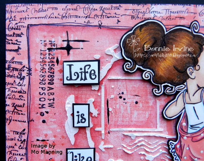
To add a little more texture and interest to the sky, Manganese Blue Archival Ink was used to apply a dotty spiral stamp and Forget-Me-Not Archival Ink was used to add text stamping. Jet Black Archival Ink was used to apply some splatter stamping before Ranger Texture Paste was scraped through the triangles of AALL and Create #6 stencil. A doodled border was added to the outside edges to frame the page. The wording was printed onto white cardstock, matted with black, and popped up with foam tape to add dimension. Finally the page was adhered to the black base which serves as a frame and also strengthens the page.

Thanks for stopping by today. My little birdie friend and I appreciate that. To see what others create in response to this Birds and/or Blossoms prompt, be sure to pop by the Joggles Art Journal Adventure Facebook group where inspiration and fabulous art and constantly being posted by our wonderful community members. Come join the fun!

Life is good; so is art.
Bonnie

Saturday, March 23, 2019

Plan A ~ an art journal page inspired by a Vera Lane Studio image


Hi everyone! I had a play today creating an art journal page featuring an image I love called Planner Girl by Vera Lane Studio. Not only does she have cute details but I love her oversized head. It's full of all kinds of plans and goals. She took up a whole page on her own so I created a two page spread to accommodate her message.


I coloured PG (Planner Girl) with my usual Polychromos and Prismacolor pencils. She was fussy cut leaving a narrow white border, matted with black, and fussy cut leaving a narrow black border to help her stand out against what I knew would be a busy background.


The background began with 3 Distress Oxide Inks applied with a blending tool: Fossilized Amber, Ripe Persimmon, and Candied Apple. Water was spritzed over the inks to help them move and blend. After drying this layer, Ripe Persimmon and Candied Apple were applied separately to a 3 inch gel plate, spritzed with water, and added to the background where I wanted more layers of that colour. Using Vermillion and Tiger Lily Archival Inks, little Lawn Fawn planner stamps were added randomly to the dried ink. White acrylic paint was slightly watered down and applied with an empty sewing spool.


The wording was printed onto white cardstock, cut into sections, and matted with black. Once the sections were glued in place, circles from Studio Light Rainbow Designs (MB17) were stamped onto white cardstock, cut out with dies or by hand, and scattered around both pages. Before they were adhered, the edges of the circles were inked with black Big Brush Pen. To finish off the page, a border was doodled with black pen and the insides of the white spool circles were shaded with Inktense pencil activated with a waterbrush. This helped them become more visible as they faded into the background before this step.

Thanks for joining Planner Girl and me today. We love it when a plan comes together...LOL.

Life is good; so is art.
Bonnie


Monday, March 18, 2019

Joggles Art Journal Adventure Week 11 ~ Change


Hi everyone! It's Week 11 of the Joggles Art Journal Adventure and since Wednesday marks the change of season, we are celebrating with a prompt of Change. I am going with an image from Mo's Digital Pencil called Big Girl Pants. She was the ideal image for the saying about change that I wanted to illustrate. There were many sayings to choose from but this one made me laugh and that clinched it :)


I coloured this little sweetie with a mix of Prismacolor and Polychromos pencils, adding some white dots to her bloomers with a Posca Paint Pen. She was fussy cut leaving a narrow white border, matted with black cardstock, and fussy cut again leaving a narrow black border. Foam Tape was added to the back of the image to pop her up and create natural shadow.


I wanted a variegated background that changed from vivid colour to a much lighter version. Using a brayer, Dina Wakley Blushing paint was spread on one side of the 6x8 background and then white was added to the right side until it blended with the still wet Blushing. More Blushing was brayered onto a 5x7 gel plate and then loaded onto Joggles /Cat Kerr Reinforcements foam stamp in order to transfer it to the lighter side of the background. The darker half was printed with white paint using the same gel plate transfer method. A mask was cut from a piece of cardstock, blocking all but .5 inches all the way around the page. Script stamping was added using Jet Black Archival Ink and one of the Indigo Blu Tasty Textures set to form a border. This border was doodled around with a black pen to separate it from the main part of the background.


Subtle tone on tone pattern was added one of the Studio Light Rainbow Design stamps (MB11) and Brilliance Rocket Red Gold Ink. Ranger Texture Paste was scraped through TCW Mini Elliptic stencil and, once dry, was shaded next to using a Neocolor II crayon spread with a water brush. More of the same shading was added next to the doodled border. Barn Red Oxide Ink was used to apply another stamp from the same set to several areas. White ink was added with one of Carabelle Studio Grungy Patterns stamps. Jet Black Archival was used to apply the numbers from Studio Light Post Card stamp set as well as a TH splatter stamp.


The wording was printed onto white cardstock, matted with black, and popped up on foam tape. To add a few more black touches, black acrylic paint was added with a gift card and Black Big Brush Pen was used to darken the white edges of the page. It was then adhered to the black background common to all of the pages in this journal which seems to frame the pages and unite them all.

Thanks for stopping by today. You know, we love when you do that :) To see the awesome creations from others in our Joggles AJA community, be sure to join our Facebook group. It's a wonderful place to hang out and soak up the friendship and inspiration. Hope to see you there!

Life is good; so is art.
Bonnie


Wednesday, March 13, 2019

Really, I would ~ inspired by a Vera Lane Studio image


Hi everyone! Yesterday I wanted something to make me laugh while I played so I combined this sweet Vera Lane Studio image called Miss Sassy Pants with a saying that reminds me of something I do with my husband. I will say something like "I would walk through torrential rains to get that for you...well, maybe not torrential rains but if it was sprinkling...as long as I had an umbrella...and it wasn't too far"...you get the idea. It always makes us both laugh. Anyway, that's the look on this Miss Sassy Pants' face as she reconsiders her rash statements. Or so I imagine!


I coloured Miss Sassy Pants with Prismacolor and Polychromos pencils, cut her out with my usual double border of black and white, and added a little sparkly star in her wild and wonderful hair. I added a little extra linework to her dress and stockings with black Pitt pen and set her aside while I played with the background. She was fine with that :)


I was going for the colours of fire to suit the saying so I applied Scattered Straw, Spiced Marmalade, and Fired Brick Distress Oxide to the page which I then spritzed to move the colour around. After drying it, I applied the colours one at a time to my petite Gel Press rectangle, spritzed with water, and added the colour where I wanted it on the background. Once dry, pattern was added with Brilliance Rocket Red Gold Archival Ink and Wendy Vecchi Open Dots as well as Stampotique Dotted Squares stamps. Jet Black Archival Ink was applied to one of the Studio Light MB11 stamps and Crafty Individuals Script stamp to create more texture here and there. I used some of the off cut harlequin diamonds left over from die cutting a piece for another project to create clusters. Fired Brick Oxide was applied with a water brush to the right of each diamond to create depth.


 I die cut a scalloped border piece from black cardstock which was divided into two segments, one for each page. I like how that creates unity and helps with flow. White paint pen dots were added to echo the design of one of two washi tapes. These two were layered under Sassy to ground her and then repeated on the opposite page again to tie things together.


The sentiment was printed onto white cardstock, torn around, and matted with black cardstock to help it stand out against the busy background. To add another bit of white to the background as well as some bigger shapes to contrast with all the tiny stamping, white chalk paint was added using a bottle lid as a stamp. These didn't show up as well as I had hoped so I added Neocolor II crayon applied with a water brush to shade inside the white rings and charcoal applied with a blending stump to the outside of them. The finishing touches to the page were a doodled border around the outside and edging with black Big Brush Pen, both of which helped to frame the spread.

Thanks for popping by today. Miss Sassy Pants and I are delighted you did. Mission accomplished in that this page makes me laugh. I hope it does the same for you. Be sure to check out the other amazing digital images in the Vera Lane Studio Etsy shop and pop by the VLS Facebook group where there is a ton of inspiration from the DT and the rest of that wonderful community.

Life is good; so is art.
Bonnie


Monday, March 11, 2019

Joggles Art Journal Adventure ~ Week 10: Time


Hi everyone! We're at Week 10 in the Joggles Art Journal Adventure and, in honour of turning the clocks ahead an hour yesterday, our prompt for this week is Time. I chose to use the opportunity to illustrate one of my favourite quotes and feature one of the delightful Carabelle Studio Les Oiseaux stamps. I love their little goggles and hats.


The 6x8 inch mixed media paper background was first spritzed with Steampunk Sepia and Opal Sea Oats Lindy's Starburst Sprays. Once dry, it was stamped repeatedly using Carabelle Studio Background Horlages stamp with Sepia Archival Ink. A dictionary page containing time words was torn and applied in several directions using Matte Gel Medium. White gesso was dry brushed across the entire page to embed the text into the background. More clock faces and numbers were added using Coffee Archival Ink through TCW Time Travel stencil. Jet Black Archival was used to apply Carabelle Studio Quadrillages stamp in several places to introduce a pop of black here and there.


Ranger Texture Paste was scraped through TCW Tiny Circles stencil with a palette knife to add dimension and texture to the background. Because the paste picks up the Starburst sprays, white Posca Paint Pen was used to whiten the dots. A Sizzix Alterations die was used to cut two harlequin pieces from black cardstock which were then glued to opposite corners. Some of the negative diamonds cut out by the die were used to create a pattern in two other spots. A few of the TH number rub-ons were also added both to repeat the number theme and also to add more pops of black texture.


The focal of this page began with a Bo Bunny pocket watch die cut which has been in my stash for evah! I die cut wings from black cardstock using a Cheery Lynn die and highlighted them with Treasure Gold, Copper and Renaissance waxes. Love the shimmer!These were adhered behind the clock and topped by the Carabelle bird which was coloured with Prismacolor and Polychromos pencils. It was then fussy cut leaving a narrow white  border, matted with black cardstock, and trimmed leaving a black border. Glossy Accents was applied to the watch face and the bird's goggles. Foam tape was used to raise the bird to the same level as the watch.


The wording was printed onto white cardstock and matted with black. The sections were popped up on foam tape to add dimension. To finish the page, Coffee Archival and then Jet Black were added to the edges. A border was doodled around those same edges. The decorated substrate was added to the black background page common to the other journal pages.

Thanks for stopping by today. To see the awesome creations from others in our Joggles AJA community, be sure to join our Facebook group. It's a wonderful place to hang out and soak up the friendship and inspiration. Hope to see you there!

Life is good; so is art.
Bonnie

Tuesday, March 05, 2019

Losing my Marbles - inspired by a Vera Lane Studio image


Hi everyone!Sometimes I find an image I love and want to colour but it isn't exactly right for my page. I like to tweak it a little both to change it up and to get more mileage from the original image.That's what I did with this image from Vera Lane Studio called Stella Luna. She was originally a witch with a witch's hat...and cute as a button. I removed her witchy hat and substituted a hat from the Boutique Hats digi set which changed her look completely. Love the new Stella! With 8 hats in that set, just imagine what else she could be :)


I coloured Stella with Prismacolor and Polychromos pencils, using black Pitt Pen to sharpen up the lines dulled from the pencils. The same pen was also used to outline a hole in her paper bag to fit the saying. She was fussy cut leaving a narrow white border, matted with black, and trimmed out again leaving a narrow black border. The hat was  glued to her head before she was adhered to the black cardstock.


The 6x6 inch watercolour paper background was inked with Blueprint Sketch and Peacock Feathers Distress Oxides applied with a blending tool. They were then spritzed with water and the page was tipped in different directions to allow for some dripping and blending. I love these two colours together because you get this gorgeous purple where they blend. Once dried, one of the Carabelle Studio Grungy Patterns stamps was applied with Garden Patina Archival. A second one from the same set was applied with Deep Purple Archival Ink. Jet Black Archival Ink was used to add the Stampotique Circles Cube stamp as well as Joggles Nonsense Latin Text. Brilliance Moonlight White was applied to a stamp from Indigo Blu Tasty Textures set.


Since Stella Luna needed a place to stand, and I just happened to have two strips of checked washi tape on my desk, I stacked them on the bottom of the page before she was adhered to it. Posca Paint Pens were used to make the marbles which were then outlined with black pen. The same pen was used to create a border with marbles separating the lines. The saying was printed on white cardstock, cut into sections, and matted with black before being glued flat to the page. Black Big Brush Pen was used to darken the outside edges of the page.

Thanks for joining Stella Luna and me today. We love that you popped by. Be sure to visit all her friends at the Vera Lane Studio Etsy shop. You're sure to be inspired to play.

Life is good; so is art.
Bonnie

Monday, March 04, 2019

Joggles Art Journal Adventure - Week 9 (use black)


Hi everyone! It's time for the next prompt in the Joggles Art Journal Adventure (Week 9) and this one is an absolute no-brainer for me. The prompt is : Well, aren't you a little ray of pitch black...so we are meant to use black in our creation. Hello...I always include at least a touch of black in my creations and in the rooms I'm decorating. I love how it sets off the other colours, how dramatic it is, and how it can move the eye around the page or the room...contrast, love it! To make this prompt more of a challenge for myself, I decided to go with black moods and the idea of melodrama and pity parties because that makes me smile (just my weird sense of humour). I found the ideal digital image at Mo's Digital Pencil called Woe is Fay...she's just the adorable drama queen I needed.


I coloured Fay and her doll with a mix of Prismacolor and Polychromos pencils. They were fussy cut leaving a narrow white border, matted with black cardstock, and fussy cut a second time leaving a narrow black border. Foam tape was used to adhere them, adding dimension and natural shadowing.


For the background, I tore a page out of the dictionary with the words melodrama and melodramatic at the bottom. The page was torn in half to fit the height of the background base. Before adhering it to the white base, Jet Black Archival was used to stamp an Inkadinkado image from the Bloody Scene stamp set several times across the top of the dictionary paper. Once it was adhered, two different washi tapes were layered as a frame, overlapping the edges of the dictionary paper. Black pen was used to outline the inside of the dotty tape.


To draw the eye to the word melodrama, and its definition, red Posca Paint pen was used to draw a box around it. This also helped pull some of the red from the image into the background, helping with continuity and repetition.


The wording was printed onto white cardstock and the open areas of the font were coloured with red coloured pencil, making a third spot of red and completing the visual triangle. The saying was cut into individual words which were then matted with black and adhered to the page with foam tape. Three purple pearls were added after the quote to indicate the three dots. Black enamel dots were adhered to the corners of the narrow washi tape. The background was adhered to the black page of my art journal which framed the entire page and added yet another pop of black.

Thanks for joining Fay, Dolly, and me today. We appreciate that. To see what the others in our fabulous Joggles Art Journal Adventure Facebook group create as a response to use black Prompt 9, be sure to pop over to the page. We would love to see you there!

Life is good; so is art.
Bonnie