Thursday, February 28, 2013

Something Wonderful journal spread

Warning: Hold onto your hat...it's a long one!
 

 Today I had a good ol' play in the children's board book that I started altering for the eclectic Paperie  Get Altered challenge. This book is already so thick and I have three more double pages to finish. I'll need a bungee cord to keep it closed :) The altered book is entitled Flight Risk so today I continued on with the winged things theme.


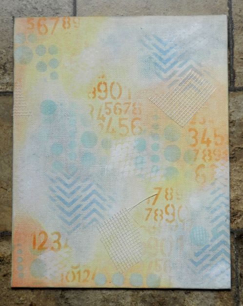
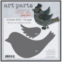
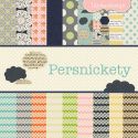
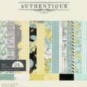
I started with the white gessoed page and all I knew was that I wanted to include the bird illustration and some of the Authentique Renew 8 x 8 paper pack. I loved the colour of this greenish coloured paper so it was torn to make the grass layer. Before adhering it with gel medium, the sky section was scribbled over with Neocolor II watercolour crayons, using water and a brush to spread it around.


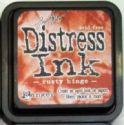
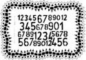
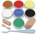
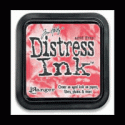
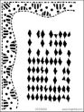
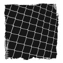
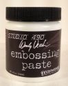
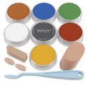
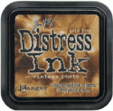
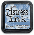
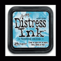
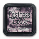
 To add even more colour tones to the sky, Broken China and Faded Jeans Distress inks were applied over TCW's Mini Fence Frame and Mini Collage Numbers stencils. Vintage Photo DI was applied through the small Dylusions Diamond of a Border stencil. Next came the application of my new Wendy Vecchi embossing paste (which is as lovely to work with as everyone has been saying) with an old gift card through the Dylusions Chequered Dots stencil. It was left to dry (which happens quickly compared to modelling paste I've used before) and then was given a little colour. The circles have Pan Pastel and Faber-Castell Big Brush pen on them, charcoal on the left side for a shadow, and doodling on top and to outline. The checks have Black Soot DI on them, strengthened with the Black Big Brush pen, and given white dots with the white Big Brush pen.


Now it was all about adding texture to the background. A little drywall tape was cut roughly and applied in three places. My favourite script stamp from Inkadinkado was partially stamped here and there using Rich Cocoa Memento ink, as was the Tim Holtz smudgey dot stamp.. The dotty stamp from Studio 490 Seriously Art set was rolled over a few places with Archival Coffee ink. I'm really not looking for perfect or even recognizable images. Messy and multiple stampings with one inking are great. I keep a container with some of my faves right on my desk, nice and handy so I don't overthink. Watery black and white gesso were used to create the lines and scrapes using an old gift card. The Big brush pens were once again enlisted to darken the outside edges of the pages, the top of the grass, and to outline the checked pattern below.


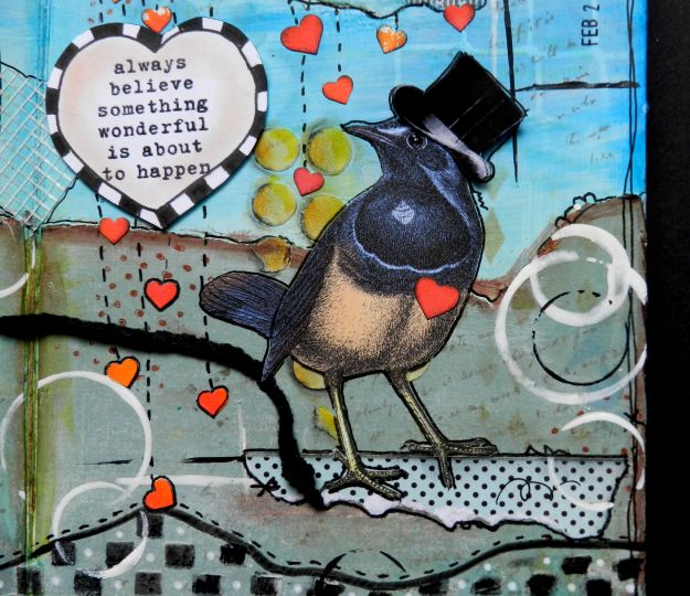
While things were drying, I started working on the images. Birdie, from Paper Whimsy, needed a top hat, a Glossy Accented eye, some torn clouds from the backside of the grass paper, and something to stand on which is actually the top pattern of the same paper where it tears out of the pad. The decision was made to have him pulling the wagon which was in my bin of ephemera from various sources.


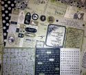
 Next came the loading of the wagon. I had a sheet of mop-up paper which I had used when spraying some Dylusions sprays in my larger journal. Love the colour combo of orange pink and yellow so various hearts were cut from the coloured bits on the paper. A slit cut in the wagon, allowed some to be popped through so they looked like they were actually inside it. Black Soot was inked around the edges of the hearts so they would remain distinct when they were overlapped. A small gratitude banner was hand lettered and cut to attach to the back of the wagon with baker's twine. Who wouldn't be grateful for a wagon load of blessings?


The Donna Downey Empowered Words sentiment was stamped on white cardstock with Versafine and heat embossed with clear embossing powder. A hand drawn checked border was added to the outside and Pan Pastel was used to colour the inside. Now I was left with two thoughts which collided. Where did Birdie's wagon of hearts come from and what wonderful thing was happening? Why, it was raining love and blessings, of course! A few more hearts were punched from the mop-up paper, adhered under the clouds and given dashed lines to show them falling. Awesome day! The final steps to complete the pages were a date stamp, more doodling and outlining, and watery gesso circles made with lids.


This journal spread makes me happy partly because of the way it evolved without a plan, partly because it stayed ugly for a long time before I actually liked it, and partly because I love the message and vignette. It makes me smile...hope it does the same for you! Thanks for visiting, for reading such a long post, and for your wonderful comments. That all makes me appreciate my blessings :)

Life is good; so is art.
Bonnie

To view some of the products I used making this piece, click on the thumbnails below to magically land in the eclectic Paperie shop at the right stop.

Wednesday, February 27, 2013

SNP's Love Cherub


Today I'm using two more small Stamp N Plus Scrap N stamps to create the focal on a 4x4" card. The stamps are called Cherub which measures about 1 3/8x3/4" and which I have linked and Flourishes which I can't locate on the store site, although I know it's there...tricky little thing. The cherub was coloured with Prismacolor pencils, had Goldenrod Stickles patted on his wings, and then was fussy cut.


The frame is a Prima Create-Its and the insert actually pops out. I covered it with old French bookpaper, inked it with Scattered Straw and Worn Lipstick Distress inks, and stamped parts of the flourish on both sides, being sure to come off the edge. The now inked and stamped insert was placed back in the frame and the cherub was adhered on top so that he is resting his arms on the frame. A gold brad was added to the hole to repeat the gold of his wings.

The rest of the background is made with gold cardstock as the base and scraps layered over that in the form of a rectangle and a matted fishtail banner. Gold hemp twine was wrapped twice around the front of the card and through a slit cut in the fold before being tied in the center. The silver edge of a  metal love charm was alcohol inked with Gold to better suit the card and was then adhered with foam tape over the knot in the twine.

I'm loving this 4x4 size of notecard. It's a fun size to design and it's allowing me to use both small stamps and scraps. Win/win! Thanks for visiting today. I hope you find a little time to play.

Life is good; so is art.
Bonnie

Monday, February 25, 2013

CYP Banners Challenge


Happy Monday...if that's not an oxymoron for you. One thing I always enjoy about Mondays is that it means a brand new challenge at Craft Your Passion Challenges. The theme this week is Banners ...love that!  I got to play with this sweet Birdie Brown image by Torico. If you aren't familiar with her images, you are missing out. They are adorable, whimsical, and just plain fun! I coloured this image, Be My Friend, with Prismacolor pencils cut it out as a rectangle and added a die cut border cut from a Spellbinders die. The image is double matted.


The blue and plaid papers come from the MME Oliver 6x6 paper pack. The banner flags are the reverse patterns from the double sided paper. Brown textured cardstock was used to mat both rectangles of patterned paper. The three white scallops to the right of the image were punched, inked on the edge, and faux stitched. Brown half pearls were added to the center of each. The corrugated bracket shaped tag was cut using a spellbinder die trimmed to fit the space.

The banner flags were hand cut and popped up with foam dots. To form the clothesline,  hemp cord was tied around two brown brads before being inserted into the background. Glittery letter stickers were added to the flags and rhinestone stars were adhered next to them.

I love the look on these guys' faces. Like all of the Birdie Brown images, they make me smile. Thanks for stopping by to meet them and thanks also for leaving such wonderful comments. They make me smile, too. If you get a chance, stop by the Craft Your Passion blog to see what the rest of the DT did with their Birdie Brown images and the Banners theme. It's worth the trip.

I am entering this card in the following challenges:
Cards in Envy ~ Polka Dots and/or stripes
Daisy Doodles Creative Challenge ~ #78 Anything Goes
Love to Create Challenge Blog ~ #54 Wrap It Up ( string, twine, or fibres)

Life is good; so is art.
Bonnie

Friday, February 22, 2013

Night On The Town


This is my first atc with the ATCs With Attitude Design Team. Formerly, I had been on the Fat Pages With Attitude DT but when the opportunity arose to switch to the atc team, I jumped on it. ATCs are artists trading cards and are a standard size of 2.5 x 3.5 inches. They are amazing little pieces of art and I enjoy the challenge of the smaller size. They are also frequently used on tags, cards, or other larger works.


The theme for this fortnight's atc challenge is favourite colours. Mine are turquoise, cream,  and black. I was fortunate to play with this awesome digital stamp from Smeared Ink called Smitten ~ Night on the Town. I love the glamour and vintage elegance of this image. The lovely couple were coloured with Prismacolor pencils. The bottom of her gown and the choker around her neck were glittered with Black Diamond Dry Fine Glitter which I won as blog candy from the fabulous Anita Houston...thanks Anita. It has the most amazing colours in it and because it is so fine, it fills in small spaces without losing the detail. Sometimes with the wet Stickles, you don't get the range of colours in the Black because the glitter pieces are bigger so not as many sparkly bits fit in the small space. Two rhinestones were added to her outfit and then the duo was fussy cut.

The background paper is packaging material matted in dark brown cardstock. A flourish stamp by Inkadinkado was inked with Versamark and embossed with gold embossing powder. A scrap of textured gold paper was adhered to the bottom third of the card. A turquoise paper rose was clustered with other punched flowers to embellish the corner. The sentiment which is part of the stamp was printed, cut out, matted in brown, and popped up on foam to complete the atc.

Please note that the ATCs With Attitude Challenge blog has undergone some changes recently due to some technical problems. The blog, which disappeared, is being redeveloped but the challenges are full steam ahead. The major difference is that it is now an atc only challenge, meaning that cards will no longer be accepted. Please pop by the blog and see the wonderful atcs created by the rest of the DT. I hope you'll decide to join in our favourite colours challenge. I'd love to come for a visit and see what you create. Thanks for visiting.

Life is good; so is art.
Bonnie

Thursday, February 21, 2013

eTeam Challenge ~ See my Thoughts


Welcome to eclectic Paperie's second eTeam Picks Challenge! The eTeam Picks Challenge is held on the third Thursday of each month and each challenge is an opportunity for you to be inspired by one of our eTeam’s creations, to share your work, and to be entered into our challenge prize drawing. Our hostess this time is the talented Donna-Marie and her challenge is to create a piece of art which includes something folded. How fun is that!


I decided to work on a flat canvas this time, starting off the process by covering the background in Pan Pastel. I bought my Pan Pastels individually which is not the way to go. eclectic Paperie has these fabulous sets where the colours are combined so that you can shade and the colours work together beautifully. The mixed media 1 set is on my wish list. Anyway, after I finished blending and layering the Pan Pastels, which is such an easy process, I sprayed the canvas with workable fixative so that they would stay put and accept whatever I did next. I pulled out The Crafter's Workshop Chevron 6x6 stencil and worked Faded Jeans Distress ink through it.


Switching to Dylusions Number Jumble 5x8 stencil, Rusty Hinge Distress ink was applied next. Broken China and Faded Jeans were applied over the Dylusions chequered dots 5x8 stencil. This was building up both texture and interest while keeping the colours soft. Drywall tape was added in three places (more texture) before stamps were randomly applied. Wendy Vecchi's Art word from An Eye For Art was stamped with Faded Jeans. The coffee rings from Stampers' Anonymous, were stamped with Vintage Photo Distress Ink, and the zigzag from Dylusions' Inbetweenies set was stamped with Memento Teal Zeal.


The folded text paper seen above came from an old book. It was inked on each fold with Vintage Photo, stitched with baker's twine, stamped with Dylusions Inbetweenies line dot stamp and Coffee Archival ink and then adhered to the canvas. Doodling with a Micron Sepia pen and a white Pentel Touch pen was added to emphasize some of the stamping and stencilling on the folded piece and the canvas as well as frame the outside edges. The edges, as well as the orangey sections, were further deepened with an application of Worn Lipstick Distress ink.


While paint and ink were drying on the canvas, I worked on the woman who would be the focal for the canvas. Her face was stamped on white cardstock using the Dylusions stamp from Bits of This. She was coloured with Prismacolor pencils and fussy cut. The eye band was stamped and coloured a second time so that it could be popped up on foam dots. I love her face!


The arrows started out as 1 3/8 x 3" rectangles of paper from Authentique's Peaceful pad and Lily Bee Design's Persnickety pad. The arrow shape was cut and the bottom section was folded into the center twice. The challenge is folded paper, after all! It also gave the arrows greater substance and dimension.The green reverse side of the Authentique paper was a little too green for this piece so half was covered with the snipped scraps and the other half got a coat of Fresco Finish Beach Hut transluscent paint to help it fit in with the turquoise palette. To me, those arrows represent her thoughts being sent out into the world (hence the sentiment) but also work for her hair :)


Her wings are Wendy Vechhi Art Parts. Love playing with those. They were covered in more of the Persnickety paper, easily trimmed with an exacto blade, and sponged with Beach Hut and Snowflake Fresco paint with Worn Lipstick Distress ink near the top edge. Doodling with a Micron pen added more detail to the edges.


My lovely's body was a torn chunk of corrugated cardboard that just happened to be this shape and was sitting on my desk from another project. I used Fresco Finish paints in Beach Hut, Inky Pool, and Snowflake to highlight the bumps. Three washers which I confiscated from the kitchen junk drawer became her buttons. Her arms were printed from a Tumblefish Studios collage sheet and fussy cut to slide under her torso.


The sentiment was computer generated, printed on kraft cardstock, and torn around the words. Crumpling and inking with Vintage Photo added to their grunginess. Finally, white rings were added by dipping various lids into watered down Snowflake paint and applying them to the canvas with a slight twisting motion. Overlapping on the words, image, and folded text helps to embed these pieces into the background creating a more cohesive look.

Can you tell I had a blast creating this altered canvas? If you haven't tried this type of art, I encourage you to go for it. There are no rules, no great amount of thinking, and you probably have everything you need to get started. If not, the eclectic Paperie shop certainly has it. For links to the shop for some of the products I used, just click on the thumbnails below. This type of art is a very freeing process...pure play! Thanks for visiting today. Be sure and check out the eP blog for Donna-Marie's amazing take on this challenge as well as other DT members' creations linked up below the main post. I'm excited to see what you create using folded papers!

Life is good; so is art.
Bonnie