Tuesday, February 26, 2019

Cake Happens ~ Inspired by a Vera Lane Studio image


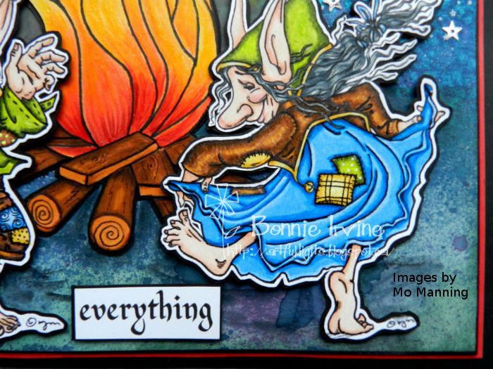
Hi everyone! Today I am sharing a quick card created with a Vera Lane Studio image called Happy who is part of the Housewives set. All 4 of the images have a quirky headpiece/hat which makes them ideal for so many occasions. Happy, in particular, seemed to suit the celebrate theme for the February swap.


I coloured Happy with Prismacolor and Polychromos pencils, then fussy cut her leaving a narrow white border. She was matted with black cardstock and fussy cut again leaving a narrow black border, and then popped up on foam tape.


The card background started life as a gel print using Liquitex Light Blue Permanent, Bright Yellow Green, and Bright Aqua Green plus an extra layer of white applied to the plate through a checked stencil. It was trimmed to just under 4 x 6 inch rectangle. Jet Black Archival ink was used to apply a Carabelle Studio star stamp as well as an Ellen Hutson Bokeh stamp. Ranger Texture Paste was scraped through a Studio Light stencil (MB06) in several places. Black Big Brush Pen was used to darken the edges of the background. To ground Happy so she didn't float away, two different widths of washi tape were cut into fishtail flags. Another pair were adhered to the upper left corner.


The sentiment was printed onto white cardstock, cut into sections, and matted with black. The sections were popped up with foam tape. The background was matted with black cardstock and adhered to the white card base. Three enamel dots were placed on the top right corner of the background to help balance the design. Faux stitching was doodled around the outside edges of the card base to finish it off.

Thanks for joining Happy and me today. We appreciate your support. To check out other creative makes featuring Vera Lane Studio, be sure to pop by the Vera Lane Studio Facebook group. There is wonderful inspiration there daily. It's a great place to hang out!

Life is good; so is art.
Bonnie

Monday, February 25, 2019

Joggles Art Journal Adventure ~ Week 8 Fire


Hi everyone! It's Week 8 of the Joggles Art Journal Adventure and the prompt this week is Fire. We can feature flames, a colour palette based on fire, or anything else this prompt stirs up.The page I chose to create took me ages to complete because it was filled with intricate images to colour as well as layers and layers in the background. However, I love the outcome and enjoyed the process so I have no complaints. The page stars two digital images by Mo Manning (Mo's Digital Pencil) called Jerry and Mags. I love their joy and exuberance.


I coloured Mags and Jerry with a mix of Polychromos and Prismacolor pencils.


They were fussy cut leaving a narrow white border, matted with black, and trimmed out again leaving a narrow black border. Foam tape was applied to the back to pop them up and create a natural shadow.


The campfire was a free clip art image which was printed onto white cardstock and then completely re-coloured with the same brand of coloured pencils used above. It was fussy cut and matted the same as Mags and Jerry. The tops of the flames were given a shine with Clear Wink of Stella. The background began as a 6x8 inch rectangle of mixed media paper which was spritzed with Lindy's Afternoon Delight Denim (mostly) and Sweet Violet Purple Teal, spraying heavier on the top half and much lighter on the bottom where the ground would be.


Once that was dry, a paper was used to mask off the sky area, leaving the grass open for inking with Evergreen Bough Distress Oxide and then Library Green Archival Ink. The sky was stamped using a Viva Las Vegas starry sky stamp and white Brilliance Ink.


To create the glow from the fire, a circle template was used as a stencil. Scattered Straw and Mustard Seed Oxide Inks were stencilled through the circle opening. Inktense Pencils and Gelatos spread with a waterbrush were also used to deepen the glow.


To give Mags and Jerry a full moon to dance by the light of... a semi circle was punched from a piece of mop up paper covered with spray inks. The edges were inked with Cornflower Blue Archival ink, glued to the corner and trimmed to shape. Clear Wink of Stella was used to give the moon a shine. A scrap of cheesecloth was used to create a cloud. Silver star sequins were adhered in several places once the fire was adhered flat to the page. The wording was printed onto white cardstock, trimmed into sections, and matted with black cardstock. Foam tape was used to pop up the wording. The outer edges of the page were darkened with black Big Brush Pen before the page was matted with red cardstock, and then adhered to the black background, common to all the pages.

Thanks for stopping by today. Mags, Jerry, and I are happy that you did. To see what the others in our Joggles Art Journal Adventure Facebook group create as a response to Prompt 8, be sure to pop over to the page. We would love to see you there!

Life is good; so is art.
Bonnie

Saturday, February 23, 2019

Awesome takes practice ~ inspired by a Vera Lane Studio image


Hi everyone! For my last project as a guest designer for Vera Lane Studio, I created a #10 size tag featuring one of the 7 images from the new set called The Thumbs. These characters are simple and sweet, fun to colour and ideal for paper piecing.


I coloured the skin and hair of Pigtails with Prismacolor and Polychromos pencils. She was fussy cut leaving a narrow white border, matted with black, and fussy cut again leaving a narrow black border. Her dress was printed a second time onto a mop-up atc sized paper covered with Lindy's Starburst sprays. This was fussy cut, shaded with coloured pencil, and adhered over the original image. Three small black jewels were used to indicate the dress buttons. Pigtails was then popped up on foam tape, ready for the background to magically appear.


The background started as a second pull from a gel plate which had used acrylic paints and TCW Mayan Calendar stencil to achieve the design. The page was mostly white with pink patterning. Extra pattern and texture was added with Viva Las Vegas Row of Stars stamp plus TH splatter dots with Jet Black Archival, Stampotique Dotted Squares stamp applied with Magenta Hue Archival Ink, and Crafty Individuals script stamp using Tiger Lily Archival Ink. Three patterns of washi tape plus black cardstock cut into a strip and punched in a scallop border were added. The edge of the tag was edged with Magenta Hue Archival Ink, Black Big Brush pen, and given a doodled border.


The wording was printed on white cardstock, cut into individual words, and matted with black. Foam tape was used to adhere the words to the tag. A black button from Gram's stash was threaded and glued to the left side of the bottom washi strips and the entire tag was matted with black cardstock to frame and finish it.

Thanks for joining Pigtails and me today. Be sure to pop by the Vera Lane Studio Etsy shop to check out the rest of The Thumbs set as well as the multitude of fabulous images available. There is a ton of inspiration there as well as on the Vera Lane Studio Facebook group. I have had the most delightful time guest designing for the month of February. Thanks again to Janet and the amazing VLS design team.

Life is good; so is art.
Bonnie

Week 4 of Guest designing for Vera Lane Studio


Hi everyone! It's hard to believe that this is the last week of my guest designing stint at Vera Lane Studio. The time, she flies :) For my first post this week, I am sharing a card I made with one of the beautiful Matryoshka images which were released on Monday. The set contains two lovely dolls and a sentiment.


I coloured Mattie (the Matryoshka doll) with a mix of Polychromos and Prismacolor pencils. She was fussy cut (so easily) leaving a narrow white border, matted with black cardstock, and trimmed out a second time leaving a narrow black border. Foam tape was applied to the back to adhere her to the background as well as add dimension.


The background, a 4.5 x 6 inch rectangle of white cardstock was coloured with Abandoned Coral and Spiced Marmalade Distress Oxide Inks. These were applied to my craft mat, spritzed with water, and picked up by dipping the card into the puddles of ink several times. Once dry, the same ink colours were used to transfer the DecoArt Doily stencil design to the background using stencil brushes. I wanted a very light pattern and the stencil brushes achieve that look much easier than the blending tools. To give Mattie a place to stand, a length of washi tape applied to white cardstock was added to the bottom of the card front. A narrow strip of spray inked paper in orange hues was added to the top of the washi tape to make the base stand out and pull some of the bright orange from her dress into the background.


The sentiment I chose, instead of the one which came with the set, was printed onto white cardstock, chopped into sections, and matted with black. Foam tape was used to pop the sections up. Faux stitching was added to the outside edges which were then darkened with Tiger Lily Archival Ink. Large enamel dots were adhered to opposite corners before the card front was matted with black and adhered to the white card base.

Thanks for joining Mattie and me today. A special heartfelt thanks to Janet Klein for the opportunity to guest design for Vera Lane Studio. I had such a blast. A huge thanks also to the VLS Design Team who not only inspire me each week with their creativity and talent but are also wonderfully supportive. If you haven't already joined the Vera Lane Studio Facebook group, be sure you do. It's a great place to hang out!

Life is good; so is art.
Bonnie

Tuesday, February 19, 2019

If Only...inspired by a Vera Lane Studio image


Hi everyone! It's been a little while since I played in my 6x6 inch watercolour journal and I knew just the page I wanted to create. Agnes Rose, a Vera Lane Studio digital image, was going to be the star of this page because she looks like she would be fabulous at dealing out sarcasm. She is a snarky senior after all.


I coloured Agnes Rose with Polychromos and Prismacolor pencils, adding black Pitt pen to create the pattern in her coat and to re-draw the lines that the coloured pencil dulled. White Posca Pen highlights were also added in a few places...love the bright white! Ahe was fussy cut leaving a narrow white border, matted with black cardstock, and trimmed out a second time leaving a narrow black border.


The background began by spraying Lindy's French Lilac Violet Starburst Spray onto a small gel plate and then applying the plate to the page. I like the "smushed" look this gives the ink (less individual ink dots) plus it allows white space to be left if the entire plate is not covered. Lindy's Witch's Potion Purple Starburst spray (a contrasting purple) was spritzed onto the craft sheet and splattered onto the background with a fan brush to get the speckled look.


Once that was dry, Blueprint Sketch Distress Oxide was applied with a sponge through an AALL & Create Stencil (#6) to add pattern and texture. A number stamp from 49 & Market Memories of Summer set was applied in three places using Vermillion Archival Ink. Ranger Texture Paste was scraped through TCW Mini Chicken Wire Reversed stencil. Violet Inktense pencil spread with a water brush was used to shade inside the tops of some of those shapes to help them stand out more.


To give Agnes Rose a place to stand, washi tape was adhered to white cardstock and cut into a fishtail flag. It was bordered along the bottom edge with a torn piece of black cardstock. Three small enamel dots were used to embellish the straight end of the washi. Black pen was used to outline the washi. The sentiment was printed onto white cardstock, cut into individual words, and matted with black. Another piece of the same washi tape was used to back the word "sarcasm" so that it was emphasized. A photo corner was added to the left top of the page to bring a little black up there. To finish the page, a black border was doodled around the page and it was edged with black big brush pen to frame it.

Thanks for joining Agnes Rose and me today. We appreciate that :)

Life is good; so is art.
Bonnie

Monday, February 18, 2019

Joggles Art Journal Adventure - Week 7


Hi everyone! It's Week 7 of the Joggles Art Journal Adventure and the prompt this week is " Silence is golden. Duct tape is silver". We are meant to use gold, silver, and/or any other metallic that suits our fancy.This was an easy-peasy one for me because I love metallics and Steampunk so I decided to combine the two in this week's page.


I began by colouring this gorgeous digital stamp I purchased from TeddyBoandCo on Etsy. This one is called Wonderland 011 and I think she is gorgeous. I coloured her with Prismacolor and Polychromos stamps, using a white Posca Paint pen to highlight and a black Pitt pen to darken the linework where the pencils dulled it. I also used a silver gel pen on one of her hat decorations. She was fussy cut leaving a narrow white border but I was able to forego the black matting and border because she was going on a dark background. Foam tape was used to adhere her to the background and add dimension.


The background began with the usual black cardstock paper with the holes punched in the left side for the rings. I cut another rectangle of black about 4 x 5.75 inches and ran it through my Cuttlebug using a Tim Holtz embossing folder called Diamondplate. Treasure Gold and Treasure Silver gilding wax were then applied with a finger to highlight the raised pattern and lightly tint the background. This was adhered to the center of the page. Aluminum foil tape (used to seal duct work) was embossed with another Tim Holtz embossing folder called Gears. The tape which is 2 inches wide was cut in half lengthwise, had the backing removed, and was adhered around the first rectangle to form a frame. This tape embosses beautifully, so crisp and clear and the sticky back is a bonus, for sure.


The upper right and lower left corners of the frame were embellished with metal gears, adhered with Glossy Accents. The opposite corners were embellished with kraft coloured Chit Chat stickers matted with black to read "embrace adventure". In the black space below the frame, two game spinners and a clock charm were added to finish the design.

Thanks for stopping by today. My Steampunk friend and I are so happy you did. I'm excited to see how others in the Joggles Art Journal Adventure community respond to this prompt of using metallics. If you're curious or want to play along, pop over to the Facebook group and join us. It's a wonderful group of talented and friendly people and you would be welcomed and appreciated.

Life is good; so is art.
Bonnie

Saturday, February 16, 2019

Week 3 of guest designing for Vera Lane Studio


Hi everyone! This post marks the third one in my 4 week stint as a guest designer for Vera Lane Studio. I have certainly been enjoying myself. This week, I chose to play with two of the images from the Warm and Cozy image & sentiment set. Not only do I love the fact that these two are all dressed up for winter weather (of which we have had more than our share) but their expressions were ideal for the sentiment I had in mind. Besides that, they are just plain cute!


I coloured them with a mix of Prismacolor and Polychromos pencils, highlighted with a white Posca Pen, and used a black Pitt pen to re-trace the linework where the coloured pencils dulled it. They were then fussy cut leaving my usual narrow white border, matted with black cardstock, and fussy cut leaving a narrow black border. Foam tape was placed on the back of each image to pop them up, creating a natural shadow.


The background began as a gel print from a while ago. Liquitex Basics Light Blue Permanent and Brilliant Yellow Green acrylic paints were applied to the plate and then I used a plastic canvas shape to make marks by removing paint before pulling the print. Prism Violet was used to stencil TCW Tile Mania template in a few places. To add a little more green to the white spaces, Twisted Citron Distress Oxide was applied to a Viva Las Vegas circle text stamp. More texture was added with a numbers stamp from VLV using Forget-Me-Not Archival Ink. Deep Purple Archival Ink was used to add a Crafty Individuals text stamp here and there, and Jet Black Archival Ink to add the stitching from 49 and Market Captured Adventures stamp set.


I had this idea to add a sidewalk to the bottom of the gel print to give the girls a place to stand. I wanted it to have texture so first I printed the word sidewalk over and over on white cardstock and then spritzed the strip with Lindy's Down the Rabbit Hole Starburst Spray to add gray tones. The strip was edged on all sides with Watering Can Archival Ink and matted to black cardstock. Thin pieces of the same cardstock were used at an angle to mark where the sidewalk lines were. Once the sidewalk was adhered, gray Neocolor II was applied along the top edge with a waterbrush to create dimension.


Because I loved this look of the text so much, I did the same thing for the cloud, printing cloud over and over onto white cardstock. I then fed this back through the computer and printed one of the Vera Lane Studio clouds from the Polka Dot Fairy set. It was fussy cut and the bottom was edged with Aquamarine Archival ink.


The sentiment was printed onto white cardstock, cut into sections, and matted with black. Foam tape was used to pop up the words and a doodled border was added to the outside edge of the page to frame it. At that point, there still seemed to be something missing from the design so I applied Deep Purple Archival Ink directly to white cardstock, and punched .25 inch circles. These were then scattered around the sky area and adhered with Scotch Quick Dry glue. The edge of the page was inked with Black Big Brush pen before it was matted with black cardstock, again to frame it and keep the eye from drifting off the page.

Thanks for joining the Warm and Cozy Girls and me today. We are delighted you popped by. To check out the huge selection of Vera Lane studio images, hop over to the VLS Etsy shop where you will find inspiration galore. Speaking of inspiration, remember to stop by the Vera Lane Studio Facebook group where you will see fabulous makes created by the Design Team and the VLS community. It's a great place to hang out and find out about the newest releases.

Life is good; so is art
Bonnie

Monday, February 11, 2019

Joggles Art Journal Adventure ~ week 6


Hi everyone! It's Week 6 of the Joggles Art Journal Adventure and this week the theme sparks from one of my favourite sayings. The saying is "Not my circus, not my monkeys. My monkeys fly." Barb is suggesting that we feature monkeys, circuses, or anything else that saying inspires. I chose to go with the circus reference although there are no monkeys, flying or otherwise, on my radar.


The 6x8 background was spritzed with Lindy's Hi Maintenance Magenta and Cotton Candy Pink Starburst Sprays. It's such an easy way to get colour on the page with a pleasing result. Once it was dry, one of the AALL & Create Dot Matrix stamps was applied to the background with Magenta Hue Archival Ink. The number stamp from Studio Light Memories of Summer set was applied with Garden Patina Archival Ink. The chevron was stamped with Jet Black Archival Ink and a stamp from 49 & Market Captured Adventures set, making sure that one was positioned to serve as a path to the tent. Ranger Texture Paste was scraped through My Favourite Things Graduated Star stencil. These stars were then shaded next to the left side with Neocolor II Purple crayon applied with a waterbrush. Once that was dry, black pen was used to outline the lower left side of each star. The same colour Neocolor II was used to shade next to the checked washi tape border once it was adhered.


The tent was sketched from some internet examples and a cardstock pattern was created. This was used to fussy cut the tent shape from a piece of Art by Marlene packaging. Love that design and why waste it? I added a piece of turquoise inked mop-up paper to create the folded back tent flap and a piece of black cardstock was placed behind the opening. Once the lines were added with black pen to define the tent panels, Gray Big Brush Pen was used to shade it. The tent edged with Black Big Brush Pen and popped up on foam tape to create dimension and natural shadow.


The star of this page is an image by Mo Manning (Mo's Digital Pencil) called Cupcake Mouse. I think he's as cute as can be and the closest I'm willing to get to a circus clown. I coloured this wee mouse with Polychromos and Prismacolor pencils using purple gel pen on his neck ruffle. He was fussy cut leaving a narrow white border, and matted with black cardstock. He was then trimmed out again leaving a second narrow border of black. This helps him stand out against the busy background and gives strength to those skinny lines holding up the stars. He was popped up on foam tape as well.


The sentiment, my tongue in cheek response to the saying, was printed on white cardstock using a Vera Lane Studio font called Baby Powder. The sentiment was cut into sections, matted with black, and popped up on foam tape. To finish the page, outlining with black pen was done next to the washi tape border before the page was adhered to the black cardstock which serves as a frame.

Thanks so much for visiting with Cupcake Mouse and me today. Be sure to pop by the Joggles AJA Facebook group throughout the next week to see how others in the AJA community respond to this prompt. We would love it if you played along.

Life is good; so is art.
Bonnie

Saturday, February 09, 2019

Guest Design Projects Week 2 for Vera Lane Studio


Hi everyone! Today I am sharing two Guest Designer projects made with the new Vera Lane Studio digi set called Birthdays. The set contains a boy and a girl as well as a sweet saying, all of which can be used together or separately depending upon your needs.


I created a birthday card with the adorable girl as well as a tag featuring the cute little guy. I love doing two projects at once because you only have to think once...LOL


I coloured both images with Prismacolor and Polychromos pencils, adding white Posca paint pen dots to Birthday Girl's dress and their eyes.


Both were fussy cut leaving a narrow white border, matted to black cardstock, and fussy cut again leaving a narrow black border. Foam tape was applied to the backs of the images to add dimension and natural shadow.


Both the tag and card backgrounds were created at the same time using the same colours and mediums. I started with the card background first. Brilliant Yellow Green Liquitex paint was brayered onto my gel plate and then Joggles Teardrops in the Round Foam stamp was applied to the painty plate to remove some of the colour here and there. The card front was then pressed to the gel plate and a print was pulled which had white spaces in the shape of the foam stamp design. As I lifted paint from the plate with the foam stamp, I applied the painty foam stamp to the white cardstock tag to begin the tag background. That way no paint is wasted and you end up with a two-fer...two backgrounds for the price of one :)


The next step was to apply some turquoise pattern over the yellow green. Bright Aqua Green Liquitex Acrylic paint was brayered across the gel plate in a thin even coat. This was then used as a "stamp pad". Joggles Wonky Layered Circle foam stamp was loaded with a thin even coat of Aqua Green paint from the gel plate and then pressed over the previously yellow green printed background. The paint was brayered smooth in between each stamping to get even coverage and a crisper image. The same step was done to the white tag, printing the turquoise circle over the green ones from earlier. Such a simple process and I love how the two backgrounds look different depending upon the background colour.


The card front was then stamped with an Indigo Blu text stamp using Garden Patina Archival Ink. Black gesso was pounced through the harlequin section of Stamperia Steampunk Man stencil. Two pieces of turquoise dotty washi tape were overlapped and matted with black cardstock before being adhered on the left side of the card. Two enamel dots accented the washi flags. The tag had the same dotty washi tape, topped with a thin strip of the card background print adhered above it. This gave Birthday Boy a place to stand. Before he was adhered to the tag, the same Stamperia harlequin stencil design was applied to the background. I love the contrast the black provides and how it makes the other colours pop. A black enamel dot was also used to accent this washi.


The sentiment on the card front was created using the Vera Lane Studio Baby Powder font. I love this font so much! Both sentiments were printed onto white cardstock, cut into sections or individual words, and matted with black. Foam tape was used to op them up. Both projects were then given a doodled border and matted with black cardstock to frame them. The finishing touches of adhering the decorated card front to the white base and adding ribbon as a tag topper were done to complete the two projects.

Thanks so much for joining Birthday Girl, Birthday Boy, and me today. To see more projects using these adorable images, be sure to stop by the Vera Lane Studio Facebook group. The talented Design Team has been creating with them all week and there are also inspiring projects created by the VLS community. When you have a minute, pop by the Vera Lane Studio Etsy shop, too. There is a huge selection of fabulous images and collage sheets that will surely spark your mojo.

Life is good; so is art.
Bonnie

Monday, February 04, 2019

Joggles Art Journal Adventure ~ Week 5


Hi everyone! It's Week 5 of the Joggles Art Journal Adventure and Barb has a doozy of a prompt for us this week. It's the Number 23. Yep, you read that right...#23. I was stumped because the only things that came to mind were Michael Jordan or 23 pairs of chromosomes, neither of which sparked any joy. I Googled and found that there are a number of mystical and magical things related to the number 23, movie references, etc. but I still wasn't feeling it. Then one night I woke up in the middle of the night and thought 23 Skidoo which means hightailing it out of some place or getting while the getting is good. Ahhh! I could work with that :)


I started with a piece of mop-up paper. I believe I had Heidi Swapp Ocean Color Shine and Lindy's Van Dyke Sepia Moonshadow Mist along with water on my craft sheet and then dipped the paper into that allowing the colours to blend and drip. I also spritzed some of the Sepia onto the card to get some of that spattered look. I sponged Coffee Archival Ink through TH Dot Fade Layering Stencil and then scrubbed Mother of Pearl Nuvo Embellishment Mousse through TH Starry Layering stencil to create a little shimmer. The same mousse was used to stencil the running man series onto black cardstock which was then torn to form a strip.


A Crafty Individuals text stamp coloured with Coffee Archival Ink was rolled onto the background in several places. A number stamp from a Studio Light set was added twice using Jet Black Archival Ink. White gesso was used to push most of the numbers into the background and a black pen was used to circle and emphasize the 23 in each row. Clear Wink of Stella was painted within each circle, again to add shimmer.


An image from a magazine featuring a woman in big boots running across the sand was torn around the edges and glued onto the middle of the page with her foot overlapping the black strip. Black Posca Pen was used to create swirls to indicate her quick motion (the skidooing). White Posca paint dots were added to the swirls.


The 23 to the left of the image was stamped with Jet Black Archival Ink and dotted with white paint pen. Black Scrubby yarn was wound into a circle and stapled around the 23 with a Tiny Attacher. In the upper left corner of the page, a torn piece of book paper with Chapter Twenty-Three on it was inked with Coffee Archival Ink, outlined with black pen, and adhered to the background.


The Skidoo letters started out as a variety of bright colours. They were painted with black gesso and dotted with white acrylic paint before being adhered vertically down the right side of the page. Coffee Archival Ink was used to darken the page edges before a black border was doodled to help frame the page. Black Big Brush Pen was used to darken the white edges of the paper before it was matted with black cardstock.

Thanks so much for stopping by today. Be sure to pop by the Joggles AJA Facebook group throughout the next week to see the other creative works of (he)art from the rest of the AJA community. We would love it if you played along.

Life is good; so is art.
Bonnie