Friday, May 31, 2013
3 Cheers 4U ~ ATCs With Attitude
It's time for another challenge at ATCs With Attitude. I really enjoy making atcs. There's something so fun about the 2.5 x 3.5" size that always inspires me. This fortnight the challenge is to use Neutral Colours on your atcs. That always poses quite a challenge for me because I generally gravitate to vibrant colours...the knock-your-socks-off kind.
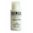
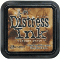
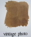
I started with a Eureka Stamps image called Cheerleader. Isn't she cute? I coloured her with Prismacolor pencils and then fussy cut her. The background started as a plain piece of kraft cardstock. I added Vintage Photo Distress ink through the stars on the TCW Mini Punchinella stencil. Next Titan Buff Golden paint was pounced through the circle portion of the same stencil. Script was stamped with an Inkadinkado stamp and Vintage Photo. More Vintage Photo was applied to the edges. A little doodling was done around the edges and some of the stencilled designs.
The sentiment was computer generated, coloured in with Prisma pencils, inked around with Vintage Photo, and matted with brown cardstock. The sentiment was then popped up on foam tape. The little cheerleader was popped up on foam dots so that she sits higher than the words. A length of brown and white baker's twine was wrapped around the atc and knotted in the front. Phew...I did it! All neutrals :)
This atc is dedicated to all of you who have been sharing my crafty journey with me. A great big thanks and three cheers for you all. Be sure to pop over to the ATCs With Attitude blog so you can see the inspiration provided by the rest of the DT following the Neutral Colours challenge. Come join the fun!
Life is good; so is art.
Bonnie
Thursday, May 30, 2013
Dig Deep ~ an eP post
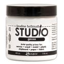
I started by gessoing the pages and then applying a coat of Golden's Titan Buff for a neutral background. next I scribbled over the background with an Inktense block (1800) which is a golden tan. This was activated and spread with a wet brush and allowed to dry with the colour heavier in some places than others. One side of a Stampendous Marble texture cube was stamped all over the pages using Archival coffee ink.
The Dylusions letter jumble stencil had Vintage Photo Distress ink applied through it onto the background. Colorbox Prussian Blue ink was applied over the Dylusions Dotted Flowers stencil to make the blue dots.
I was itching to play with my new stamp, Prima's Mixed Media Doll in the Swing Dress by Julie Nutting. I stamped her once on a piece of Graphic 45's A Ladies' Diary because I wanted her skin to have the advertizing print; once on the dotty paper (Afternoon Tea) for the dress; and once on kraft cardstock for her hair all using Archival Coffee ink. The entire doll was fussy cut and shaded with Inktense pencils which were activated with a waterbrush. The dress was also cut out and shaded the same way. Her hair was coloured with Prismacolor pencils before being cut out. Then she was glued together, named Lindy, and asked to wait quietly while I made her a special space :)
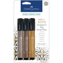
For the background of her tag, I recycled the packaging that came with the stamp. Vintage Photo was applied through the Dylusions Diamond of a Border stencil and half circles of her dress, skin, and platform were adhered to the edges. A scrap of burlap was glued across the bottom of her tag after it was frayed to fit and another G45 scrap was adhered to give her a base to stand on. Lindy was glued in place and then shaded around with an Inktense pencil and water before the tag was applied to the left page. The tag was shaded around with a Big brush pen and smudged with my finger.
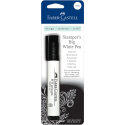
In order to tie the two pages together, more burlap scraps were adhered to the right page. Small circles were punched from the paper remnants and glued here and there. A black zigzag border cut with an MFT die and dotted with a white paint pen was cut apart and placed on both pages. Watercolour paper tear offs were coloured with Spearmint and Cotton Candy gelatos and a watery finger and also adhered to both pages. More of the two gelato colours were spread around the pages this time using no water to smudge them.
The messages from the Donna Downey Empowered Words set were stamped using Staz-on inks in either black or brown. The Strength message was stamped on kraft cardstock, torn around, and inked with Vintage Photo after being crumpled. Bits of washi tape were placed on two edges and a third piece was added to the left page. Black Studio 490 Embossing Paste was applied through the stars on the TCW Mini Punchinella stencil. The larger letters spelling Dig Deep are Idea-ology Alphaparts dotted with white paint pen. A different washi tape was added under each word and again to the left page for continuity.
After a final survey and a whole lot of doodling with Micron and Big Brush pens, a few more details were added. Primitive stars were punched from teal cardstock and scattered throughout the spread. Two metal butterflies were added. A leftover piece of a die cut was added under Lindy's feet to create a more substantial base. White gesso was pounced through punchinella and slightly watered gesso was applied as rings using a lid.
I did try adding a few other elements (tail and feet) to my spread as you can see in the photos but they were eventually removed by the owner who could see that I wasn't buying her artful advice ...uh huh.
Anyway, that's it for Lindy, Molly the art critic, and me today. I thank you for popping by. I am so far behind on visits, comments, and DT projects but I am determined to remedy that soon. In the meantime, I appreciate your visits and comments of support.
Life is good; so is art.
Bonnie
To visit the eclectic Paperie shop and check out many of the products I used on this piece, just click on the thumbnails below.


Monday, May 27, 2013
Fab(you)lous ~ CYP #164
Holy Toledo! Once again I'm recovering from some kind of virus. What's up with that? It's so unusual for me to be ill yet I've had a series of illnesses back to back that have put me in bed and out of commission. Anyway, if I haven't been by to visit you, that's why. Our theme for this week's challenge at Craft Your Passion is Natural Materials. We want to see things like burlap/hessian, twine, feathers, natural elements on your creations. I chose to work with the lovely Sunbather Frog from DRS Designs. She is truly delightful in her bathing costume :) I coloured her with Prismacolor pencils and then cut her out with an MFT die. The background surrounding her was inked with Tumbled Glass and Broken China Distress inks on the top 3/4. A torn scrap of paper masked off the sand area. The other half of the torn scrap was used to mask the sky so that Gathered Twigs Distress ink could be applied to the bottom section. The outline of the die was traced onto brown cardstock and fussy cut giving me the perfect sized mat for the image.
The background of the cream card was covered with a piece of burlap frayed to fit. Across the bottom of the burlap, where the image would go, a piece of cheesecloth coloured with Dylusions Melted Chocolate ink spray was adhered for additional texture. Natural twine was slid through a cut made in the card fold so that it could be wrapped twice and tied behind the image. Small shell buttons were adhered over the twine to the right of the image. The image was popped up on foam dots and had MuddPuddles Malibu Beach sand and Mini Shells applied to the Gathered Twigs ink at the bottom before it was adhered over the background. This added dimension, texture, and more natural materials to the image layer.
The card was finished by adhering three Recollections flowers with starfish button centers to the top left corner. The sentiment, a chipboard piece from my stash, balanced out the bottom left corner...and perfectly summed up my impression of this sunbathing beauty who is, indeed, fab(you)lous. What an awesome b-day or even thank you card this would make.
Speaking of thank yous, I so appreciate you taking the time to visit Miss Froggy and me today. She is enjoying the weather and I am ...well, under it :) But slowly getting better. Be sure to visit the Craft Your Passion Challenges blog to see what the rest of the DT has cooked up for our Natural Materials theme. It's always worth the trip...or click.
Life is good; so is art.
Bonnie
Tuesday, May 21, 2013
Gimme a Little Kiss ~ Alpha/Dictionary Challenge
The Craft Barn is running an alpha/dictionary challenge where they give us a new letter each fortnight and we chose a word in our dictionary to illustrate beginning with that letter. I was getting concerned that I would run out of time to play this fortnight (it's so much fun!) but I squeezed out a little pocket today. The letter this time is K and the word I chose is Kiss.
I decided to feature this Mo Manning image called Kisses...mainly because she makes me smile. I decided to colour her first and work out the background second. She's coloured with Prismacolor pencils and then fussy cut. I decided to go very girly on this one because Kisses asked me to.
The pages were prepped in the usual way: gesso on the pages I'm using and DecouPage to glue those pages to the ones before and after for strength. I scribbled three different pink Neocolor II crayons and one yellow one over the dictionary pages and spread the colour with a waterbrush. Picked Raspberry Distress ink was applied with an applicator tool over a flower stencil and a heart stencil from my stash. The hearts were then shaded with Prismacolor pencil and lined with a white paint pen and a black Micron. A border was stamped using a Fiskars Love Bug stamp and coloured in with Prisma colors. "Mwah" was stamped numerous times using black Archival ink and Hero Arts letters.
Washi tape was glued to the left page to give Kisses a place to stand and then bits were scattered over the two pages to move the eye around. The white MFT die cut piece is actually the reverse side of a border I didn't use the other day. Again it was cut in half (ish) and adhered to each page for continuity.
The letter K is a sticker from my stash and the words were printed on my trusty DYMO labeller. Before Kisses was adhered to the page a small doily was placed behind her for greater contrast and a little more texture. An internet image of a candy heart was printed and then altered with Picked Raspberry ink and a doodle pen before being popped up on foam tape.
The letter K is a sticker from my stash and the words were printed on my trusty DYMO labeller. Before Kisses was adhered to the page a small doily was placed behind her for greater contrast and a little more texture. An internet image of a candy heart was printed and then altered with Picked Raspberry ink and a doodle pen before being popped up on foam tape.
To finish up, white gesso was pounced through punchinella using a scruffy old brush. Watery gesso was used to make rings with a lid to something or other. White lines were made with the same watered down gesso and an old gift card. Doodling was completed with a Pilot pen and a Micron and additional stamping was done with a checkerboard stamp. A little more gesso was brushed here and there onto the pages with my finger.
That's it for Kisses and me today. We appreciate your visit and always love reading your comments. I love that you are coming along on this creative journey with me. I'm off now to link up with The Craft Barn Alpha/Dictionary challenge and to finally have a look-see at what the others have created this time. The suspense has been torture :)
Life is good; so is art.
Bonnie
Poppy Tag at the eclectic Paperie blog
It's my turn to post at the eclectic Paperie blog so today I'm sharing a Poppy Tag that went through the Seven Stages of Ugly before it was finished. If you want to know more, hop over to the eP blog to see lots more photos and get the scoop. Hope to see you there!
Life is good; so is art.
Bonnie
Monday, May 20, 2013
Party Animal ~ CYP #163
We have such a fun theme for this week's Craft Your Passion challenge. It's Party Animals and we want to see images with animals celebrating. My card once again reflects my very quirky sense of humour. I used an image from QKR Stampede. So many of the images there make me laugh and are so much fun to colour. I coloured Monsieur Bunny (Daydreaming Bunny) with Prismacolor pencils and then fussy cut him. I inked the edges with a black Pitt brush pen as usual so that the white from the cut cardstock didn't distract from the rest of his lovely grayness :)

The background papers are from a few sources. The blue is from a Cloud 9 Design paper pack. It has very faint tone on tone vines on it. The green, the cake and ice cream border, and the striped piece are from Paper Wishes Birthday paper pad. The balloons, which were hand drawn, were cut from scraps and popped up on layers of foam tape for dimension. White embroidery floss is tied around the pink balloon and glued in two places to create the curl in the balloon tie.
Rhinestone hearts were used to separate the words on the border and repeat the black from the balloon, and Monsieur's eyes. White dots and faux stitching were done with a paint pen. The top corners of the blue layer were punched with a 5/16 circle punch before that layer was matted on a darker blue cardstock. The word party is done with a Dymo labeller.
Just a simple card but it makes me laugh. He looks like such an enthusiastic bunny so ready to party...or not. Perhaps he's already started partying without us and that's why he looks this way. Either way, it's a fun story. Thanks for stopping by today. Monsieur Bunny would get up to thank you himself but apparently it takes too much effort. Maybe we should start the party without him :) Be sure and pop over to the Craft Your Passion Challenge blog to check out the rest of the Party Animals (and I don't mean the Design Team...LOL)
I am entering this card in the following challenges:
613 Avenue Create ~ #20 Anything Goes
Challenges 4 Everybody ~ #20 Always Anything Goes
One Stitch at a Time ~ #164 Use a Digi
Robyn's Fetish ~ #160 Four legged Friends
One Stop Craft Challenge ~ #229 Anything Goes
QKR Stampede ~ #39 Children's card or gift tag
Life is good; so is art.
Bonnie
Saturday, May 18, 2013
Bee Happy
One of my all-time favourite designers, Mo Manning, is having a design team call. Talk about just under the wire, I just read about it this morning and it closes tomorrow. I have no idea how I missed it! Anyway, since I love any opportunity to colour a Mo Manning image and I'm always so inspired by the DP2 challenge posts I get via email ....and because one of my favourite card-makers is on that team (you know who you are, Tracy MacDonald :D), I decided to throw my hat into the ring. Who knows, right? There are some amazing entries which you can see by clicking on the linkys under the challenge. There is so much talent out there...very cool!
Anyway, we are supposed to make a card featuring our favourite Mo image...which for me is all of them. So I decided to colour up one of the more recent images I got called Baby Fairy Bee. I used my Prismacolor pencils and a little blue metallic gel pen on her wings, and then fussy cut her. Half pearls decorate the ends of her antennae. She was popped up on foam dots for dimension and layered over a hexagon cut with a Spellbinders die from Steampunk Botannica paper by Recollections. A tiny flourish was stamped either side of her using Timber Brown Staz-On. A length of washi tape gave her a base to stand on. The hexagon was matted on brown cardstock to tie in the brown on the ribbon.
The black background layer is textured cardstock punched in the corners using a small circle punch. Two lengths of this fabulous honeycomb twill ribbon were wrapped around the black card base and adhered to the back. A small bee charm was fastened to the card using a brad and Glossy accents. The sentiment a freebie from Bird's cards was computer generated, cut with an MFT die, coloured with Prismacolor pencils, and faux stitched before it was matted on the same paper as the hexagon. To complete the card, tiny white dots from a paint pen were added to the outside edges of the black layer.
Regardless of what happens, I thoroughly enjoyed making this card. Whenever I add a Mo image to a card, tag, or mixed media piece, it makes me smile. That means it's easy to "Bee Happy". Thanks for stopping by today. You know how much I appreciate that. I hope your weekend is wonderful and you get a chance to play.
Life is good; so is art.
Bonnie
Friday, May 17, 2013
Shaken...not stirred (AWA)
There's a new girl in town and she comes with her own martini :) it's time for a new challenge at ATCs With Attitude. This fortnight, we want to see atcs following the theme Frame It. I chose to work with this fabulous image from Sassy Studio Designs called Martini Pin-up which I coloured with Prismacolor pencils. I added Black Diamond Stickles to her LBD and a rhinestone to her ear.
For the background, I applied Tumbled Glass Distress ink to the background, using coloured pencil to darken next to the frame. The frame is a K & Company ephemera piece from my stash. I added gems to the fancy bits at the top and backed it with dark brown cardstock which was fussy cut around the frame. It allowed the openings and pretty edges to stand out more. The sentiment, which Mr. Bond made famous, was computer generated and matted with the same dark brown. Tiny half pearls formed the three dots after the word shaken.
Thanks for joining me today. I appreciate your time, your comments, and your support...you guys are the best. Be sure to check out the rest of the atcs made by my wonderful teamies on the ATCs With Attitude blog. Maybe you'll feel inspired to join in our Frame It challenge.
Life is good; so is art.
Bonnie
Thursday, May 16, 2013
You are loved ~ eTeam Picks
Holy Toledo...here she goes again with all those words and pictures!!
You need to pack a lunch to get through this one :0
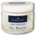
It's time for May's eTeam Picks Challenge at eclectic Paperie. The eTeam Picks Challenge is held on the third Thursday of each month and each challenge is an opportunity for you to be inspired by one of our eTeam’s creations, to share your work, and to be entered into our challenge prize drawing. It's Julie's turn to host this time and she has chosen a product, Gel Medium, for her theme. There are so many ways to use it in a project. I often use it to adhere paper to canvas or in my art journal so I was looking for something different. I chose to feature an image transfer on my canvas, something I have never done before (I live in a very sheltered world...LOL).
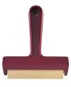
I printed an freebie image from my computer stash...wish I knew where I got it from. It's a lovely vintage image of a little girl which I printed on my ink-jet printer. I fussy cut her and applied a generous coat of gel medium to her sweet face before adhering it to the canvas. I then brayered it for a few minutes and left it to dry for about 1.5 hours. At that point, I used water and my finger to gently remove the backing paper from the image so that all that was left was the ink. This type of transfer gives you an imperfect hazy image which looks a little distressed. I added to that when I got a little over-zealous with my rubbing of the image and rubbed away a chunk of her hair, ink and all. Oops!
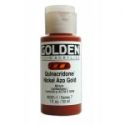
I started the background around the image by painting it with Golden Titan Buff acrylic paint watered down slightly to make it more transparent. Next I mixed Golden Quinacridone Nickel Azo Gold paint with Acrylic Glazing Liquid and applied a glaze over the Titan Buff. While it was still wet, I layered a length of plastic wrap over the canvas and smushed it (technical term) to get wrinkles. I let it dry for 20-30 minutes before pulling off the plastic wrap and then heat zapped it.
You get these awesome creases and patterns allowing some of the undercoat to show through. I repeated the process twice more once with DecoArt Traditions Quinacridone Burnt Orange plus Glazing liquid, and the final time with Americana Dark Chocolate and water. The background was so cool, I didn't want to cover it :)
I adhered Idea-ology Melange Tissue Wrap to the top of the frame and a small chunk to the bottom using gel medium. Once dry, Vintage Photo Distress stain was applied over the tissue and spread with my finger.
To create more texture, watered down white gesso was applied to this lovely textured foam sent by our friend and team-mate, Micki. It created such a fun texture in random places...you can see it best over the tissue wrap at the top.
I had a piece of lace and the zigzag die offcut sitting on my desk, volunteering to join the party so they were adhered under the girl with gel medium. Hmmm, need...more...texture. I cut a small chunk of beige burlap into two tabs and applied some of the leftover paint on them with my finger. They were adhered to the canvas with Scor tape and little metal buttons were affixed to the points. Brown paint and white gesso rings were added in several places making sure to overlap some of the elements to embed them into the background. Three slivers of washi tape were added to the top left and bottom right sides
Hmmm, need...more...metal :) The buttons looked lost without other metal elements to carry the eye around the canvas. I added an Idea-ology metal corner to the top left.
An Idea-ology ornate plate, backed with burlap and cheesecloth sprayed with Melted Chocolate Dylusions spray ink, was added beside the girl with an Idea-ology metal heart below it. The word love was spelled out in stickers inside the ornate plate.
The other metal piece is also from Idea-ology. It's a metal phrase tab which has seam binding threaded through the holes and wrapped to the back. The words were inked in with White Big Brush pen which was wiped off the flat part (mostly) but left in the letters to age the piece. Little dots were placed under each point of the zigzag paper, again using the white Big Brush pen. Love the coverage of this pen. Doodling was done around the edges with a sepia Micron pen, around the image and some elements with a Brown Big Brush pen, and on the zigzag with a gray Big Brush pen. Vintage Photo Distress ink was applied around the canvas edges to create a frame effect.
I had no idea when I started where this piece was going. I only knew that I wanted to try an image transfer. Beyond that, it just sort of evolved from playing. Lots of products, messy fingers, and a willingness to trust the process...somehow it always works. Thanks for hanging in for this super long post. One thing about mixed media...there's usually lots of splainin' to do. Make sure to pop by the eclectic Paperie blog to see Julie's fabulous inspiration project and video. By clicking on the Linky thumbnails that say DT, you'll be able to see what the rest of the team has created, too.
Below are links to products I have used on this project which can be found in the eclectic Paperie store.
Life is good; so is art.
Bonnie
 18px;">
Subscribe to:
Comments (Atom)


