Wednesday, August 26, 2015

Watch out world ~ Rick St. Dennis Mixed Media Spread


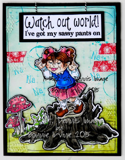
Hi everyone. I had some fun combining three of Rick St. Dennis's images to create this mixed media spread. I love combining images to tell a story.I love the image Bad Bitsy where she is making the classic teasing gesture. I can almost hear her saying the Na..na..part. Who doesn't remember both being the sender and receiver of that message? Bitsy needed to be higher than whoever she was bugging. It's far more effective when you are up on a "stage" looking down at the person...don't ask me how I know this. Ha!I decided to use the tree stump and mushrooms from Rick's Wonderland Elements Set One for Bitsy's soapbox.


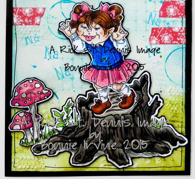
All three images were coloured with a mix of Prismacolor and Polychromos pencils. They were fussy cut singly leaving a narrow white border. A small slit was cut in the trunk so that Bitsy's shoe would tuck in behind it for a more realistic look. The three images were tacked together where they overlapped and then the entire new image was mounted on black cardstock and trimmed again before foam tape was placed on the back to create added dimension.


The background, a 6 x 8 inch rectangle of mixed media paper, was coloured with Tumbled Glass and Broken China Distress ink for the sky and Shabby Shutters plus Peeled Paint Distress inks for the grass. Both of the darker colours were applied through Sheena Douglass' Distress Grid stencil. Water drops were flicked onto the background and then mopped up with paper towel to create light spots. Text stamp was rolled onto the background with either green or blue ink. Bottle top lids were used to create paint rings with Hey Pesto or Inky Pool Fresco Finish Chalk Paint.


The image was adhered to the background and white embossing paste was scraped through TCW's Tiny Circles stencil. The sentiment from Create With TLC seemed like the perfect choice for Bitsy. It was printed on white cardstock, matted with black cardstock, and popped up on foam tape. Two lengths of baker's twine were added to make it look like a hanging sign. Short lengths of washi tape brought the pink up to the top half of the spread. Na...na was stamped with Forget-Me-Not Archival ink around Bitsy...just for fun! To finish the page, a black border was doodled around the edge, Black Big Brush pen used to ink the edges, and black cardstock used to mat the page.

Thanks for stopping by today. I hope you know that Bitsy's sassy gesture is not directed at you...or me for that matter! You must admit, she is enjoying her attitude :) And by the way, have you seen the two fabulous Aadult colouring books which Rick has published? They are amazing...Rhinestones, Furs, & Feathers and The Day of the Dead. Check them out!

Life is good; so is art.
Bonnie

Tuesday, August 25, 2015

Altered Playing Cards Trio


Hi everyone. One of my favourite things to create is an altered playing card. I've been making these for years ever since I took a fabulous online class with the very talented Mary Jane Chadbourne. It's a wonderful mojo spark and I also love to play with them when I have finished a series of projects with deadlines and have nothing looming :) It's sort of a palette cleanser for my brain. It's also a fabulous way to use up all those little scraps of paper, washi tape, fibres, die cuts, etc. that have been collecting on my table.


The backgrounds are all done with Neocolor II crayons, gelatos, Big Brush pens, anything that will get vibrant colour down. It is pure play. Stamping, flicking water or paint, bottle top rings, gift card lines and scuffs are all part of the next layers. I do this all intuitively with no plan and no specific image match in mind. It's very freeing. Layers of paper scraps, cheesecloth, drywall mesh, fabric, punched or die cut shapes are all added to create compositions I like.


Once I have a pile of backgrounds done I either go through some sayings I have collected and find ones I want to illustrate with once of the collage images I have already fussy cut or vice versa. I find an image I want to pair with the background and then choose a saying that I think fits. After that...the outlining, doodling, and finishing embellies and touches. It's a delightful process where I create just for the sheer joy of it!

Thanks for stopping by today. We're all glad that you did :)

Life is good; so is art.
Bonnie

Saturday, August 22, 2015

Sweet Little Vampire ~ Sweet Pea Stamps


This adorable vampire from Sweet Pea Stamps artist Charmaine Flannery just seemed to call my name until I coloured her. Her name is Age of Vampires and she was delightful to colour. The detail as well as her beauty made me smile the whole time.


I coloured her with a mix of Prismacolor and Polychromos pencils. She was then fussy cut leaving a narrow white border, matted with black cardstock, and trimmed out again. This adds strength to the image so that it can easily be popped up on foam tape. It also provides contrast with the busy background as well as visual weight.


The background began as a 6 x 8 inch rectangle of mixed media paper. The paper was spritzed with water and yellow, orange, and red Brusho crystals were sprinkled into the puddles and spritzes. The paper was tipped this way and that to get blending of the colours. Black Brusho crystals were also added in a couple of places but the black ended up more diluted than I wanted. Once it was dry, I added black ink over the same areas and allowed it to run horizontally and vertically to create a cool graphic look.


Two drippy borders were die cut: one from red cardstock and one from black. They were cut on an angle so the drips got closer to her head as the border went from left to right. They were adhered slightly offset so that the black created a shadow for the red. The sentiment was computer generated and made me laugh. It was printed on white cardstock, die cut, and  matted with black. It was then faux stitched.and popped up on foam tape for dimension. To finish the page, Black Big Brush pen was used to edge the background before it was matted with black.

Thanks so much for stopping by today. To see more of Charmaine Flannery's gorgeous images as well as an absolute ton from other equally amazing artists, please visit Sweet Pea Stamps. You are sure to be inspired!

Life is good; so is art.
Bonnie


Thursday, August 20, 2015

Alice in Wonderland Shadowbox ~ Part 2

And we're back..Haha! This is the second post showing the Alice in Wonderland shadowbox that I created using mainly the Tenniel style images. The first 6 cubbies and info on the background are in this post from yesterday.


This scene with Alice and Chessie is very simple. I used the two images and featured a chipboard tree branch which was coloured with sprays and shaded with Archival ink.


I wanted a library background for this cubby so I sized a bookshelf image, punched a little floor mat, and used mini Scrabble tiles to spell Alice.


An image from Etsy was fussy cut and matted in black before being popped up on foam tape like the other images. Die cut vines, a blue butterfly, and wording from the book helped set Absolom's scene.


This image is from Pool of Tears where Alice ends up swimming in her giant tears. The Explore arrow is made from wood and the rabbit's fan is folded from origami paper.


Oh dear, this poor fellow has to get the roses painted red before the Queen comes along.The fence and grass were die cut. The roses are metal and were first painted with gesso and then red paint. A little extra red was added to the image because I think he paints messy like me!


China teacups from an actual child's set were stacked in front of Hatter and the March Hare. I like the effect layering dimensional pieces gives to the occasional cubby.

 And this is the finished project complete with the door and a few little extras on top. The cat's face reminds me of Chessie, the tea pot and cup for the Hatter and friends, and the gloves and watch for the White Rabbit. Thanks so much for stopping by. I had a blast creating this shadowbox. It was one of those projects Just For Me...something in my head that just had to get out :)

Life is good; so is art...and Alice in Wonderland.
Bonnie

Wednesday, August 19, 2015

Alice in Wonderland shadow box ~ Part 1


Hi everyone. I have been playing with a shadow box for a while now and I finally finished it. I had the idea to fill each cubby with one of the scenes from Alice in Wonderland...still one of my favourite books. The shadow box started out as a taupe colour but I wanted black to make the scenes pop so painting it was the first order of the day.


The back piece came off so I tore out pages from one of my many AIW books and collaged the sections onto the background, adhering them with gel medium. Once dry, I set the front back onto the backing, marked the squares on the text paper and used Vintage Photo Distress ink to deepen and age the edges of each square.


From there, it was a matter of choosing twelve characters/scenes and finding the appropriate digital downloaded images. Some came from Etsy, some from Alpha Stamps. I must say I have a large collection so it was easy to find what I wanted.


I decided not to worry about the order...I wasn't trying to retell the story. I only wanted to have a reference to parts I like and to have fun in the creating...which I surely did.


I took the cubbies one at a time starting with the characters first. These were fussy cut and matted in black to help them stand out against the text as well as giving them strength. They were then popped up on foam tape.


I kept the additional background elements simple so as not to compete with the colourful images. I knew once all twelve cubbies were finished that it would look busy so simple was good.


So here are the first 6 of the twelve squares. Come back tomorrow to see the other six and the finished (door and all) project. Don't be late...LOL.

Life is good; so is art.
Bonnie

Monday, August 17, 2015

Gear Up ~ One Sweet Challenge Mid Month Reminder


Hi all. It's time for the mid-month reminder of our August challenge at One Sweet Challenge. This month our theme is Back to School...not in the traditional sense but as in trying out a new technique or medium. I love this as there were a couple of things I wanted to try and this gave me the little push I needed. This time it was using alcohol inks (not new) on Yupo paper (new to me). It's awesome!


The Sweet Pea Stamps image I chose to feature for this project is Holly Durr's All Aboard. I am such a fan of her images and always enjoy creating anything steampunk. I coloured her with a mix of Prismacolor and Polychromos pencils. A little Glossy Accents was added to the charm hanging from her tunic. She was then fussy cut leaving a narrow white border and matted with black cardstock. Foam tape was added to the back of the image to add dimension.


The background began with a 6 x 9 inch rectangle of Yupo paper which I have never used before. I had seen it on a YouTube video on Joggles' channel and was able to purchase a pad of Yupo at an art store. It looked like too much fun not to try it! Yupo is a coated paper which causes alcohol ink to react in cool and somewhat unpredictable ways. A drop spreads like crazy and gets a halo of another colour around the edges. When dropped close together, you get organic shapes where one pushes into the other. If dropped on top of each other, you get the coolest rings. So fun! I let it dry thoroughly and then stamped some gears over top using black VersaFine ink. The only thing you have to watch is how slippery it is when you set the stamp down. It was also slow to dry so I sprayed a fixative over the stamping before moving on.


Black cardstock was embossed witha TH folder and Treasure Gold, Silver, and Copper were rubbed over the raised pattern to highlight it and create an industrial feel. This was torn into three scraps and adhered onto the background. Metal and cardstock gears, a metal clock face, propeller, and key were all adhered to the background with Glossy Accents. The wording was added with Idea-ology Alpha Tiles. To complete the page, black cardstock was used to mat and frame the piece.

Thanks for stopping by today. To see the other fabulous creations by my teamies, pop over to One Sweet Challenge blog. It's worth the click! You still have two weeks until this challenge ends. We sure would love to have you join us!

Life is good; so is art.
Bonnie

Saturday, August 15, 2015

You Ought to be in Pictures ~ The East Wind Challenge


Hi everyone! We have a brand new challenge theme on The East Wind Challenge blog today. Our theme for #37 is You Ought to be in Pictures. We want to see your creations inspired by a movie and be sure to let us know which one. One of my favourite movies of all time is still The Princess Bride As many times as I've seen it, I still laugh. I decided that Aurora Floral Kiss would make a fabulous Buttercup.


I coloured Buttercup with a mix of Prismacolor and Polychromos pencils. I used a little mound of Liquid Pearls in the center of one of the purple flowers. Can you guess the colour of that? Why, Buttercup, of course :) She was then fussy cut leaving a narrow white border and then was matted with black cardstock and trimmed out again. Foam tape was added to the back to add dimension.


The background started as a 6 x 8 inch rectangle of blue patterned paper to which I added texture with paint and bubble wrap as well as stamping with Cornflower Archival ink. Layered over that was patterned paper and book text scraps. White gesso was used to knock back the text. Doodling and rub ons added some black detail. Die cuts and punches were used to create hearts from ink spritzed paper which were added in three places. The writing is a quote about Buttercup from the movie. It was printed onto white cardstock, cut into segments, and matted in black. Foam tape was used to adhere the segments to the background.


The title Buttercup was created with puffy glittered letter stickers. A doodled border as well as black Big Brush pen were added to the outside edge. Black cardstock was added as a mat to frame the piece and add strength.

Thanks for joining Buttercup, AKA Aurora, and me today. We are delighted that you did. When you get a chance, pop over to The East Wind Challenge blog to see the other fabulous DT responses to the You Ought to be in Pictures challenge. We would love to see you join us.

Life is good; so is art.
Bonnie


Wednesday, August 12, 2015

Imagine ~ A Rick St. Dennis mixed media page


Hi everyone. As soon as I saw this fabulous man in the moon image created by Rick St. Dennis for Bonnie's Celestial Collection, I had this vision of a fairy swinging from him. How magical would that be? And of course, some very friendly stars from the same digi sheet would be cheering her on and keeping her company. The Star Fairy image seemed the perfect one for the role.


I coloured the three images with a mix of Prismacolor and Polychromos pencils, adding white paint pen dots to the sweet fairy. All images were fussy cut leaving a narrow white border, matted in black cardstock, and then trimmed out again. Star fairy was given a string, created from a scrap of designer paper shaded with Big Brush pen. her swing was attached to the Man in the Moon with black and white twine. Foam tape or dots were added to the back of each image to provide dimension with the moon and fairy lifted the highest.


The background began as a 7 x 10 inch rectangle of mixed media paper. It had to be bigger than usual to fit everybody in :) Witch's Potion Purple, Afternoon Delight Denim, and Delphinium Turquoise Lindy's Starburst Sprays were spritzed onto the paper lightly to allow the white to show through. Stamping was done with a splatter stamp and  Forget-Me-Not Archival ink as well as Dusty Concord Distress ink on a swirl stamp. White embossing paste was scraped through TCW's Tiny Circles stencil to add more texture.


Before Star Fairy was adhered to the background, a length of cheesecloth was added behind her to create a cloud and add interest. The word Imaging was created with TH AlphaParts letters accented with white dots. Two black photo corners were added to opposite corners of the background and the page was matted with black cardstock to frame the piece.


Thanks for joining Star Fairy, her friends, and me today. We appreciate that! All of these images are available in Rick's Zibbet shop, along with an absolute plethora of other inspiring images. I would love to see where your imagination takes you!

Life is good; so is art.
Bonnie

Monday, August 10, 2015

To the Moon ~ Sweet Pea Stamps Progressive Challenge Part 2


Hi everyone. It's time for Part 2 of the Progressive Challenge on Sweet Pea Stamps Friends &Fans  Facebook group. If you played along with Part 1, you will have received this awesome image by Courtney McAnsh called To the Moon and Back which I adore. That is the image we are all playing with this time. If you didn't get a chance to play along with the first part, you can still join us this time as the image is available for purchase at Sweet Pea Stamps.


I coloured Mr. Moon with a mix of Prismacolor and Polychromos pencils. He was then fussy cut leaving a wider than usual white border to accommodate the writing. An extra wide black mat was added to the image for contrast and to give him a little more visual weight.


The background began with a 6 x 8 inch rectangle of mixed media paper which was sprayed with Afternoon Delight Denim and Delphinium Turquoise Lindy's Stamp Gang Starburst sprays. Love the mica shine from these. Once dry, pattern was added with Forget-Me-Not Archival ink and Joggles Latin text stamp. Platinum brilliance ink was used with Joggles Sparks background stamp to randomly create more texture and glimmer. Stars were punched from old book text paper and adhered and outlined. Slight yellow colour was added with an Inktense pencil and a water brush.


Bottle lid rings were created with Dylusions Black Marble paint and black die cut arrows with gel pen writing brought movement and attention to the focal image. A border was doodled around the page before black Big Brush pen and cardstock mat were added. Blue and white washi tape was added in two places and topped with orange sprayed paper scraps. A heart was cut from the same scrap and added to the intersection of the two rings...like a Venn diagram showing that Love is what the two parts have in common. It also completes the orange visual triangle. Black gems were added to the ends of the arrows to indicate more movement and Mr. Moon was adhered with foam tape.

Thanks for stopping by today. Mr. Moon and I appreciate that. be sure to pop over to Sweet Pea Stamps Facebook group to see how others have featured this awesome image. We would love to have you play along, too.

Life is good; so is art.
Bonnie

Tuesday, August 04, 2015

You Go Girl! ~ New release at The East Wind


Hi there! The East Wind releases a new image every Tuesday and Friday and today I got to play with one. She is called Ha Ha Ha and looks absolutely filled with joy. I coloured her with a mix of Prismacolor and Polychromos pencils using fabulous summer brights on her clothing, hat, and shoes. I wanted the image to shout fun & funky :) She was fussy cut leaving a narrow border of white and then matted with black cardstock and trimmed out again. Foam tape on the back lifted her off the background slightly.


The background is an absolute riot of colour and pattern...even for me. I scraped Cut Grass, Fresh Lime, and Vibrant Turquoise Dylusions paint over the 6 x 8 mixed media paper with a plastic gift card. Once that layer was dry, Black Marble paint was sponged through TCW's Mini Chevron stencil. Baltic Blue Fresco Finish paint was sponged through Dylusions Dotted Flowers stencil for another contrasting layer. Black Marble was also used to make the bottle top rings...great consistency for these.


I wanted to create the illusion that HHH was sitting on some steps so I overlapped three lengths of washi tape to create this. These gave her a place to sit and grounded her so she wasn't floating. It also helped her stand out by creating a bigger focal point. The sentiment was created with white Thickers to which I added white paint because I wanted a really crisp white to break up the busy background. She looks like she is pumping her fist so the sentiment seemed appropriate.


To add more black to the background, giving the eye more places to rest between patterns and colour, I die cut three painty splotches from black Cardstock using TH Scribbles and Splats die. Three enamel dots were added to the top right corner for balance. The edges of the background were coloured with Black Big Brush pen and the entire piece was matted in black to frame it and keep the eye from wandering off the page.

Thanks for joining HHH and me today. It's always a treat to have you visit. To see other inspiration projects using this same fun image, pop over to The East Wind Facebook group where others on our team are posting about their creations. This particular image would be awesome for our blog challenge theme of Summer Lovin' ! Hint! Hint!

Life is good; so is art.
Bonnie

Monday, August 03, 2015

It's the Little Things ~ One Sweet Challenge post


Wow! seriously, is it August already? I feel like Rip Van Winkle...I keep losing days and weeks. If I'm sleeping them away, why am I still so tired? LOL Anyway, since today is the first Monday of the new month, we have a new challenge theme at One Sweet Challenge. Our theme for this month is Back to School but not in the traditional sense. This time we are going back to school by learning and experimenting with a technique or medium that is new to us. I love having that little push to try something new! My something new is Brusho Crystals which aren't new to  the world but are to me. I bought them a while ago but never experimented and just played with them until now. They are tiny crystals of colour which when activated with water give the most glorious rich hues. Yum!


I wanted to colour this gorgeous image from Sweet Pea Stamps called Blueberry Fairy by Holly Durr. Holly Durr creates these gorgeous faces,delightful hair, and wings. I cannot resist her images. I coloured BB (blueberry) with a mix of Prismacolor and Polychromos pencils. The photos don't show it very well but her wings are a blend of turquoises and green. There are actually four colours on each feather. BB was then fussy cut leaving a narrow white border, matted in black cardstock, and fussy cut again. She was then popped up on foam dots to give her dimension and create a shadow around her.

The background began with a 6 x 8 inch rectangle of mixed media paper. This was the first time I tried using only one colour of Brushos (Purple) and varying the intensity with the amount of water I added. I tipped the paper to get bigger runs and then used the TH Spritzer tool to get the tiny drips. White embossing paste was scraped through TCW's Mini Netting stencil. I love how it picked up some of the Brusho purple from the background...cool effect. Stencilling was also applied using Forget-Me-Not Ranger Archival ink and Memory Box's Alpha Crumble template. Black rings were added with Black Marble Dylusions paint and a bottle lid.


Two different patterns of washi tape were added in three spots and faceted jewels layered on top of the left side flags. The sentiment was computer generated, printed on white cardstock, and matted with black. Foam tape on the back of each segment gave them a little dimension. Black Big Brush pen was used to edge the background which was then framed with a black mat.

Thanks for joining BB and me today. That might seem like a little thing to you but to us it's huge. When you get a minute, pop over to One Sweet Challenge blog to see what the rest of my talented teamies created and what they chose to experiment with for our Back To School theme. Remember to stop by Sweet Pea Stamps as well. There are always new images and I always come away from a browse with inspiration galore...not to mention new images too :)

Life is good; so is art.
Bonnie