Wednesday, November 28, 2018

Bookworms Rule ~ inspired by a Vera Lane Studio image


Hi everyone. I am a huge bookworm like my dad was...have been since I was little. Reading has always been a great source of enjoyment and I love to hang out in bookstores and libraries. Most of all, I love curling up on the couch in the den with my current book in hand. When I saw this fabulous image from Vera Lane Studio called Book Lover, I knew just what saying I wanted to pair with her. This one makes me laugh because quite often reading one more chapter postpones whatever action I fleetingly thought of taking. You know what I mean! You've probably played that "Just 10 more minutes" game :)


I coloured Book Lover, the book she's reading, and the stack waiting to be read using a mix of Prismacolor and Polychromos pencils. Her dress dots were created with a Posca paint pen. The images were fussy cut leaving a white border, matted in black, and trimmed out again to leave a narrow black border to help everything stand out against my usual busy background.


The journal I'm working in has 6 x 6 inch watercolour paper which stands up so well against anything I throw at it...or on it. I began by gessoing the page and, once dry, I adhered torn pieces of vintage text in overlapping layers with gel medium, leaving lots of white space. Gesso was brushed over the text to make it blend into the page. Next I fingerpainted  different areas with Dina Wakley Blackberry Violet, Ruby, Lapis, and Lemon Media Paint as well as Liquitex Brilliant Green acrylic paint to pull colours from my colouring into the background. I also added the green lines here and there with the edge of a gift card.


Stamping was applied using a Kaisercraft Texture Plate and Jet Black Archival Ink and circles were added with a bottle cap and Black Media paint.Texture Paste was scraped through a piece of drywall mesh in three places and left white to add some brightness to the paint. Once dry, a couple more skinny torn strips of text were adhered to the page to give Book Lover a place to rest and bring some of that embedded text pattern to the surface again. A doodled border, Jet Black Archival Ink, and Black Big Brush Pen were added around the page to frame it.


The wording was printed onto white cardstock, cut into segments, and matted with black cardstock. Three black gems were used to create the pause dots after Bookworms rule the world. The final step to finishing the page was to add those three black semi circles to the left side of the page. It seemed to create better balance and to better draw the eye to Book Lover's sweet face.

Thanks for popping by today. Book Lover and I appreciate it...so much so that she even looked up from what she was reading...at least for a moment. LOL

Life is good; so is art.
Bonnie


Monday, November 26, 2018

Come here, Beautiful ~ inspired by Vera Lane Studio images


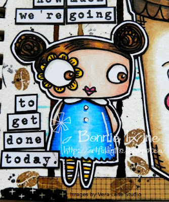
Hi everyone! Those who know me IRL or who follow me here know that I am a huge coffee fan, although I limit myself to two or three a day. As soon as I saw Janet's Coffee Cups images at Vera Lane Studio, I knew I had to art journal with one of them (there's also a boy coffee cup) because I had an awesome saying just waiting for the right images. I searched through the VLS shop to find the one I wanted for the coffee lover and finally decided on Kadee and KatI loved how she was looking sideways at the cup, inviting it over.


I coloured Kadee and Coffee Cup with a mix of Prismacolor, Polychromos and Luminance pencils, re-outlining and highlighting with black and white Posca pens. Both were then fussy cut leaving my usual narrow white border and matted on black cardstock.


The images were then fussy cut again leaving a narrow black border so that I could go as busy as I wanted on the background and they would still pop.


For the background, I dripped Vintage Photo re-inker along the top of the 6x6 inch watercolour page and spritzed with water to get it to drip. Some tipping of the page helped this process along as did a little puffing of air from my TH tool. Coffee Archival Ink was applied through TCW Mini Texturized stencil to create very faint circles in the white areas. Forget-Me-Not Archival ink was applied through Kaisercraft Dots and Dashes stencil to pull the blue from Kadee's dress into the background.


To give Kadee and the cup a place to stand and ground them, two patterns of washi tape were layered along the bottom edge.


The very wordy saying was printed onto white cardstock, cut into individual words which were then matted with black. They were auditioned in several configurations once Kadee and the cup were glued down until finally I settled on this one. Once the wording was adhered, a Technique Tuesday coffee bean stamp was applied here and there using Coffee Archival Ink. The edges of the page were darkened with Black Big Brush Pen and then Jet Black Archival to fade the black into the page a little more. Finally an enamel star was placed between the first two sections of the saying to break it up and also draw attention to how she feels about that big beautiful Coffee Cup :)

Thanks so much for popping by today. Kadee, Coffee Cup, and I appreciate it. There is still a little time if you want to play along with the coffee themed ATC swap on the Vera Lane Studio Facebook group. I would if it wasn't for our rotating postal strikes in Canada. The entries in the album are fabulous and great sources of inspiration :)

Life is good; so is art.
Bonnie

Wednesday, November 21, 2018

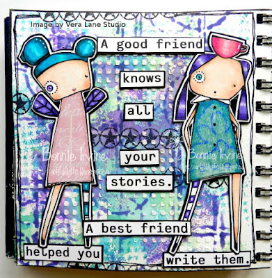
Friends ~ inspired by two Vera Lane Studio Images


Hi everyone! I created another art journal page in my 6 x 6 inch watercolour book, again featuring images by Vera Lane Studio. The images for this page are called Adorabelle (the one with wings) and Margaux (the one with a cup on her head). I've been having fun both with this size of page and also playing with messy wet layers since the watercolour paper can handle it.


Margaux and Adorabelle were printed onto Neenah Solar White cardstock and coloured with Prismacolor and Polychromos pencils. Their lovely dresses were paper pieced and shaded/highlighted with the same pencil brands plus a little white Posca pen.


They were then fussy cut leaving my usual white border and then matted with black cardstock and trimmed out again. This guarantees they will stand out against the background.


To create the background, I smushed three separate layers of Distress Oxide onto my craft sheet, one at a time, spritzed the ink with water and then dipped the page into the diluted ink. I made sure to dry in between each layer (Broken China, Cracked Pistachio, then Wilted Violet. This kept the layers distinct and the water also activated the oxidation effect. Once the last layer was dry,  Deep Purple Archival Ink was applied through Studio Light Mask MB04. Forget-Me-Not Archival Ink was used to apply the Carabelle Studio repeated star stamp in several places. Jet Black Archival Ink was used to stamp the TH circle star images. Texture Paste was scraped through Dina Wakley's Plastic Canvas stencil to create dimension and texture.


Margaux and Adorabelle were adhered to the page after the bottom two quote sections were glued in place. I wanted them to have places to rest their stylish shoes so they weren't floating. All sections of the wording were printed on white cardstock, trimmed close to the letters, and matted with black cardstock to help them pop against the busy background. A doodled border was added to the outside of the page before Black Big Brush pen was used to darken the white edges.


Thanks for stopping by today. Margaux, Adorabelle, and I all appreciate that. It's always lovely to have friends visit. To all of my American friends, Happy Thanksgiving tomorrow. I hope your day is filled with family, friends, and yummy food.

Life is good; so is art.
Bonnie


Monday, November 19, 2018

Two more collage pages - inspired by One Crabapple images


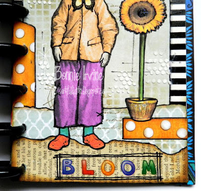
Hi everyone. I have a couple more pages using the bits and pieces from collage sheets by an Etsy seller called Art Tea Life (One Crabapple). She has awesome sheets with separate body parts and other elements so you can creatively put together your own style of images.


The pages are almost traveler's journal size, just a little wider because I wanted the extra real estate for borders. The background started as fairly neutral but thin designer paper which I folded in half and punched with a planner punch so they could be disc bound.


The background was then stamped and/or stencilled with paint or Archival ink before clear stickers, rub-ons, and scraps of music paper were added. I used strips of paper, some pre-printed borders, washi tape...really anything that would work to frame the pages.


Penwork was added with black and white Posca pens. The butterflies and the semi-circles were punched, as were the flowers. Black Big Brush pen was used to darken the edges and further frame the pages.


The wording on the pages were Tim Holtz stickers which were adhered to the pages with additional glue so they would stay put.


Thanks for stopping by today. My quirky little friends and I appreciate that. None of us get out much...LOL.

Life is good; so is art.
Bonnie

Friday, November 16, 2018

Attitude is the Difference - Inspired by a Vera Lane Studio image


Hi everyone! The first thing I thought of when I saw this fun image from Vera Lane Studio called Little Boy was that he would be awesome on a coffee themed journal page. He looks like he's totally jacked up on caffeine and raring to go. Then I found this amazing quote which made me stop and think (love quotes like that). I knew I wanted to art journal about it because it really rings true for my experience with health issues over the past year. Attitude makes all the difference in the world and staying positive was one of the best gifts I gave myself as well as those around me. I looked at Little Boy in a different light, seeing him as ready to face whatever with a positive frame of mind and a sense of "bring it on...I've got this!" He's jacked up on life. Now I love him even more :)


I coloured Little Boy (LB) with a mix of Prismacolor and Polychromos pencils. He was then fussy cut leaving my usual narrow white border, and matted with black cardstock to create a narrow black border as well. I create very busy backgrounds and this double border frames the image and helps it stand out against the colours and patterns.


The colours used on the image became the jump off point for the background. I sprayed the 6 x 6 inch watercolour paper with water to hold the crystals in place, sprinkled Brusho crystals (Turquoise, Lime, and Leaf Green) here and there, and then spritzed with more water to blend and create drips. Once dry, a baby wipe was used to remove some of the paint in several places by rubbing it through the openings of Badass mini stencil 2013. This lightens those areas you are scrubbing and leaves a pattern behind. Next I figured out approximately where LB would be positioned on the background and applied Ranger Texture Paste through Badass mini stencil 1037 which is the trail of stars and the star clusters. To brighten them, white acrylic paint was stencilled over the Texture Paste once it was dry. Black pen outlining helped the stars stand out.


Before the image was adhered to the page, pieces of drywall mesh were placed in three spots to help lighten some of the more solid areas. Two different washi tapes were overlapped to give LB a place to stand so he wasn't floating. The wording was printed on white cardstock, cut into segments, and matted with black before being adhered around LB. White paint pen dots were added in a few areas, again to break up and lighten the background. Jet Black Archival ink and Black Big Brush Pen were used to edge the page helping to frame it. A  doodled border was added with black pen to finish off the page.


I had such fun with this image and the page. It will serve as a wonderful reminder of how humour and looking for the lessons and good in a situation helped me through some challenging times and usually changed what could have been just an ordeal into an adventure with more good memories than bad attached.

Life is good; so is art.
Bonnie

Wednesday, November 14, 2018

A little collage work


Hi everyone! Today I thought I would share a couple of my collaged journal pages. I created these when my hands wouldn't cooperate for colouring or doing much doodling because of the side effects from treatments. I still wanted to make art because that helped me find the joy and kept me sane (ish) so I turned to straight collage using printed images.


I re-discovered my love for the collage sheets by an Etsy seller called Art Tea Life (One Crabapple). She has awesome sheets with separate body parts and other elements so you can creatively put together your own style of images. I had so much fun auditioning bits and pieces until I arrived at what I wanted for each page.


I had a pad of thinner designer paper which I was unlikely to use for anything else. I cut the 12 x 12 papers to 9 x 8.25 inches which is a little wider than a traveller's notebook size. After I created my focal image and tacked her together, I chose one of the cut papers, folded it lengthwise and began to make it my own. Stamping and stencilling with both inks and paints was followed by adding borders of washi tape or paper scraps.


Details were added to both the background and the image with scraps or bits and bobs left over from other projects. Some were die cut, some punched, some rub-ons and some were gems or enamel stickers. I just played and had fun. I also added outlining  with black pen to make things stand out or add my own spin.


The wording on most pages was TH stickers or other sticker alphabets, although stamped letters and acetate words were also used. Anything that was easy, simple, and involved little fuss was fair game. I decided to use my planner punch to create the openings for these pages to be joined together with discs which ended up being a pain. The punch wouldn't go through the multiple layers of paper at the edges so I will soon switch to a similar size but less fiddly format which I will show at a later date.


I do love the size of these pages and how well the Art Tea Life images fit on the pages. I also love the quirkiness of the characters, although I have kept them fairly tame so far. They are a great way to express myself creatively and even though my hands are improving, I know I will continue to play...just for the sheer fun of it.

Life is good; so is art.
Bonnie

Monday, November 12, 2018

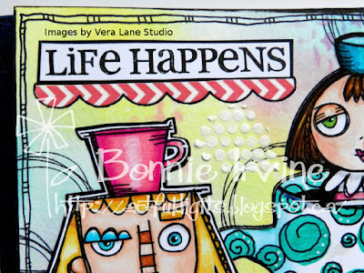
Coffee Helps - Inspired by Vera Lane Studio images


Hi everyone! I thought that this was going to be the month where I finally participated in the Vera Lane ATC exchange on the VLS Facebook group but with our continuing rotating Canadian Postal strikes and the back-up of mail still to be delivered, I figured I'd better wait. I wouldn't want my partner to be waiting forever to get my mail. Anyway, I decided to go ahead and use November's Coffee theme, always a favourite of mine, for an art journal page.


I coloured two Vera Lane Studio images, Barista and one from The Girls on the Block, with my Prismacolor and Polychromos pencils and fussy cut them. For Barista, I left a narrow white border and then matted her with black cardstock which I cut again, leaving a narrow black border.


The Girl on the Block, I trimmed without a border because she already has a thicker black outline. I wanted her rising out of a cup of coffee, so I cut a cup shape from a previously gel printed paper, doodled some black and some white pen on the circles, and shaded the outside edges with Garden Patina Archival Ink. The coffee was coloured with a Big Brush Pen and then a slit was cut between the coffee and the cup so she could be inserted. The edges of both the cup and the girl were darkened with black Big Brush Pen.


The page background was created with Picked Raspberry, Squeezed Lemonade, and Peacock Feathers Distress Oxides applied with Blending Tools. Water droplets were flicked onto the blended inks which removed the colour in spots. Picked Raspberry was applied through a Studio Light stencil (Mask MB03) and Jet Black Archival rings were added using my Bokeh Dots stamp.To gibe Barista and the cup a place to stand, a scrap of left from a previously created background was matted with black and adhered along the bottom edge of the page.


A doodled border was inked in with black pen and the images were adhered to the background. The computer generated wording was trimmed and matted with black. Both sections were adhered with a scalloped washi border underneath to tie in the pink from the girls. Finally, molding paste was scraped through Joggles Punchinella Quintet stencil, and the page was edged with black Big Brush Pen.

I love the way these two images combined. The looks on their faces seems to fit the wording and make me smile. And bonus...I used up two of my scrap pieces...2 down; 8 bajillion to go...LOL

Life is good; so is art.
Bonnie

Thursday, November 08, 2018

Stop Thinking - inspired by a Vera Lane Studio image


Hi everyone! It had been so long since I had created an art journal page from scratch with an image I coloured and a background I created that I felt a little overwhelmed and kept procrastinating. My hands, although better than they were, are still not back to "normal" so I was lacking confidence. By nature, I am an intuitive art journaller...I rarely have more than a thread of an idea of what I want to do and just go where the page takes me. The problem was that I was over-thinking the whole process and kept getting in my own way. Finally I decided to just start and stop thinking :) It worked!!


I coloured this fabulous image by Vera Lane Studio called Heads and Borders using my Prismacolor pencils. I added white highlights and darkened the black lines with Posca paint pens and then cut her out. I punched the earrings out of a scrap of green mop-up paper, used an Inktense pencil to shade, and added Glossy Accents to give them a shine. Love her!


She was destined to star on the first page of a 6 x 6 watercolour journal. I used a large mop brush to lay some water in a loose rectangle making sure to leave white space around the edges. Using blue and green Koi watercolours, I filled in the background blending in some places and leaving the colours pure in others. Once dry, I again used my black Posca paint pen to doodle a checkered border around the watercolour. The stencilling on the background was done with a BadAss stencil and Viridian Archival ink. Stamping was done with Garden Patina, Manganese Blue, and Jet Black Archival inks.

The wording, a reminder to myself and perfect for the first page of an art journal, was done on the computer, fussy cut, and matted with black cardstock. Both the wording and the image were adhered to the page with Fabri-Tac glue. I added a little date and called it done :) Not only did I clear that hurdle I had set up for myself but I also had a blast doing it. Go me!

Life is good; so is art.
Bonnie
Monday, November 05, 2018

Scrappy Bookmarks


Hello...long time no post! I thought it was about time I tried to breathe some life into my abandoned blog and try to resuscitate it. I have had quite a year health-wise and because of side effects from  chemo, I had huge problems making my hands do what I asked of them. They seem to be getting better (I can actually type now) so I thought I would share one of the ongoing projects I was able to do when I couldn't do my normal art. Collage really seemed to be the answer because it's less precise than say colouring or painting, it could be done in small time segments, and I have an over-abundance of scraps which I have been hoarding (like many other people I know).

Anyway, I decided to make  2 x 6 inch bookmarks on kraft paper backgrounds. There was a lovely volunteer named Donna at Cancer Clinic and she was a wonderful ambassador for my cause which was to brighten the day of chemo and radiation patients and their families/friends in any small way I could. She passed out the bookmarks to people waiting for appointments or treatments along with a hug and some kind supportive words. It felt like a win/win for everyone: for me because I was doing something so positive, to the receivers who were going through some of the toughest times in their lives, and to Donna who was the spreader of joy. I included a message on a heart explaining the thoughts, caring, and wishes behind the bookmarks, and the hope that, like Donna and me, they would take an opportunity to "pay it forward" when they could.


The bookmarks were created from things I already had in my stash...little left-over bits of  designer paper, book text, stamped paper, and lace. Ephemera from collage sheets or from packs I already owned, old buttons, rub-ons...I used anything and everything especially if it was in my too-good-to-throw away bin or sitting in a heap on my desk. Lots of TH Small Talk and Chit Chat Stickers came into play as well as a bunch of simple black outlining. The edges front and back were inked with Coffee Archival and faux stitched with black pen to finish them off.


I probably made close to 100 over the past 5 months and found joy in both the creating and in the giving. The art kept me sane and it felt wonderful to be thinking of others instead of dwelling on what I was going through. And guess what? I made a dent in my scrap and bit boxes...although I know that it's only temporary...LOL

Life is good; so is art. (I believe this more than ever )
Bonnie