Showing posts with label altered playing cards. Show all posts

Tuesday, August 25, 2015

Altered Playing Cards Trio


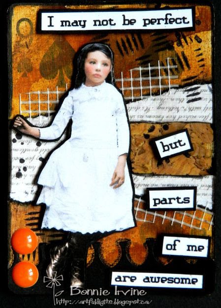
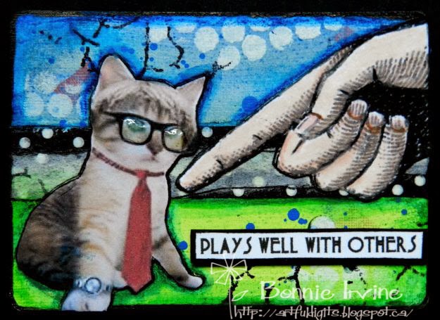
Hi everyone. One of my favourite things to create is an altered playing card. I've been making these for years ever since I took a fabulous online class with the very talented Mary Jane Chadbourne. It's a wonderful mojo spark and I also love to play with them when I have finished a series of projects with deadlines and have nothing looming :) It's sort of a palette cleanser for my brain. It's also a fabulous way to use up all those little scraps of paper, washi tape, fibres, die cuts, etc. that have been collecting on my table.


The backgrounds are all done with Neocolor II crayons, gelatos, Big Brush pens, anything that will get vibrant colour down. It is pure play. Stamping, flicking water or paint, bottle top rings, gift card lines and scuffs are all part of the next layers. I do this all intuitively with no plan and no specific image match in mind. It's very freeing. Layers of paper scraps, cheesecloth, drywall mesh, fabric, punched or die cut shapes are all added to create compositions I like.


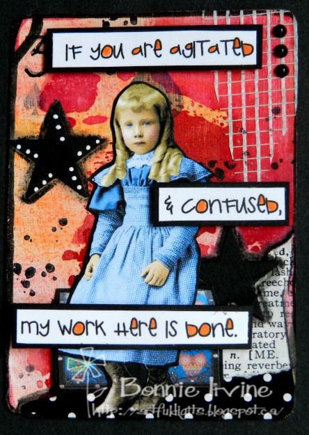
Once I have a pile of backgrounds done I either go through some sayings I have collected and find ones I want to illustrate with once of the collage images I have already fussy cut or vice versa. I find an image I want to pair with the background and then choose a saying that I think fits. After that...the outlining, doodling, and finishing embellies and touches. It's a delightful process where I create just for the sheer joy of it!

Thanks for stopping by today. We're all glad that you did :)

Life is good; so is art.
Bonnie

Friday, April 03, 2015

Altered Playing Cards ~ JFF


Hi all! I have a few more altered playing cards which I completed just for the sheer joy of it! I love playing with these little pieces of art and creating little stories for them inside my head. I will soon have to prep another deck of cards...not my favourite part but a necessary step. I like to have them ready to play with so that when I have time or the mood strikes, they are good to go. As usual, the backgrounds are a mix of Neocolor II crayons activated with water, gelatos, and Big Brush pens


Stamping and stencilling are done with Archival inks or gesso. Scraps of designer paper, embossed bits, burlap, drywall mesh, and left over bits of die cuts and layered and adhered to make a pleasing compostion. At this point I usually don't know which image or sentiment will be added. I work in stages and tend not to complete an entire card in one sitting.


The images used here mostly come from Mischief Circus. Fabulous images there...a huge selection. They are fussy cut and matted in black before being trimmed again. Glossy Accents were added to the buttons and nose of the bear as well as tiny black pearls for his eyes. Some images are popped up on foam tape, others glued directly to the background. Once the images are auditioned on the backgrounds, I add in any extra texture or layering needed to suit the layout and then adhere them. The sentiments are computer generated, cut apart, and matted with black so they show against the busy background. Any extra embellies are added like the eyeglasses or the brad to complete the story. The edges are inked with Black Big brush pen and heavy designer cardstock is added to the back.

Thanks for dropping by today. I appreciate you taking the time to do that. It makes my day!

Life is good; so is art.
Bonnie

Friday, March 13, 2015

Altered Playing Card Threesome


Hi there and Happy Friday 13th! I've been playing with some more altered playing cards which I first got hooked to when I took Mary Jane Chadbourne's The Spoken Soul class at Artful Gathering a few years ago. These are pure play for me...I think I could make them all day every day and not get tired of them. I won't go into much detail because you can read about my process here and here.


Those who know me also know that I have a very off the wall sense of humour and today's cards indulge that. I especially love pairing sweet images of children with zinger lines. The unexpected combination makes me laugh.


Anyway, I hope you get a little smile...or a great big guffaw out of these today. All images are from Mischief Circus artists, all cards from Bicycle (LOL), and the bits and scraps come from my attempt to clean up my desk after projects.

Thanks for joining us today. Have a good one!

Life is good; so is art.
Bonnie

Wednesday, February 25, 2015

Altered Playing Cards


Hi all. Since I didn't have many DT projects due this week, I thought it was a great opportunity to write a post featuring a few more of my altered playing cards. These are some of my favourite things to make JFF and JFJ (Just for Joy). I always keep some prepped and ready to play with so that when I get some minutes, they are good to go.


The backgrounds are created with whatever media I have on my desk or feel like playing around with...often Neocolor II crayons, Gelatos, Big Brush pens, and Derwent Inktense blocks. I add stencilling with gesso, stamping with Ranger Archival inks, and scraps and bits left over from other projects. I have a little bin on my desk at all times where I deposit any bits and pieces that I think might come in handy for these...die cut pieces, embossed ones, off-cuts...whatever.


The images most often come from Mischief Circus collage sheets. They are sized to fit, fussy cut, and often matted on black cardstock to frame them. Stickles, doodling, and other small embellies are added to make them my own. The sentiments are printed on white cardstock, matted in black, and often popped up on foam tape. The outside edges of each card are always inked with Black Big brush pen in a loose messy way. To finish the backs, I either add heavy cardstock and trim it to fit or add a second playing card so the back shows but the card itself is two layers making it sturdier.

Thanks for stopping by today. I appreciate that. I will be posting another set of three altered playing cards later this week. I could play with these forever...lol.

Life is good; so is art.
Bonnie

Sunday, February 15, 2015

Altered Playing Cards


After taking a class called The Spoken Soul with Mary Jane Chadbourne a few summers ago, I became addicted to creating these altered playing cards. Whenever I have some extra time or when my mojo has gone for a walk-about, I have a play with some of these. They are so addictive and pure fun! They are also a fabulous way to use those bits of scrap paper, borders, and embossed papers that I couldn't bear to throw away.


The backgrounds are created with Neocolor II crayons, gelatos, and big brush pen. Layers of stamping, stencilling, and paper scraps add interest to the backgrounds. I often create the various layers at one sitting so I will do all of the colour on a bunch. Then I stamps and stencil and in another sitting I will addd paper and texture like drywall tape. That way I can do bits when I have time and I always have something fun to work on when I'm not in the mood to do a larger project.


The fussy cut images come next. I often have a bunch printed, and sometimes all fussy cut. I combine them with a sentiment that fits and add some embellies to finish the design. Doodling and outlining are added at this point. The final step I do is to outline the edges with black Big Brush pen in a broad messy way to frame the whole card and add contrast. They make great little pieces of art to mail off to friends.

Thanks for stopping by today. I appreciate your company :)

Life is good: so is art.
Bonnie

Wednesday, March 12, 2014

Complicated Artists Who are Not Amused...lol


Did that title confuse you? I just took bits of the sayings on each of my altered playing cards and smashed them together. It sounds like a tabloid headline...gave me a chuckle anyway. It's been a while since I have posted any of these so I thought I'd share another three. I have to prep another deck so that I'm ready to play some more. Once again the backgrounds are a combination of products to get colour onto my cards. I won't go into the steps since it's a spin-off from the wonderful workshop I took with Mary Jane Chadbourne last summer. I can tell you that I used gelatos, watercolour crayons, and Big Brush pens primarily, along with white gesso stencilling, and stamping with Archival inks. Rings were added with watered down black gesso on bottle lids. Paper scraps, washi tape, and a litttle drywall mesh also make their appearance. All of the images are from Deviant Scraps and were fussy cut. All of the wording was generated on the computer, fussy cut, and matted or edged with black. The woman in the first card is indeed complicated given that she is part bee. However, sometimes complicated can be fascinating or at least a great story. Anything or anyone with layers can seem complicated initially.


The second one has a saying that I truly believe. We are all artists and we all are creative. We might not all be in touch with those parts but if we look for both, they are there. I love how matter-of-fact his expression is...like we should know this. He also embraces his individuality. There is a tiny piece of burlap behind him plus old book text and some stencilling from TH's Measured stencil.


The third playing card just makes me smile because the girls who I imagine as sisters look so serious. I wonder if their brother is teasing them again or if Uncle Ted just pranked them.The stencil at the top of the sky is from TCW's Well Rounded template. The brown trees behind them are part of the leftover or negative piece from a die cut which was sitting on my desk waiting its turn to make art.

That's it for me today. I thank you for visiting and for the wonderful and supportive comments you leave me. I do appreciate them. I hope you get a chance to get messy and play soon.

Life is good; so is art.
Bonnie


Thursday, February 06, 2014

eP February Get Altered Challenge ~ Altered Playing Cards


Woohoo! It's time for the new eclectic Paperie Get Altered Challenge which begins the first Thursday of the month. This time, our lovely and talented Broni Holcombe is hosting and she has chosen altered playing cards as her challenge theme...something near and dear to my heart. I'm pretty sure that I will be creating two entries for this challenge just because I love them so much. If you have visited before, you know that my backgrounds begin the way that Mary Jane Chadbourne taught in her The Spoken Soul class. I won't go into those details out of respect for her copyright for the dvd but I will tell you that I use a combination of Neocolor II crayons, gelatos, and Big Brush Pens to apply colour to the background. The layers of paper are mainly scraps and the lettering is done on the computer.


On the first altered card, I stencilled white gesso through TCW's Art Is stencil. The turquoise paper is a remnant of a watercolour paper which was sprayed with water and Dylusions Vibrant Turquoise. Holes had been punched for another project so I used the leftover piece behind the boy. I liked that the background colours show through the randomly placed holes. The stars are tiny sequins attached with Glossy Accents. The boy is from Deviant Scraps and the message is popped up on foam tape. Both the boy and the card are edged with Black Big Brush pen along the sides. I love that he looks so serious and almost matter of fact with his message like it's something we all know but sometimes forget.


The second altered playing card has gesso applied through the same Art Is stencil. The dots are stamped with Jet Black Archival ink. The image was a freebie which was fussy cut and then matted with black so it didn't disappear into the background. The scissors were cut with an MFT die and some metal foil tape used to seal heating ducts. Again, the sentiments which are mounted on black cardstock for more visual weight and contrast, are popped up on foam tape. Two little threaded buttons are adhered to the top left corner with Glossy Accents. To me, she looks like the person you would least suspect of running with scissors which is often the way. Don't make assumptions based on her appearance.


The third playing card has a dramatic blue background. The arrows were stencilled with gesso through TCW's Chevron Arrows stencil. The circle behind her is punched from a leftover Distress inked paper, a combination of Scattered Straw and Spiced Marmalade. There are actually four different scraps of paper layered onto the background, in addition to Jet Black Archival stamping, and black gesso rings. The images are from Deviant Scrap. Both the moon and the wording altered slightly from Dr. Seuss were popped up on foam tape for added dimension

Thanks for stopping by today. I always appreciate that. If you get a chance, pop over to the eclectic Paperie blog to see Broni's fabulous altered cards. Other DT members will add their creations to the thumbnails below along with our wonderful participants in the challenge. We'd love to see you there, too.

Life is good; so is art.
Bonnie
These are links to some of the products used which are sold at the eclectic Paperie store:


Saturday, February 01, 2014

The Voices in my head....


Here are the next three altered playing cards in my latest series. I seriously hope that the middle one doesn't offend anyone. It's just my wacky sense of humour at play. As previously stated, these cards were first inspired by The Spoken Soul, an Artful Gatherings 2013 class, that I took last summer with Mary Jane Chadbourne. I won't go into detail as to the backgrounds out of respect for her copyright except to say that I used my favourite ways to add colour: Neocolor II watercolour crayons, gelatos, and Big Brush Pens. The papers are from my scrapbox (or sometimes my desk if I'm between clean-ups). The first one has a quote that I often say to my husband, especially when I'm smiling or laughing for no apparent reason. He knows that something is going on inside that brain of mine. The image is from Hidden Vintage Studios and I've given Bonnie Bee (that used to be my nickname when I was a kid) two flat pearls to accent the ends of her antennae. The circle stamp is from Michael's $1.50 bin, and the stencilling is done with gesso through TCW's mini punchinella stencil.


The second one is the one I hope doesn't offend you with the wording. The concept of being that far behind that you've been lapped by yourself makes me laugh...maybe because I can relate so well :) The circles were punched from a piece of scrap that had been spritzed with Dylusions ink sprays and water. The image was from the Internet but I cannot remember if it was Etsy or Graphics Fairy...it's very common and easily found. I filled her binocular lenses with Glossy Accents and placed a silver star sequin in the center of each. The mesh is drywall tape.All the wording on each card was generated  on the computer, some backed with foam tapeas well as black matting.


The third playing card also makes me smile. The little fairy looks so serious but also has that expression on her face that says she knows something we don't. This could be me. If I don't know you well or the situation calls for it, I can come off as quiet and serious. However, there is a whole other side to me that often surprises people until they know me better. Just ask my husband or my sister...lol. They are always saying "If people only knew..." or "you know, you appear to be normal...". So fun inside my head :) Anyway, the image is also from Hidden Vintage Studios and I have added Icicle Stickles to her lovely wings. The stencilling is done with gesso through the TCW Well Rounded stencil. All three are edged with Black Big Brush pen and doodled/outlined with a black Sharpie pen.

Thanks for stopping by today. You know how much I value that...so awesome. Have a wonderful weekend. I hope you get a chance to play.

Life is good; so is art.
Bonnie


Tuesday, January 28, 2014

Again with the altered playing cards!


Here are another threesome of those altered playing cards I've been creating. I usually do a whole batch of them at once so I always have something ready to play with at any given moment. I do all of the prep work at once, and then all of the backgrounds in another sitting and so on. They are wonderful little surfaces for experimenting with colour combos or techniques. The first one makes me laugh both because of the fabulous Hatter image from Hidden Vintage Studios Down the Rabbit Hole but also because of the saying. The mesh is drywall tape, the stamping is a music score stamp. The stencilling is gesso pounced through TCW's Halftone borders, and the brown border is cut with an MFT die.


The second image is also from Hidden Vintage Studios, this time Just So Bossy, and is one of my favourite images. I love his facial expression...it just seems to say "What were you thinking?" as if we should know better than to leave him unsupervised. The stencilling on this one is gesso through TCW's Mini Punchinella stencil which is probably the one I use more than any other. The stamping is from a crackle stamp. The wording is popped up on foam tape for dimension.


The third playing card has a Tumble Fish Studios image. She looks so serious and yet matter of fact and seems to suit the wording so well. Between the dotty scraps is a scrap of burlap...love the texture that adds. The stencilling is gesso through TCW's Mini Tile Texture. Can you tell I love my stencils? I also love the red and purple on the background with the dramatic black contrast.

Anyway, that's the next three in the line-up. Again, these cards evolved out of a wonderful workshop, The Spoken Soul, by Mary Jane Chadbourne through Artful Gathering 2013. The DVD for this class is available for pre-order at this link. Mary Jane is teaching at Artful Gathering 2014...I can't wait to sign up for whatever she is offering. Thanks for taking the time to join me today. I am very grateful for your company.

Life is good; so is art.
Bonnie

Wednesday, January 22, 2014

Altering Some Playing Cards...and keeping warm!


Well, brrrr! It's another frosty day out there...which is why I'm in here...lol. I've been playing with some more altered playing cards and because it's so very wintry outside, I've used very vibrant colours to warm things up. Not that I don't usually use brights but these seem exceptionally so as I played with new colour combinations. I won't go into details about the process for doing the backgrounds. Suffice it to say, I throw every kind of media on the playing cards to colourize and then throw in whatever stencilling, stamping, or doodling comes to mind...or fingers. The card above uses an image from Deviant Scraps which was fussy cut and adhered to a background of book page and cardstock scraps. A little piece of drywall mesh and flat pearls also found their way onto the card. you must admit, he is a colourful character!


The second card, Limited Edition, features another Deviant Scrap image on a background of French book text, punched and stamped circles, and some stencilling with the TH Measured layered stencil, one of my favourites. The little corner filigree piece is metal. We are all Limited Editions, none more so than children. It's so important to celebrate our individuality and be true to ourselves. That's what makes us remain LE.


 The last playing card features this hilarious romantic fellow purchased on Etsy. I don't know what it is about the combination of human bodies and animal or bird heads but they always amuse me. This guy is embracing the possibility that "She loves me". The background has some stencilling from TCW's Halftone borders, stamping with a Studio G stamp, and a chunk of paper where this half of the die cut was not used. I adhered the photo turn to the center of the bulls-eye stamped image with a brad. It reminds me of a game spinner where you take your chance and embrace possibility.

I started doing these altered playing cards following a wonderful Artful Gathering 2013 class by Mary Jane Chadbourne called The Spoken Soul. I see that the DVD for this class is available for pre-order for February 1st release. Here's the link - it's an awesome class with a gifted teacher.

Thanks for joining us today. My friends, seen above, and I appreciate your lovely visits and comments.
Stay warm...and make time to play soon!

Life is good, so is art.
Bonnie

Monday, January 13, 2014

You're Fan-tastic! ~ CYP Challenge 196

You are, you know! Fantastic, I mean. Just in case you forgot.


We have a new challenge at Craft Your Passion Challenges this week. Our theme is Cool Colours (blues, greens, purples)...colours from the cool side of the colour wheel. I found this to be a challenge indeed because I tend to gravitate toward the warm, vibrant colours. As I was colouring this fabulous Fan-tasia image from our awesome sponsor, Delicious Doodles, I kept reaching for some of the downright hot Prismacolor pencils like Process Red, Sunburst Yellow, or Orange for a jolt of heat...lol. The outside edges of the image background were inked with Broken China Distress ink and Icicle Stickles was dotted on the circle centers.


The background paper comes from DCWV's The Far East Stack and was matted with dark blue cardstock for contrast. The paper behind Fan-tasia is a tiny tone on tone print from my scrap box and was also matted with dark blue. The pre-cut scalloped edge was darkened with Stormy Sky Distress ink. Two layers of ribbon, one white satin and a second narrrow one with turquoise stripes, were wrapped to the back of the background paper.

 Two Heidi Swap resist butterflies were colourized, the larger with Glimmer Mist and the smaller with Stormy Sky Distress ink. Turquoise bling created their bodies and they were popped up on foam tape for dimension before being adhered to the ribbon layer.


The sentiment was computer generated, inked around with Broken China and matted with dark blue cardstock before being popped up on foam dots. Three white pearls were added to the top right corner for balance.

Thanks for stopping by today to visit with Fan-tasia, me, and all of our cool tones. I so appreciate your interest and lovely comments. If you get a chance, pop ove to the Craft Your Passion Challenges blog to see the fabulous inspiration for the Cool Colours challenge from the rest of our talented DT. I'd love to see what you come up with...hope you'll join us.

I am entering this card in the following challenges:
613 Avenue Create ~ #54 Anything Goes
The Squirrel and the Fox ~ #61 Show off your new stuff (resist butterflies & digi)
A Gem of a Challenge ~ #110 Something New  (craft stash: resist butterflies & digi)
Allsorts ~ #241 Use ribbons, no bows (layered ribbon)
Left of Center ~ #22 New Beginnings  (crafty stash: resist butterflies & digi)

Life is good; so is art.
Bonnie

Wednesday, December 11, 2013

Altered Playing Cards


I do believe I have finished my first deck of altered playing cards. Time to sand another one and prep it for more play. I'll keep the description short and sweet...well, short anyway...OK not that either...because if you follow my blog you know the drill :D The cards were all sanded and gessoed, then coloured with Neocolor II crayons, gelatos, Inktense blocks, and Big Brush pens. A little stamping, a little stencilling, some flicking with water and the backgrounds were ready for layers of paper, washi tape, die cut and embossed leftovers. This first card had a layer of black and white Duck tape added to the bottom before a watercoloured and fussy cut stamped  experiment was added to black matting. The stamp is one of my favourite faces ever...Wendy Vecchi's Queen of Art and I had done it as a trial run for another project. Doodling, outlining with Black Big Brush pen, and computer generated wording finished it off.


 This strongman card has a piece of black cardstock embossed and highlighted with Treasure Silver adhered to the bottom section. The odd shape is due to the fact that it was left over from another project where I cut a chunk out. The images come from a number of sources such as Tumble Fish Studio, Alpha Stamps or Etsy. Love the look on the moon's face. Tiny star sequins, also from Alpha Stamps, helped with the starry sky. The words printed from the computer are matted with black cardstock and popped up on foam tape. Again, the edges are outlined with black Big Brush pen and shading was done with a Sketch & Wash pencil and a waterbrush.


This card cracks me up...my odd sense of humour. The message is Choose Joy but the couple look like they would have a hard time expressing it. I love old photos where everyone looks so serious and pained. For this card, I had used Frisket, a masking fluid, to cover the house shape before adding colour. It was rubbed off to expose the card background and then watercoloured yellow and orange. Washi tape was used to outline the house shape once the happy couple were adhered inside. The top border is a die cut piece with doodling and pearls to finish it off. More doodling was done around the edges before the wording was added.


This little fellow also amuses me because he doesn't look like he plays at all. He's very business-like with his little kitty watch, tie, and specs. Torn washi tape was added to the background along with the stamping and stencilling. The hand and Monsieur Le Kitty were fussy cut and heavily outlined. His glasses were given shine with Glossy Accents. Again, the wording is matted with black and popped up on foam tape to give it more presence.

Thanks for joining us all today. The Art Queen, the strongman, the happy couple, and M. Le Kitty all appreciate your company and your time as much as I do. Hopefully, you were given a smile or two in return.

Life is good; so is art.
Bonnie