Showing posts with label altered art. Show all posts

Thursday, November 21, 2019

Altered tags


Hi everyone! I had this tag pad from K&Company kicking around for ages. I had already used all the ones I really liked and was left with a bunch that were OK but not really my style. They sat neglected for so long that finally I decided to alter them, keeping the parts I liked about each but changing the parts I was less fond of. Now, I love them and can see myself or someone else using them.


First I added scraps of patterned paper to cover the sections or details I didn't care for or to create a different colour story.


Then I added details such as die cuts, clear stickers, lace, buttons, brads, or tags to make them more interesting. Coffee dyed paper was adhered to the back of each to add strength and texture to the plain white backs.


The front and back edges were darkened with Coffee Archival Ink and faux stitching was added with brown Sharpie pen. Reinforcement circles were punched from kraft or coordinating cardstock and edged with Coffee Archival Ink before being glued on to the front and back.


To finish them off, words from TH ChitChat Stickers were inked around with Walnut Big Brush Pen and adhered to the tag fronts. The good news is that I went from 10 tags I would never use to 10 tags I love. The bonus is that I used up more scraps and bits from my stash. And...I had great fun collaging them.

Thanks for joining me today. I appreciate that. Do you have anything kicking around your stash that you can alter to make something you like? Have a play! It'll be worth it :)

Life is good; so is art.
Bonnie

Monday, August 05, 2019

Joggles Art Journal Adventure Week 31 - Alter a Face


Hi everyone! It's Week 31 for the Joggles Art Journal Adventure Facebook group and the theme this week is to Alter a Face. This could be a face we have drawn or a face from a book or magazine...even a photograph. We can alter it in any way we wish, like changing the colours normally used, changing the features or their number, or any other way we want. I chose to grab a face from a magazine ad and altered it by adding doodling with Black Pitt pen and white Posca Paint pen. I loved every moment and can't wait to do it again!


The face itself was in colour and about 4.5x6.5 inches in size. I cut off the hair and neck leaving just the oval(ish) face itself. Some of the line work was done with the help of stencils and a lot was done freehand. A flower image was fussy cut from a magazine page , adhered over her eye, and doodled with both pens.


The background started as one of those extra papers they give you in Stampington magazines sometimes. As part of my Use It Already! mindset, I pulled it from a folder of saved papers, cut it to size (6x8) and added my own creative voice. Stamping and stencilling were added with Coffee Archival Ink and some layered washi was placed in opposite corners and topped with drywall mesh scraps.


Once the face was glued in place and outlined with black, Joggles/Margaret Applin Designs Rosette #2 stencil was used to add her hair design. Detail was added to the open areas to help the hair integrate with the face better.


The wording, Be an original, was created with a DYMO labeller and outlined with white Posca Pen. Scribble writing was added around the two circles which had also been outlined in black and a border was added to the outside edges with the same pen. I could have kept playing with adding more detail but I was happy with how it looked at this point and wisely decided to stop. The page was adhered to the black background to frame it and added to my journal.

Thanks for stopping by today. To check out what others in our awesome group do in response to this Alter a Face prompt, be sure to pop by the Joggles AJA Facebook group throughout the week. I can't wait to see where everyone goes with this! Fair warning...I have a whole lot of other faces from magazines just waiting for their turn to get altered. You'll be seeing this style of art again from me!

Life is good; so is art.
Bonnie

Tuesday, June 12, 2018

Altered Journal Cards


Hi everyone! I haven't been doing as much creating lately as I've been a bit under the weather so I thought I would start back with something simple. Years ago, I bought these Hope Chest journal cards from pinkpaislee at a great sale price. Then I decided that I didn't really like them as they were so I put them away and forgot about them. More recently, I purchased Tim Holtz Botanicals ephemera pack and then didn't know what to do with them either because, like the journal cards, they didn't really suit my style of junk journals, even though they were pretty. Well, the two packs landed on my desk at the same time and I had a blast altering the journal cards with the botanical images. Who knew! LOL


There were 12 cards in the pinkpaislee set plus the packaging was so cute that I cut another slightly bigger one. The thing I didn't like about them was that they weren't dimensional and they were a little plainer and more muted than the mixed media look I usually go for. The first thing I did was cover all of the printed doily parts with real doilies cut up and adhered, then outlined with brown ink. I used the same brown ink to faux stitch around each card's edges to frame them and then added Coffee Archival Ink over that to age and make an even more noticeable frame.


I added stamping to the background with Coffee Archival Ink and also stencilling with either the same ink or Ranger Texture Paste. Words were added in the form of Tim Holtz Big Chat or Chit Chat Stickers, each outlined with black Big Brush Pen.


Bits of washi tape, threaded buttons,  and yellow Stickles were all used to add more texture, sparkle,dimension, and interest to the cards. Several were decorated with the smaller butterflies in the Botanical set and I gave them each a different body style using anything from rusty safety pins, to hooks (from hook and eyes) to cutlery charms or photo turns.


I love the way these turned out and definitely can see me using them in future junk journals. I really like to alter ready-mades or printables to make them my own. While they look good in their original state, they make me smile when I add the "Bonnie touch". Besides...who can resist a chance to play? LOL

Thanks for visiting.

Life is good; so is art.
Bonnie


Friday, September 02, 2016

We're baaaackkkk! ~ Joggles DT Project Sneak Peek


Barb was kind enough to give the Joggles DT Team most of August off so people could enjoy their summers. Today is the first day back and I am one of the two team members (the other is Amy) who are posting a new project on the Joggles blog today. As soon as I saw this fabulous  6 x 7.5 x 4 inch Paper Mache Gingerbread House in the Joggles shop, it became a Must Have. I love houses of all sorts and you'll often see them cropping up both in my home decor and my art. Above is a Sneak Peek of the project which I have added to the Joggles blog featuring some of the new Joggles/Virginia England cling mounted rubber stamps and some collage sheet images. To see the tutorial showing my process for creating this, be sure to pop over there and have a look.

See you there!
Life is good; so is art.
Bonnie

Friday, April 15, 2016

The East Wind Challenge #53 ~ Make it 3D

Hi there. We have a new challenge at The East Wind Challenge Blog beginning today. The theme for this one is to Make it 3D. That means we want to see either layering of the image itself to make it 3D or to alter a 3D object like a box or tin or somehow make the card 3D. I chose to alter a book box because I had picked one up a while ago and didn't care for the cover.


The image I chose as the focal for my new cover is called Lucy Loo Bobbed. She was a fairly recent new release and I couldn't wait to colour her with my usual mix of Polychromos and Prismacolor pencils. She was fussy cut leaving a narrow white border and then matted with black cardstock.She was adhered directly to the finished background because I felt that with the box being handled a lot, foam tape would not be the best idea.


I liked the spine of the book which looked like brown leather and silver details. I cut a piece of Yupo paper to fit the front of the book. Lettuce, Meadow, and Stream Alcohol Inks were applied to the Yupo using a felt applicator and a few drops of Blending Solution. several drops of the Stream were also dripped onto the background to make these cool organic shapes. Silver Mixative was also dropped onto the background to tie into the spine. Joggles Nonsense Latin stamp was added to the background using Jet Black Archival Ink. Before the panel was adhered to the front using 1/2 inch Scor tape, washi tape was added to all of the edges to cover the old paper which had been wrapped around the covers. This was also done to the back cover.


To finish the details of the front, a length of rhinestone chain was Glossy Accented beside the new cover. The word Secrets was added with Idea-ology Ransom Alpha Parts which were then dotted with white paint pen.


White chipboard hearts with a resist pattern were inked with both Cracked Pistachio and Peacock Feathers Distress Inks were applied over the resist to make the pattern show. The edges of the hearts were inked with black Big Brush Pen before they were adhered overlapping Lucy Loo. On the inside of the front cover, a piece of designer paper edged and stamped with Vintage Photo Distress Ink was added to cover the washi tape and match the inside of the box.


Thanks for joining Lucy Loo and me today. To see the projects created by my fantastic teamies, be sure to pop over to The East Wind blog. We would love to have you play along with our 3D Challenge.

Life is good; so is art.
Bonnie


Thursday, August 20, 2015

Alice in Wonderland Shadowbox ~ Part 2

And we're back..Haha! This is the second post showing the Alice in Wonderland shadowbox that I created using mainly the Tenniel style images. The first 6 cubbies and info on the background are in this post from yesterday.


This scene with Alice and Chessie is very simple. I used the two images and featured a chipboard tree branch which was coloured with sprays and shaded with Archival ink.


I wanted a library background for this cubby so I sized a bookshelf image, punched a little floor mat, and used mini Scrabble tiles to spell Alice.


An image from Etsy was fussy cut and matted in black before being popped up on foam tape like the other images. Die cut vines, a blue butterfly, and wording from the book helped set Absolom's scene.


This image is from Pool of Tears where Alice ends up swimming in her giant tears. The Explore arrow is made from wood and the rabbit's fan is folded from origami paper.


Oh dear, this poor fellow has to get the roses painted red before the Queen comes along.The fence and grass were die cut. The roses are metal and were first painted with gesso and then red paint. A little extra red was added to the image because I think he paints messy like me!


China teacups from an actual child's set were stacked in front of Hatter and the March Hare. I like the effect layering dimensional pieces gives to the occasional cubby.

 And this is the finished project complete with the door and a few little extras on top. The cat's face reminds me of Chessie, the tea pot and cup for the Hatter and friends, and the gloves and watch for the White Rabbit. Thanks so much for stopping by. I had a blast creating this shadowbox. It was one of those projects Just For Me...something in my head that just had to get out :)

Life is good; so is art...and Alice in Wonderland.
Bonnie

Wednesday, August 19, 2015

Alice in Wonderland shadow box ~ Part 1


Hi everyone. I have been playing with a shadow box for a while now and I finally finished it. I had the idea to fill each cubby with one of the scenes from Alice in Wonderland...still one of my favourite books. The shadow box started out as a taupe colour but I wanted black to make the scenes pop so painting it was the first order of the day.


The back piece came off so I tore out pages from one of my many AIW books and collaged the sections onto the background, adhering them with gel medium. Once dry, I set the front back onto the backing, marked the squares on the text paper and used Vintage Photo Distress ink to deepen and age the edges of each square.


From there, it was a matter of choosing twelve characters/scenes and finding the appropriate digital downloaded images. Some came from Etsy, some from Alpha Stamps. I must say I have a large collection so it was easy to find what I wanted.


I decided not to worry about the order...I wasn't trying to retell the story. I only wanted to have a reference to parts I like and to have fun in the creating...which I surely did.


I took the cubbies one at a time starting with the characters first. These were fussy cut and matted in black to help them stand out against the text as well as giving them strength. They were then popped up on foam tape.


I kept the additional background elements simple so as not to compete with the colourful images. I knew once all twelve cubbies were finished that it would look busy so simple was good.


So here are the first 6 of the twelve squares. Come back tomorrow to see the other six and the finished (door and all) project. Don't be late...LOL.

Life is good; so is art.
Bonnie

Wednesday, June 03, 2015

Red Riding Hood ~ Sweet Pea Stamps ATB


Hi everyone. I haven't made an altered trading block (ATB) for a little while and I still had some blanks which I had purchased from Joggles. As soon as I spotted these adorable Red Riding Hood images from Ching-Chou Kuik at Sweet Pea Stamps, I just knew that they would be awesome for this project. The image is called Plate 65 and is a bit of a departure from her other images. Same sweet faces, though!


I coloured each of the four images with Prismacolor and Polychromos pencils. They were delightful to colour. I think I might have to do a domino book with them soon. Once coloured they were each fussy cut leaving a narrow white border and then matted them with black cardstock. I wanted them to pop against the background and this usually does the trick.


The block, from Joggles, comes in two pieces cut from white mat board and scored where necessary. I spritzed the two sections with Bachelor Button Blue, yellow Rose of Texas, and Freaky Frankenlime Lindy's Starburst Sprays. The shimmer from the mica is yummy. I edged all sides of both pieces with Permanent Green Olive Big Brush pen. Each face was then edged with two shades of blue Gelatos to act as a frame. Hero Arts Painted Circle was stamped on each face with Jet Black Archival. Joggles Sparks stamp and splatter dots were added with Forget-Me-Not Archival ink.


The four little Red Riding Hoods were added to the side faces along with a die cut branch, fence, or grass. Three of these were cut from green and black cardstock and then layered to create a shadow. It also allowed the green to be seen more easily. Once each sweetie was placed, black embossing paste was scraped through TCW's Halftone Borders stencil with a palette knife.


One of the sentiments that comes with these images was used to create the title on the top face of the block. It was printed on white cardstock, torn around, and matted with a torn layer of black. A wooden hand cutout was inked black and added with a tiny blue gem for a cufflink. A small wooden house was sprayed with the same Starburst spray used before and it was added with Patina Stickles squeezed into the heart cutout.

Thanks so much for stopping by today. I had so much fun creating this ATB and colouring these sweet Little Red Riding Hood images from Ching-Chou Kuik. If you head over to Sweet Pea Stamps, you can find this one plus check out all of the other fabulous images by her as well as the other talented artists. I'd love to see what you create!

Life is good; so is art.
Bonnie

Saturday, May 16, 2015

RSD Coffee Monsters Altered Board Book


Hi all. I have started yet another altered children's board book using images from Rick St. Dennis. This one will follow a coffee theme and will feature several of Rick's cute monsters because I am a monster without my morning coffee...and I am not alone! Besides, I love these guys. They are so fun!


The star of the first two page spread is the cute monster called Swixtus. He was coloured with Prismacolor and Polychromos pencils. He was fussy cut leaving a narrow white border and then matted with black cardstock. Swixtus was then popped up on foam dots for dimensionand Glossy Accents were added to his eyes. (Monsters like that.)


I began by sanding each page as well as the covers and then putting gesso on each spread. That is the tedious part because there is drying time and sometimes multiple coats depending upon how saturated the original colour was. Washi tape was adhered to the center line between the pages and then covered with gesso. For the first spread, brown Neocolor II watercolour crayons were  scribbled over the gesso and activated with water. This didn't give me the depth of colour that I was looking for so I topped that with Vintage Photo Distress stain. Yep, that did it! Jet Black and Coffee Archival inks were sponged through Sheena Douglass' Distress Grid stencil. White gesso was pounced through TCW's Tiny Circles stencil to apply more random pattern.


Coffee themed digital paper was cut into a rectangle and edged with Vintage Photo, then edged with black Big Brush pen. This and a scrap of a corrugated coffee sleeve were layered behind Swixtus and lined with black Big Brush pen. A small fussy cut clock ('cause it's always coffee time) was added to that vignette. To create a nod to  the sentiment, travel themed washi tape was adhered to white cardstock and added to the background. The sentiment was printed on white cardstock, edged with black. It was then attached to a coffee cup cut from French book text coloured using gelatos and Inktense pencil. The coffee cup started as Rick's Pencil Cup image which was used as a template. Another piece of the coffee sleeve was added under the cup and a coffee bean image was fussy cut and layered over both. The page was finished by die cutting a scalloped border from black and red cardstock. This border was split into two sections and adhered to each page. Black letter stickers were added to each section. A little outlining and edging of the pages with Black Big Brush pen completed the spread.

Thanks so much for joining Swixtus and me today. We're happy that you did that...and that you waited until we had our first fill up of coffee. We're so much more sensible after that. Stay tuned for more of Swixtus' friends when I post next week.

Life is good; so is art.
Bonnie


Friday, May 08, 2015

Deborah ~ An RSD Altered Art Doll


Hi everyone. Last summer, I took Mary Jane Chadbourne's 
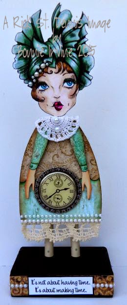
Imaginarium class where we altered wooden dolls using collage image heads and ever since, I have been wanting to create one with one of Rick's fabulous faces. The head and body are 3/4" wood. The legs and neck are dowels, and the base is about 1x4x2".


I chose to use the gorgeous Deborah, one of Rick's beautiful hat ladies, for the head of this doll. I coloured Deborah with Prismacolor and Polychromos pencils, and fussy cut her leaving off her fur wrap and one layer of her hat in order to fit the pre-cut head. The edges of the image were inked with black Big Brush pen and Deborah's face was adhered to the wood. Flat pearls were added to the detail on her hat.


Designer paper was adhered to her body, trimmed with an exacto to fit and edged with Vintage Photo Distress ink to create a vintage feel. A second piece of designer paper was punched along the bottom edge, embossed with a paisley folder, and adhered over the green layer to make her dress more interesting and elegant. Again, Vintage Photo was applied to bring out the detail of the embossing and to age the paper. Her arms, pre-cut and purchased from Retro Cafe, were covered with scraps from the scallop punched green paper, and adhered as sleeves. Her hands and neck dowel were painted with Fleshtone acrylic. Cuff detail was added with Inktense pencil activated with water and green half pearls became buttons. The arms were adhered after the blingy clock was added so that her hands could be placed properly to hold it. A crocheted doily was added as Deborah's collar by fitting it over the neck dowel before the head was glued onto it. Half pearls were added to the collar as buttons.


The pearl detail was repeated again when two rows were used to decorate the bottom of her dress once the crocheted lace was adhered to the hem. Her legs which were painted Titan Buff like the sides and back of the wood pieces were given Sage dots because Deborah is a stylin' gal. No plain legs for her! The base was painted with black gesso, and a strip of fancy textured border was glued around it. The sentiment was computer generated, matted in black cardstock, and adhered to the base over the border. A row of pearls was added to each side of the sentiment and around the sides. This helps to create flow throughout the altered doll as the pearls repeat from top to bottom. Oh my word, I just love her!

Thanks for joining Deborah and me today. We are both delighted that you stopped by. I have about a zillion ideas for more of these altered dolls featuring Rick's beauties. Hope you got a little inspiration, too.

Life is good; so is art.
Bonnie