Warning: Big long post with tons of description and photos. Viewer discretion is advised :)
Happy Thursday one and all! Today marks our second Get Altered Challenge at eclectric Paperie. The Get Altered Challenge is about exploring your creative journey, about stepping outside of your comfort zone, experimenting with new products, and creating altered and mixed media art. Share a unique card, a scrapbook or journal page, a canvas, or any other project where you’ve used any supplies, such as paint, ink, paper, and/or embellishments. We want to see your work and hear about your inspiration! All of those who play along with our challenge will be entered into a prize drawing for a $15.00 gift certificate to the eclectic Paperie store. Tracy is hosting this month's Get Altered challenge and her theme is altered books which I love to do.
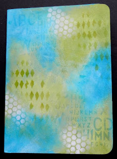
I picked up a child's board book on a thrift store visit.( $.70) These books are usually a lovely size (this one is 5"x8") and all of the pages are made of very sturdy chipboard so all they need is a light sanding and a coat of gesso. For this challenge I decided to alter only the front cover saving the rest for future art journalling pages. Once dry, Fresco paints (Mermaid, Beach Hut, Inky Pool, Guacamole, Hey Pesto, Snowflake) were applied over the front cover using cut-n-dry foam to achieve light even layers and better blending. Once this layer was dry, Hey Pesto, Snowflake or Beach Hut was applied over various stencils(listed below) using cut-n-dry foam to prevent seepage under the stencils. This works so well and gives better control to achieve a light or bold look depending upon the pressure on the sponge.
Next a torn section of Tim Holtz Melange tissue wrap was adhered over the background with gel medium. The same stencils were used to continue the pattern over the tissue wrap to embed it into the background. This helps it from looking stuck on and grounds it.
In my collection of DT goodies that Kim sent was this Studio 490 stamp set, Tales of Art, and the art part (The Gals) matching the lovely woman. This was my first experience with art parts and I must say I am hooked. They are so sturdy, fit the stamp so easily, and give great dimension to the piece. I painted her face with Fleshtone acrylic paint before stamping with Archival Coffee ink. Then I used Distress markers (Spun Sugar, Worn Lipstick, Vintage Photo, Fired Brick) to colour, shade and highlight. I used my waterbrush to fade the ink out on the shading. This photo shows the before shading and colouring view.
Glossy Accents was used to adhere the Idea-ology memo clips for her antennae as well as adhering her to the background. A Blossom Bucket flower was glued under her chin using a foam dot on the bottom half to keep it level. This flower was actually the inspiration for the colour scheme.The photo below shows how she looks after shading and highlighting. Is it me or does she remind you of Ashley Judd?
The black lettering is Idea-ology Alpha parts. Love those letters because they are different thicknesses and fonts. It creates such a funky look no matter how you mix them. The ticket which allows her to enter the journal and the flight was torn and inked with Vintage Photo Distress ink. The canvas butterfly from Maya Road was sprayed with Turquoise Blue and Lily Pad Glimmer Mist before a clock hand was adhered as its body.
To complete the bottom section of the cover, the sentiment from the same stamp set (oh the tales she could tell) was stamped onto Persnickety paper from Lily Bee Design using Memento Teal Zeal ink. The edges of the paper were darkened and then a light wash of the Fresco paint was applied to tone down the paper so that it didn't look so new. The other piece of the ticket used above was inked and adhered in the bottom corner above two turquoise buttons threaded with green embroidery floss. More of the Teal Zeal ink was sponged around the edges of the cover to darken them and create a frame.
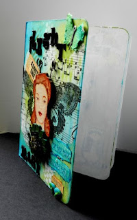
This view shows the dimension achieved on the cover of the board book. I intend to make each two page spread follow the theme of flight. When the book is completed, I'll do the back cover to match the front and come up with some kind of closure since the pages will be dimensional. I'll show you the pages as I complete them.
Thanks so much for stopping by and taking the time to read this lengthy post. I really appreciate your visits and comments. Be sure to pop over to the eclectic Paperie blog to see what Tracy has in store for you. The DT members participating in this challenge will link their posts up at the bottom of Tracy's post with DT after their names. That way you can visit their blogs and get the details if you want. Their projects are inspiring. I hope you'll join us in this challenge. I'm excited to see what you create.
Life is good; so is art.
Bonnie
Here is a list of the products used. Click on the thumbnail to find them in the eP store.






16 comments:
I love your disclaimer at the top. I should do that too. This cover is so great Bonnie. Love the tip about the tissue tape then more stenciling to create that embedded look. Great job!
Bonnie,
Love the color combo and the tips along the way about sanding and blending in the tissue. Great job
Amazing, Bonnie! I adore the tissue paper with the big 'ol butterfly...so pretty! And I love that this was a Rocky Racoon book...made me giggle! The colors are the cover are a beautiful combination! Great work!
What a fabulous transformation, Bonnie! Love your winged beauty, and fun wording... I started altering a child's board book ages ago, and got stuck... feeling very much inspired again now, thanks to you!
Alison x
Brilliant Bonnie... lol at the warning,I can sure use that myself!
Enjoyed your how to from start to finish and yep I think she could have the look of Ashley Judd.
Love your work Bonnie and thank you so much for joining in the challenge.
Can`t wait to see more!
Hugs
xoxo
What a gorgeous book!!! Love the colors and all of the little details that you added! Simply beautiful!
this is stinkin cool!
love it...great job!
This inspires me to work on some altered books that I've been meaning to get to since forever. Thanks for your narrative with all the details. Love your theme and how you executed it. Am anxious to see how this project evolves.
I did have a giggle at your warning Bonnie, but it was worth reading every word! This is stunning, it has everything I love, Fresco paints, Wendy Art Parts and butterflies, what more could a woman ask for! Stunning piece of work.... Hugs, Anne x
The caption certainly caught my attention. Very witty! Love your design. I adore the color choices! great work.
Mary-Ann M
So cool! There were so many great technique tips in your post. I learned so much! Thanks! I really like how the face looks after you softened it and yes she is sportin' a AJ look ala YA YA. LOL This is really great Bonnie. Can't wait to see the rest. Hugs!
Super stinkin CUTE!! Love the layers :-)
Wow this is wonderful, love all the info... Thanks for sharing..
This is just awesome, Bonnie! I love the backgrounds and that tissue paper! Also love the butterfly wings and the super cool "antennae"!! Super cool alteration!!
A MOST GORGEOUS Card!!! Love the background and the wings are fabulous! Love the Wendy face and all the added extras are perfect! Excellent colors! LOVE!!!
Wow, Bonnie... your book is awesome! Love all the details and that fabulous title... Flight Risk!
Post a Comment