Monday, November 05, 2012

CYP Challenge 135 ~ hexagons


Good Monday morning! Does that sound confusing...good and Monday in the same sentence? Mondays mean a new challenge at Craft Your Passion Challenges so it can't be all bad. This week the challenge is Hexagons. You must include at least one hexagon on your project.

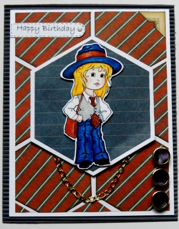
I chose to play with this digital stamp from one of our wonderful sponsors, The Paper Shelter. It's called called Little Miss Hall. She has the sweetest little face and I love her menswear inspired outfit reminiscent of Dianne Keaton's character,Annie Hall, from the Woody Allen movie. I coloured the little missy with Prismacolor pencils and fussy cut her leaving a thin white border so she wouldn't fade into the background. She is also popped up on foam tape for added dimension.


The heaxgons in the background were cut with a Spellbinders die as was the one on which Missy is mounted. All were cut from Graphic 45's A Proper Gentleman stack. Space was left between the hexagons for the white card base to show through and that was echoed in the larger blue hexagon by cutting a white mat to go behind it. To continue with the menswear theme, a piece of gold chain was adhered under the focal piece so that it resembles a watch chain on a vest. Small gold rimmed navy buttons were popped up on foam to look like the buttons on a jacket sleeve. The sentiment was computer generated, faux stitched and adhered with a brad in hopes of reminding the viewer of a crisp white shirt cuff.

The entire card front was matted with blue corrugated paper for added texture and to repeat the blue in the larger hexagon and Missy's outfit. The final detail was a photo corner cut from text paper using a Martha Stewart punch.

Thanks for stopping by to have a look-see. For more inspiration for this challenge , be sure to drop by the Craft Your Passion Challenges blog to see other hexagonal creations by the rest of the DT. Awesome creativity! Hope you'll join our challenge. I can't  wait to see where your creativity takes you.

I am entering this card in the following challenges:
Sentimental Sundays Challenge 127~ Dimensions (popped up image and hexagon)
The Crafty Pad ~ Anything Goes
Totally Gorjuss Challenge 156 ~ Anything Goes With A Button
CAS-ual Fridays ~  Masculine (menswear paper)

Life is good; so is art.
Bonnie

Sunday, November 04, 2012

Winter Fairy Halla


Since it's already November (unbelievable) I figured I'd better get started on my Christmas cards. I make cards for my mom to send and then some for me as well. Today I decided to have a play with a Mo Manning image, Winter Fairy Halla. She is available in rubber and as a digital image. Love her! I think Mo Manning  creates aome of the sweetest little kids on the planet. Look at that face  and those tiny toes...oh, and the little belly. Cute!


I coloured Halla with my Prismacolor pencils. Then I spread some Icicle Stickles on her wings and on the tiny snowflakes. The swirls from Halla's breath are dotted in with a Sakura gel pen for added sparkle. Halla was cut out using a label template. The edges were inked with silver ink and the silver Sakura pen was used for the faux stitching.


A rectangle of Recollections embossed snowflake paper was matted  with textured teal paper to form the background for Halla. A fabulous piece of sparkly silver mesh ribbon was wrapped around the two layers of background and adhered in the back. A narrower piece of turquoise taffeta ribbon was centered over the silver. Halla was layered next, using foam dots for dimension. A white Recollections flower was sprayed with Turquoise Glimmer Mist and affixed to the bottom right corner along with some punched and layered white flowers that I make ahead and always have in my stash. Some shiny blue snowflakes were also nestled in under the flowers. Another snowflake was attached to the top left corner for balance. Turquoise rhinestones were used for the flower centers.

Yay, one down and lots to go! Good thing I love making Christmas cards :)

I am entering this card in the following challenges:
One Crazy Stamper November Challenge ~ Anything Goes
Addicted to Stamps ~ Things With Wings
Dream Valley Challenges #44 ~ Glitter and Bling
The Ribbon Girl ~ Add sparkle
Mo's Digital Challenge ~ Anything Goes with a Mo image

Thanks for coming over to meet Halla. We both appreciate it!

Life is good; so is art.
Bonnie

Chalk-Ah-Lot thankful challenge


The challenge this week at the Chalk-Ah-Lot Cafe blog is to do a project connected with thanks, thankful, or Thanksgiving  with powdered chalk as one of the mediums used. I continue to have fun experimenting with the chalks from Stamp N Plus Scrap N. It's interesting to think of different ways to use them for mixed media, art journalling, cards...whatever  I can dream up.


This week I decided to combine powdered chalk with Crafters' Workshop stencils. Starting with white cardstock, two colours of Distress Ink, Scattered Straw and Dried Marigold were applied with ink blenders. Once the ink dried, copper powdered chalk, called Ritzy, was mixed with Buzz N Magic paint. When you mix the metallic chalk with this paint, you get a beautiful sheen. The chalk and paint mixture was sponged over two different stencils, herringbone and distressed diamonds, separately to achieve two different patterns. Both rectangles were matted with brown textured cardstock and layered. Before adhering these two layers to the  card base, a sentiment was printed from the computer onto white cardstock. This was cut out using the Memory Box Bistro Label die and popped up on foam tape. Two pieces of brown embroidery floss were adhered to the back of the label and wrapped around  each side of the stacked rectangles. Amber rhinestones were glued to the top of the label at each end.


The little pilgrim girl is a Stamp N Plus stamp by Mary Helen Gould which can be found here. She was coloured with Prismacolor pencils, cut out with a Spellbinders die, and matted on brown cardstock cut from the next size die. That's it, that's all for this clean and simple card. I love the effect of the powdered chalk and paint sponging through the stencils. I know that this is a technique I will repeat...can't wait to try it with other colours. Wish I could have captured the beautiful sheen on the patterns for you.

Thanks for visiting L'il Pilgrim girl and me today. We always enjoy your company. Come join the challenge.

Life is good; so is art.
Bonnie

Saturday, November 03, 2012

Time Flies


Here's another little atc I cooked up the other day. The background is white cardstock inked with Scattered Straw and Spiced Marigold Distress inks. A few other texture stamps were randomly and imperfectly stamped again for background texture. The clocks and words come from a Kelly Panacci clear stamp set and were stamped with Vintage Photo. I wanted the edges a bit wider and not completely crisp which can be achieved with extra pressure when stamping with clear stamps. It gives a more aged and distressed look.

The wee bird came from my stash. His eye is a black half pearl. The two clock centers are deep amber coloured rhinestones. The little flower in the corner was white chipboard until it was altered with Distress inks and popped up on a foam dot. The metal sentiment tag forms the center of that flower. Once again, I smushed (technical term) Versamark around the outside edges of the atc, then dipped them in black embossing powder and heated them for added texture and weight. It frames the atc in much the same way as distressing and inking does but also creates a nice shine.

Thanks for visiting agin. Love it when you do that!

Life is good; so is art.
Bonnie

Friday, November 02, 2012

Parachute


This is another atc that came from my play time yesterday. I love this saying so decided to make a visual reminder to hang in my craft room. I stamped and embossed a script stamp using white embossing powder on white cardstock. Then Broken China Distress ink was applied over the top and buffed off the lettering. A crosshatch stamp was layered over that randomly and imperfectly for added texture.

I found a very old parachute image on the internet and thought it was cool because it reminded me of the TH stamps that label parts. I wanted it to appear old so I printed it on a blank front page from an old recycled book. The aged paper had yellowed and gone soft...hope you know what I mean. Once printed, the image was lightly coloured with Prismacolor pencils, fussy cut and Vintage Photo DI was applied. Stickles were dotted on where the strings joined the parachute.

The sentiment was computer generated and the edges were inked. The only other embellies added were the sequin stars and tiny black half pearls in the center of them. To frame up the atc and give the outside some weight, Walnut Stain Distress ink was applied before rubbing the edges with Versamark and embossing them with copper embossing powder from Stamp N Plus.

I was happy with this little piece of art. I think I captured the vintage look I was after so "Go me!" It doesn't always happen that way :) Thanks for visiting today.

Life is good; so is art.
Bonnie

Thursday, November 01, 2012

ATC play

I've been making lots of cards for upcoming posts in the last few days so today I decided to have a play with something different...atcs. I love making atcs. They are great little canvases for experimenting. Atcs are 2 1/2" wide by 3 1/2" long and are fun to trade, use on a card, tag, or journal or just display. I have several little jute clotheslines across a bulletin board and also on the inside of my armoire door (which is always open). I frequently rotate the little art pieces on these, using mini clothespins to hang them.

One atc I created was an opportunity to use some of my new Paula Best stamps. I love the funkiness or quirkiness of her art. I used Scatttered Straw and Worn Lipstick Distress inks for the background and then gave it a couple of flicks with water. More Worn Lipstick was used to ink in a Dylusions stencil. The ART stamp is the bottom portion of Paula Best's art person stamp. The letters were coloured in with Distress markers and doodled with a Micron pen. Half pearls filled in the dots.

Tissue tape was adhered in the top right corner and along the bottom of the atc. The curly girl stamp was inked onto white cardstock and coloured with Prismacolor crayons,then fussy cut and adhered with foam tape. A TH grunge arrow was inked with Black Soot and then lined with white acrylic paint and a TH stamp was used for the splatter dots to the right of ART. The two final touches were the metal dream embellie and the thin black frame around the atc. I trimmed a tiny bit off the card before framing it with the black in order to keep the size the same.

I'll post some of the other atcs over the next couple of days. The styles are all very different from each other...I told you I wanted to play :)

Thanks for visiting today. I hope that you stay safe and that Sandy is finished with his nonsense. My heart goes out to those affected by his madness. We were fortunate to only get the tail end...lots of wind and rain but not too much destruction here.

Life is good; so is art.
Bonnie

Wednesday, October 31, 2012

Teeny weenie iris folding

I have never done iris folding on this small of a scale before so I was most interested to see if I could manage it. With a few adjustments it was as easy as larger iris fold designs I have made. I started by stamping this iris fold design, QIR075, from Stamp N Plus Scrap N twice on white cardstock. I stamped once for the entire design and once for the center circle which gave me the lines to follow.


After cutting out the center section, I coloured the entire design with Prismacolor pencils. I redotted the large dots with black acrylic paint and the smaller dots with Micron pen and set the piece aside to dry. In the meantime, I cut the center circle out from the second stamping, cutting outside of the lines to make the piece larger than the circle. When the coloured image was dry, I taped that piece face down over the circle section so that the lines showed through to the back of the main piece through the hole I had cut out. In other words, I had the right sdie of the center circle piece taped against the right side of the main image so that the lines showed through the hole.


Normally, I use folded pieces of thin paper for my layered strips. Because the opening was so small and the layered strips so thin, I chose to use unfolded 1/4" strips which I inked on one long edge. That served two purposes: the inking better shows the layers and the white edge of the paper was now black so it didn't look unfinished. Instead of using double sided or scotch tape for adhering each strip around the circle, I usedQuick-Dry glue just on either end, again reducing the bulk considerably. Then I just followed the lines round and round. It was completed in no time and I love how intricate the pattern looks.

I cut out the stamped and coloured design and adhered it to the turquoise rectangle made from the same paper as the iris folds. Then I just continued to layer up cardstock alternating colours and inking the edges with Distress Ink. Two little flat pearls anchor the lines from the design that extend beyond the coloured sections The sentiment was computer generated, cut out using an oval template. inked, matted, and dotted with more black paint.


I really kept the card design very clean and simple in order to let the colour palette and the strong and intricate pattern take center stage. It reminds me of a Navajo rug with the rich colours, graphic design, and punch of black. If you haven't tried iris folding yet, I urge you to give it a go. It's easy and pleasey...oh, you know what I mean :)

Thanks for visiting today. Happy Halloween...eat chocolate!

Life is good; so is art.
Bonnie