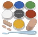
Hi All! I had the urge to play with my pan pastels a little and try out some new (to me) techniques so I decided to play in my Bee-themed altered children's board book for my eclectic Paperie post this week.. This is my third double page spread and all I knew was I wanted to use pan pastels and this fabulous bumblebee image.
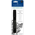
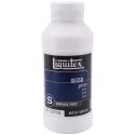
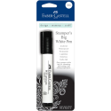
The pages were already gessoed so I began by covering the background with two shades of yellow pan pastel. Versamark ink was used to stamp the Hampton Arts honeycomb stamp. Before it was dry, I took the Yellow Ochre pan pastel and covered the wet ink to create the darker pattern. I went back and darkened in spots with Raw Umber PP. When I was happy with the background, I used Fixative to set it. Butterscotch and Chocolate gelatos were added to the outside edges, blended with a dry finger. Black Big Brush pen was used to edge the outside of the pages.
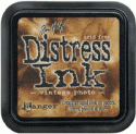
With Matte Medium, I added two papers from MME's Follow Your Heart-Be Amazing paper pack: one torn, the other fussy cut. Corrugated cardboard was peeled and adhered as well. Stamping with Vintage Photo Distress ink and Unity's Reversed Punchinella stamp as well as a Penny Black background pattern stamp addded additional texture and interest to the background. My favourite TH spotty stamp was also brought into play for the splatter dots.
The bumblebee image was in my computer stash but the bee girl is a Hidden Studios image which I fussy cut and popped up on foam over cheesecloth. I wasn't happy with how the two images blended into the background as you can see in the third photo so I printed each again, fussy cut, matted in black, and popped up on foam tape over the originals. It made a huge impact making them more focal and weighty.
The lettering for the words "Don't Call Me Honey" are a combination of Idea-ology Ransom Alpha Parts letters (Don't), Idea-ology Alpha Tiles (Call), wooden letter tiles (me), and a honey bottle label (honey). The frame around honey is from my stash and was brushed with both gesso and White Fire Treasure Gold. The wording makes me laugh because I imagine the bumblebee says this all the time to her other insect friends who mistake her for a honeybee and the bee girl doesn't look like she would tolerate being talked down to so don't call her honey either :)
At this point, I still wasn't sold on the overall look of this spread. Upon re-evaluation, I felt that there was too much "noise", busy pattern, all the same intensity, and my eyes didn't know where to look. That's when I decided to brush white gesso across the background, including the corrugated cardboard, and to add some pops of black. The die cut arrows help the viewer follow the wording and move the eye through the pages.
The three black hexagons, cut with a Spellbinders die, have some Christy Tomlinson rub-ons to add interest. The arrows and ransom letters were given white dots. Idea-ology Remnant Rubs were applied in five spots around the pages. The Black Big Brush pen was also used to widen the black border around the pages. Three pieces of torn washi tape and a whole lot of doodling brought the page to where I was happy. Someone (I can't remember who) said there was no need to panic if you weren't happy with your project. It just meant that you weren't done...yet. That is so true and if you trust the process, you can relax and just keep playing until you like what you see.
Anyway, that's it for my bee friends and me today. We thank you for popping by...love that! I hope you get a chance to play and get messy soon.
Life is good; so is art.
Bonnie
Here are links to the eclectic Paperie store for some of the products I used:







3 comments:
Love following your creative process---I learn so much from your posts.
FABULOUS!!! So much to see and love here! I am totally loving the images too! So cool and FUN!
This title cracks me up because I detest being called honey, sugar, sweetie...by folks I don't know. This gal's face just says it all. :) Love this layout Bonnie!
Post a Comment