Tuesday, October 08, 2019
Be in the Know ~ inspired by Vera Lane Studio images
Hi everyone! Did you see the fun new release by Vera Lane Studio yesterday called Cate and Canine? I love the snooty look on her face and that crazy little dog makes me laugh. I decided they needed their very own art journal page with a quote that seemed to suit her.
I coloured Cate and her dog with Prismacolor and Polychromos pencils, fussy cut leaving a white border, and then matted them with black.
I also wanted Cate to have her shopping bags filled with her "must-haves". I used some of the images from the VLS set called Gift Bags. These were printed on atcs which I used to clean up Lindy's Starburst over-spray from previous projects. They were then shaded with coloured pencils, fussy cut, and matted with black.
I searched for a free printable of Monopoly money and found the ideal one for the background. Once it was adhered to the page, Ellen Hutson Bokeh Circles were stamped with Jet Black Archival, and shaded inside with Gelatos. A dollar sign button with the shank removed was popped up on foam on top of two offset 1 inch circles. I used the same green spritzed paper as the one shopping bag to tie the corners together.
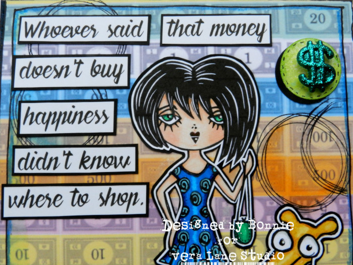
A simple border was doodled around the outside edge and shaded inside with Inktense pencil before the pieces of the scene were adhered. The wording, which was printed onto white cardstock, was cut into sections, and matted with black to help it stand out against the background.
Thanks for popping by today. Cate, her lovely dog, and I appreciate that. When you get a minute, be sure to check out the other amazing stamps at the Vera Lane Studio Etsy shop. You'll be sure to find some "must-haves" of your own :) Stop by the Vera Lane Studio Facebook group to see more projects using the Cate and Canine images. You'll be glad you did.
Life is good; so is art.
Bonnie
Monday, October 07, 2019
Joggles Art Journal Adventure Week 40 - Inspired by a movie
Hi everyone! The prompt for Week 40 of the Joggles Art Journal Adventure is to create something inspired by a movie. I spent a while considering which movie I would choose because there are so many that would be fun to use as a springboard for a journal page...so many that I have watched over and over again. In the end, I decided to go with a classic which is on my all time favourite list but which many people have never seen. The movie is a classic called Harvey, released in December of 1950...even before my time....LOL. It stars Jimmy Stewart as Elwood P. Dowd whose sister is trying to have him committed because he hangs out with a 6 foot 3.5 inch invisible rabbit named Harvey. Harvey is a Pooka, a Celtic fairy spirit. Not only is the movie funny but it also tugs at my heartstrings and I love the message.
I decided to recreate an art journal page similar to one of the original movie posters. An image of Jimmy Stewart sittin on the curb chatting with Harvey was printed and fussy cut. I just love the look on his face. Elwood P. Dowd is such a gentle soul who loves his friend...and people in general...so much. I have used kraft and black washi tape cut into a flag shape to serve as my curb. Two rabbit footprints were drawn onto gray paper and fussy cut so they could be adhered to the flag end of the washi.
The background used was a 6x8 inch rectangle of kraft cardstock because I wanted a vintage feel to the page and a subtle backdrop. Harvey's outline was sketched in with pencil and then shaded inside with Inktense pencil activated with a waterbrush to create a shadow (since he's invisible). Elwood was given a shadow by first tracing around the top and left of the fussy cut image which had been shifted up and to the left slightly. This was shaded the same way as Harvey's shadow and then Elwood was glued in place overlapping the shadow. Text was stamped onto the bare areas with Coffee Archival and tiny x markings were added with black Pitt Pen.
The wording is a quote from the movie which was printed onto white cardstock. matted with black, and then matted a second time with washi tape adhered to white cardstock. There are some fabulous lines in the movie and I wanted to feature one of my favourites. The other wording was created in the same way, omitting the washi tape border. All were adhered using foam tape to add dimension and natural shadow. To finish the page, a simple border was doodled with black pen and the edges of the page were inked with Coffee Archival. A wooden clock was added to the top right corner as a reference to Harvey's ability to alter time, an example of which you see at the end of the movie.
Thanks for joining Elwood, Harvey and me today. We are so glad you did. Be sure to check out what the other members of our Joggles Art Journal Adventure Facebook group create in response to this Movie prompt. I can hardly wait! They are such a creative and talented bunch!
Life is good; so is art.
Bonnie
Tuesday, October 01, 2019
Two Tag Tuesday ~ Inspired by Vera Lane Studio images
Hi everyone! Did you like that tongue twisting title? Am I stuck on the letter T today? I have no idea why alliteration strikes me as funny but it does. It might be because it's fun to say. I don't know but I accepted that fact long ago and I just roll with it:) Last Week, and this week, Vera Lane Studio released another two sets of awesome images calling out to be coloured. I created a tag for each: Catgirl and Skulldoos. I love them both so much!
I coloured the images with Prismacolor and Polychromos pencils, fussy cut them leaving a narrow white border, and matted them leaving a narrow black border. All three were popped up on foam tape to add dimension and natural shadow.
The background for CatGirl (why do I keep hearing the Batman theme??) was a Joggles watercolour tag which I sprized with Cracked Pistachio Distress Oxide Spray and then added colour to with Peacock Feathers Distress Oxide ink. The cat paws were added with a Kaisercraft stencil and Jet Black Archival and the text and grid stamps with Library Green Archival. Washi Tape over white cardstock created a ground line and pink puffy hearts picked up her hair colour. The tag was lined with black pen, edged with black Big Brush pen, and double matted with pink and black cardstock.
The background for Skulldoos and her chihuahua was a piece of text printed patterned paper cut into a tag shape and edged with Coffee Archival Ink and black Big Brush Pen. Across the bottom, purple designer paper matted with black was layered under orange dp, also matted with black. Across the top, a curvy border was adhered to keep the eyes on the tag instead of drifting off to who knows where. A simple border was doodled around the outside edges.
The text on CatGirl comes with the image set and the text on the Skulldoos tag was computer generated. Both were matted with black cardstock and popped up on foam tape. Simple ribbons coordinating with the tag colours became the toppers to finish them off.
Thanks for joining us today. We certainly do appreciate that! When you get a chance, stop by the Vera Lane Studio Etsy shop to check out these and all the other wonderful images. Pop by the Vera Lane Studio Facebook group as well to find inspiration galore. You're welcome...LOL
Life is good; so is art.
Bonnie
Monday, September 30, 2019
Joggles Art Journal Adventure Week 39 ~ Dots and Lines
Hi everyone! The other day I came across a fun saying that sparked the prompt for Joggles Art Journal Adventure Week 39. The saying was " A line is a dot on a stroll" and it conjured up a mental image of dots strolling around the page leaving trails behind them. I love adding both lines and dots to my art journal pages and anything polka dotty makes me smile. Thus, this page and the prompt, Dots and Lines, were born.
I had no idea where it was going but I knew that I wanted to use the yellow polka dot paper as the base and I wanted geometric shapes to be the stars. I actually wanted to use scraps of papers I had used for other projects or to clean up gel plates and collect over spray. I cut the yellow paper to the 6x8 inch size I favour and used a strip of black cardstock to run from top to bottom and cover up some inky bits staining the paper. Layered over that, I placed a strip of Lindy's spritzed paper with similar yellow tones. Over that, I layered a Dylusions Creative Dyary sticker adhered to a white strip of cardstock so that the background didn't show through.
I hand cut triangles from a gel printed black and white background which didn't work as a whole piece but was cool when cut into these small triangles. The edges of the triangles were inked with black Big Brush Pen and then outlined again with a smaller Pitt pen once adhered to the yellow base.
The black square was cut from another gel plate print where white paint had been pulled onto black cardstock. The circle below it was an alcohol ink on Yupo paper ATC die cut as a circle and edged with black. A circle stamp from VLV was applied to white cardstock with Jet Black Archival Ink and then fussy cut to layer over the colourful one.
The small inchies above the black square were cut from Asian paper which was gifted to me in a recent swap. I matted the squares with black cardstock because the cream paper got lost on the bright yellow background. A simple border was lined in using a ruler and a black pen and a dot and dash border was added to the yellow spritzed strip. Three small strips of black were added horizontally on the edge of that same layer. Black circles from a hole puncher were adhered in opposite corners of the page and between the triangles to add another dotty detail and finish the design before it was adhered to the black background page.
I was happy with the way this turned out although it is different in many ways to what I usually create. I like pushing out those boundaries of what is comfortable. It keeps things fresh and helps me learn both from what works and what doesn't. Thanks for popping by. If you get a chance, be sure to check out our Joggles Art Journal Facebook group to see where others go with this Dots and Lines prompt.
Life is good; so is art.
Bonnie
Friday, September 27, 2019
Collage ATC Junk Journal
Hi everyone! In my continuing effort to use things up and reduce my scrap pile and box of bits and bobs, I created a little atc sized (2.5 x 3.5 inch)junk journal book which I fastened together with binder rings. Each page was first cut from chipboard packaging and then collage was added to each side to create backgrounds.Above is the first and last page. I'm still pondering covers.
The wording came from either TH rub ons or Chit Chat Stickers. There is not a lot of real estate on these little cards so these were ideal.
Extra stamping and stencilling provided pattern and texture to the plainer parts of the backgrounds.
The papers run the gamut from scraps of designer paper, coffee dyed paper, corrugated coffee sleeves to embossed scraps, and ephemera. Texture was also added with fabric scraps like burlap or cheesecloth.
There are bits of black accents on each page as well as the occasional pops of bright colours. All pages were finished with a doodled border, Coffee Archival Ink and black Big Brush Pen on the edges.
It was a delight to create and fun to look through, as well as making the tiniest dent in my stash. It makes me feel so noble to use those teeny tiny scraps I saved. Like James Burke says, "It's not hoarding if you use it in a journal."...LOL
Thanks for stopping by.
Life is good; so is art.
Bonnie
Thursday, September 26, 2019
Postcard Swap at Vera Lane Studio
Hi everyone! I am squeaking under the wire on this, There is a postcard swap in the Vera Lane Studio Facebook group which closes on Saturday, September 28. I have lost track of dates this month and suddenly realized that I had better get my rear in gear. The theme for the swap is Which Vera Lane Studio image are you? which is a super fun idea. I combined several Vera Lane Studio images to put this together. I used the girl and one cat from the Girl and Cat with Hats set, the sitting cat from Kadee and Kat, the coffee cup from the Coffee Cups set, and the paintbrush from Max Makes Art. I could have just as easily called this "These are a few of my favourite things :)
The images were coloured with Prismacolor and Polychromos pencils, fussy cut, and matted with black. Black epoxy dots were added to the coffee cup's eyes. The background was a clean up sheet from a gel print using acrylic paint. Manganese Blue Archival Ink was applied to a VLV numbers stamp and Cobalt Blue to an Ellen Hutson Bokeh Stamp to add more pattern to the background. Ranger Texture Paste was scraped through TCW Tiny Circles stencil to add a little dimension and brightness to the more solid areas.
A strip of green dotty washi tape was adhered to white cardstock to keep the see through dots white. It was adhered across the bottom of the card to give the crew a place to stand...or sit as the case may be. The wording was printed onto white cardstock, matted with black. A simple border was doodled with black pen and the postcard was matted with black to frame it. Two green puffy hearts were added to the top right corner of the card to bring some of that colour from the bottom to the top of the card.
Thanks for stopping by today. The whole gang appreciates that. If you are quick, you can still join in the postcard swap. It's always fun to trade art with others, especially when they feature Vera Lane Studio images.
Life is good; so is art.
Bonnie
Tuesday, September 24, 2019
Happy Bouquet Card and Morty's Halloween AJ Page - inspired by Vera Lane Studio Images
Hi everyone! I have two projects using Vera Lane Studio images to share with you today. The art journal page, the first page in my new VLS art journal, stars the image from Morty's Halloween as well as one of the bats from one of the Halloween Collage sheets.
The image was coloured with Prismacolor and Polychromos pencils, fussy cut leaving a narrow white border, and matted with black. The collage sheet bat was fussy cut and matted in the same way as the other image. The punched stars were also matted with black to help them stand out against the background.
The 6x6 inch watercolour paper was spritzed with Lindy's Hag's Wart Orange Starburst spray. Tiger Lily Archival Ink was sponged through Colorbox Swirl Dot stencil to add pattern. Jet Black Archival Ink was applied to an Ellen Hutson Bokeh stamp and a VLV Cross Square background stamp to add even more pattern.
To give Morty and his cat a place to stand, torn strips of Halloween themed patterned paper were layered over torn strips of black cardstock to form a base. A heavy black border dotted with white paint pen was added to the four sides of the page to frame it and keep the eye on the page. Orange Inktense pencil activated with a water brush was used to shade inside of the border.
The second project, a CAS style card, was created with images put together from the Mix N Match Vases set. This is a fabulous set because it is so flexible and can be combined in so many ways, as well as the pieces being used individually.
The images were coloured with Prismacolor and Poychromos pencils and fussy cut/matted the same as Morty's crew.
The background of the card was embossed with a Carabelle Studio folder and then matted with black. The flowers were adhered to the back of the vase and then it was popped up on foam tape. Black and white washi tape was used to ground the vase.
Thanks for stopping by today. We appreciate that. To see more examples of the Mix N Match Vases set in action, be sure to pop by the Vera Lane Studio Facebook group. You can find this set, the fabulous Morty, and a whole whack of other awesome images in the Vera Lane Studio Etsy shop.
Life is good; so is art.
Bonnie
Subscribe to:
Posts (Atom)