Tuesday, July 30, 2019

Hit Me With Your Best Pot ~ inspired by Vera Lane Studio images


Hi everyone. It's Tuesday and that means it's my turn to share a DT project I made for Vera Lane Studio. I created an art journal page featuring the teapot from Wonderland Accessories Bundle stamp set as well as an image from the Tea set. Tea is no longer in the shop but she is very similar to Coffee Lover Girl so you could substitute her if you wanted. I believe they are sisters if not twins :)


I printed Zara (tea girl) on white cardstock and coloured her with a mix of Prismacolor and Polychromos pencils, using a black Pitt pen to outline and add dots to her collar. The teapot was printed onto pink designer paper which has tiny white dots. The shading/highlighting and the flower were coloured with the same coloured pencils used on Zara. The teapot was fussy cut and matted with black but Zara was fussy cut leaving a narrow white border and then matted with black.


The background was covered with Mustard Seed and Worn Lipstick Distress Oxide Inks, blending where they overlapped. More of the Worn Lipstick Oxide Ink was sponged through Carabelle Studio Des Carres avec des ronds stencil. Jet Black Archival was used to apply a Viva Las Vegas Circle Text stamp and Worn Lipstick Oxide was used on another small circles stamp to add it in a few places. White Texture Paste was scraped through TCW Tiny Circles stencil to add dimension and texture. Once that was dry, pink dotty washi tape were adhered to the bottom of the page to give Zara and her teapot a place to stand. A silver teacup charm was popped up on foam and added to the outside end of that tape.


The wording was printed onto white cardstock and cut into individual words. These were then matted with black cardstock to help them stand out from the background. A simple border was doodled around the outside edge of the page and striped black and white washi tape was added to the opposite corners to help frame the page. Black Big Brush Pen was used to edge the three outside edges to complete the design.

Thanks for stopping by today. Zara, her teapot, and I appreciate that. Be sure to stop by both the Vera Lane Studio Facebook group and the VLS Etsy shop to check out the amazing images and how our talented community members feature them.

Life is good; so is art.
Bonnie

Monday, July 29, 2019

Joggles Art Journal Adventure Week 30 ~ Bugs


Hi everyone! It's Monday which means it's time for the next prompt in the Joggles Art Journal Adventure. For Week 30, the prompt is Bugs. Now this might mean the ones outside that sometimes fascinate and other times annoy or we might want to feature something that bugs us, completely unrelated to those insect types. The choice is ours to make. I always love to see where people's imaginations take them.


When I was in high school, back in the days of yore, one of my favourite music albums was by an artist called Melanie (Safka). She had the most whimsical music and an awesome style and I played that music over and over again (think of the song "Brand New Key" or "Look what they've done to my song, Ma"). I can still sing those songs, still remember all the words...just ask my husband. I have been known to randomly bust one out at any given moment :) Anyway, on that album was a song called Alexander Beetle, based upon a poem by one of my favourite authors, A. A. Milne. This became the inspiration for today's journal page.


The background started with Lindy's Marigold Yellow Orange, Yellow Rose of Texas, and California Poppy Gold Starburst Sprays being spritzed on mixed media paper. Once dry, Worn Lipstick Distress Oxide Ink was applied through TCW Plaid Fringe stencil in several places as well as around the edges of the page. The same ink was used to add some stamped circles here and there. Jet Black Archival Ink was added through Carabelle Studio Weft Fabric and Numbers stencil.


A section containing the definition of beetle was torn from a children's dictionary, and all but that definition was gessoed over to push it back. The main definition was outlined with black pen and the edges were inked with Coffee Archival Ink before the section was adhered to the background.One of the Paper Artsy Tracy Scott stamps was inked with Jet Black Archival and applied to the background in a visual triangle.


The words to the song/poem were printed onto white cardstock, divided into two sections, and matted with black to draw attention to them and help them stand out against the background.


Alexander was fussy cut from the Joggles Watercolor Beetles I Collage Sheet. The matchbox was drawn onto red cardstock using a reference photo from Pinterest. It was shaded and highlighted with coloured pencils and lined with black Pitt Pen. A label was cut from cream paper for the top. Two sections of music themed washi tape were added to give Alexander and the matchbox a place to stand as well as giving a nod to Melanie's song. To finish the page, a simple border was doodled and the edges were inked with Black Big Brush Pen before the page was adhered to the black background.

Thanks for joining Alexander and me today before he disappeared...darn that nanny! To see where the other participants in the Joggles Art Journal Adventure Facebook group go with this prompt, be sure to pop over throughout the week. We would love to have you join us and play along.

Life is good; so is art.
Bonnie

Tuesday, July 23, 2019

Happiness shared...inspired by a Vera Lane Studio new release


Hi everyone! Did you see the sweet new release yesterday by Vera Lane Studio? It's called Flower Lover and comes with two adorable images and a lovely sentiment. I could not choose between the two sweeties so I decided to create a double page spread in my VLS art journal.  Speaking of that art journal, I am almost finished the 48 pages and boy is it stuffed full. I love it!


I coloured both girls with a mix of Prismacolor and Polychromos pencils, adding a little gel pen for the flower centers and black Nuvo Crops for the buttons. They were each fussy cut leaving a narrow white border, matted with black, and fussy cut again leaving a narrow black border. I always trace over the black lines because I don't want to lose any of the quirky detail which sometimes gets dulled or pushed back by the coloured pencils.


The background of the watercolour pages was spritzed with Lindy's Hottie Patottie Hot Pink, Yellow Rose of Texas, and California Poppy Gold Starburst Sprays. To add pattern and texture to the background, stamping was added with Magenta Hue Archival Ink and Stampotique Originals Funky Heart (by Janet Klein) and Crafty Individuals Script stamps. Jet Black Archival was applied to a Studio Light grid stamp and a Viva Las Vegas stitching stamp, as well as a TH splatter stamp. To give the girls a place to stand, one of the Dylusions border stickers from the Dyary line was split in two and added to the bottom of each page.


To help set the stage for a beautiful sunny day, one of the suns from VLS Sunshine Collage Sheet was fussy cut, edged with Black Big Brush Pen, and adhered to the upper left corner of the spread. The excess was cut off before the outside edges of the pages were inked with black. The sentiment was printed onto white cardstock, cut into individual words, and matted with black. To finish the spread, a doodled border was added to frame it.

Thanks for popping by today. The girls and I appreciate that.  To check out the other amazing art pieces by the rest of my talented DT  teammates using this wonderful new release, Flower Lover, be sure to pop by the Vera Lane Studio Facebook group. Check out the fabulous array of images in the Vera Lane Studio Etsy shop, too. There are so many must-haves there...inspiration galore :)

Life is good; so is art.
Bonnie

Monday, July 22, 2019

Joggles Art Journal Adventure ~ Week 29 ~ Peat and Repeat


Hi everyone! It's Week 29 of the Joggles Art Journal Adventure and the prompt this week is something my mom used to say all the time: Peat and Repeat. It made me laugh every time she said it but what the prompt is really asking for is that we use repetition, which is one of the principles of art and something I use all the time. It really helps to pull a page together, and to get the eye to travel around the page.


I am in collage and use it up mindset because of another journal I am playing with so I decided to go that route with this page. I love this colour palette and the variety of papers, some aged naturally and some aged with Coffee Archival Ink, especially along the edges. Stamping was added with the same ink and a Studio Light number stamp, as well as a Crafty Individuals Script stamp. Coffee Archival Ink was again used to apply the harlequin pattern using a Stamperia stencil. All of these patterns are repeated in several places to connect the various papers in the background so they read as a whole. A Bokeh circle stamp was applied in a visual triangle using Jet Black Archival, again to keep the eye moving around the page.


I also added two die cut leafy fronds cut from dotty green paper. The eye tends to look for things that are similar so in seeing one green dotty frond, it will look for a second. By placing these on a diagonal line with the image in between, it causes the eye to move through the image to arrive at the second one. All the papers and the die cuts are outlined with black pen, again to unite them as well as helping them contrast with the background.


The two images I used for this page came from Joggles Collage sheet This is for the Birds II. Both were fussy cut leaving a narrow white border, matted with black cardstock, and fussy cut a second time leaving a narrow black border. The black mimics the outlining done around the other elements. I like to add my own artistic voice to pre-made collage images to make them more my own. I added both black pen sketchy outlining as well as coloured pencil shading to these images. They were beautiful as they were but I like them better now because they have a little me in them.


The wording was printed onto white cardstock, matted with black, and popped up on foam tape. A doodled border was added which repeats the line work from the circle stamping as well as the outlining. people often ask me how I make my collage pieces cohesive but if you look at how often I use repetition, you can better understand how it happens. It's something I do so often thatI am rarely conscious of it any more.

Thanks for visiting today. My birdie fam and I appreciate the opportunity to hang out with you. If you get a chance, be sure to check out the responses to this prompt by others in our wonderful AJA Facebook group. I am always inspired, delighted, and I learn something from each of the ones who play along. We'd love to see you there.

Life is good; so is art.
Bonnie


Saturday, July 20, 2019

Use It, Already! ~ de-stashing collage journal pages 9-12


Hi everyone! I'm back with the next 4 pages (9-12) of my Holy Cow! Use It, Already! collage book where I am taking time to play and de-stash at the same time. If you want to know more, here's the intro post with the first 4 pages.


The pages are cut from larger scraps to fit inside one of the TH binder covers with the rings. Smaller scraps of all kinds of paper types are used to collage the background and bits of leftover ephemera, washi, punched elements, and die cuts help fill out the design.


The larger Th Paper Doll images are used as the focal images and are embellished to give them their own identities, as well as suit the page. I really like to add my own artistic voice to collage images created by someone else.


There is really no plan for any of these pages. I love to work intuitively and see where things go. Chit Chat, Big Chat, and Small Chat stickers which have been patiently waiting for their turns have been used for the wording. For this project, anything in my stash is fair game no matter how junky or how precious I previously labelled it. Like I said...Holy Cow! Use it, already! :)

Thanks for stopping by. My friends and I appreciate that.

Life is good; so is art.
Bonnie

Tuesday, July 16, 2019

Summer Postcard for Vera Lane Studio swap


Hi everyone! For the July swap in the Vera Lane Studio Facebook group, Carole has decided we will trade postcards with a summer theme. I have never traded postcards before so I'm extra excited to play along this time. The postcards can either be 4x6 inches (which I chose) or 3.5x5 inches and must feature a Vera Lane Studio image.


I decided to have The Sailor and her sailboat star on my postcard. I love her sweet face and little sailor suit. I coloured them with a mix of Prismacolor and Polychromos pencils. Both images were fussy cut leaving my usual white border, matted with black cardstock, and fussy cut again leaving a narrow black border. Some tiny TH number rub-ons were added to the one sail of the boat.


The background began as a larger gel print created with shades of blue and green acrylic paints. Additional texture was added with a number stamp from Studio Light, and a dotty stamp from Indigo Blu using Manganese Blue Archival Ink. A grid stamp by Studio Light was added with Jet Black Archival Ink. Tiny Xs were scattered in a few clusters using a black pen and an Alexandra Renke stencil. To create the wave pattern at the bottom of the card, a scrap of scallop printed designer paper was fussy cut and, once glued in place, was outlined with black pen. White Gesso was applied with an empty tape roll to make the double circles. Inktense pencil activated and applied with a waterbrush helped the circles stand out.


The punny wording was printed onto white cardstock, cut apart, and matted with black cardstock. The edges of the card were inked with Manganese Blue Archival Ink, and edged with Black Big Brush Pen. A simple doodled border was added as well as a small chevron rub-on was placed in the upper right corner.

Thanks for popping by to visit with The Sailor and me. We appreciate that.  Be sure to stop by the VLS Facebook group to see the other swap postcards as they are posted in the album there. We would love it if you joined in. Check out the Vera Lane Studio Etsy shop as well. There are wonderful new sets and collage sheets added all the time! Oh, the possibilities!

Life is good; so is art.
Bonnie

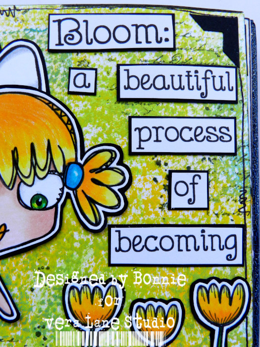
Bloom ~ an art journal Page inspired by a Vera Lane Studio image


Hi everyone! Have you seen the sweet as can be digi set called Keep the Light which was released by Vera Lane Studio last week? I love the expression of wonder on her face as she looks at her beautiful flowers. I created an art journal page where Mary could hang out in my journal.


I coloured Mary, her flowers, and the shading on the cloud with a mix of Prismacolor and Polychromos pencils. They were all fussy cut leaving a narrow white border, and then matted with black...'cuz that's my thing...LOL. Really, it allows me to go crazy with the background if I want, knowing that the images will still stand out. The cloud was given a layer of Wink of Stella over the gray shading to add a little shimmer. Amber coloured gems were added to Mary's dress for buttons.


The 6x6 watercolour page was brayered with Naples Yellow Hue and Brilliant Yellow Green Liquitex acrylic paint, using several light layers. It's such an easy background which dries quickly. Script and splatter stamping were added with Olive Green Archival Ink but I purposely kept the background plain because there were a lot of elements and words to add. The strip along the bottom, which grounds Mary, is a Dylusions sticker from the Dyary collection. I'm in a use it up mode right now and this see through sticker suited the page so well. A black epoxy dot was placed on the left end of the sticker.


Two punched black photo corners were added to the top corners and a simple border was doodled around the page before the edges were inked with black Big Brush Pen. The saying was printed onto white cardstock, cut into individual words, and matted with black to finish the page.

Thanks for joining Mary and me in her garden today. We're so happy you did! Be sure to pop by the Vera Lane Studio shop and Facebook group to gather a ton of inspiration and maybe a few must-haves :)

Life is good; so is art.
Bonnie